


largento
-
Posts
3,827 -
Joined
-
Last visited
-
Days Won
31
Content Type
Profiles
Forums
Events
Posts posted by largento
-
-
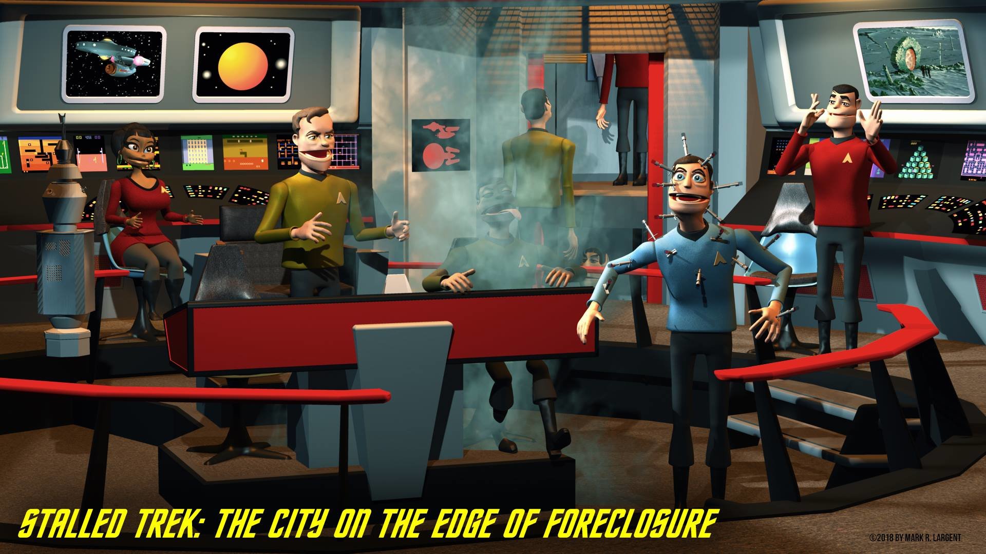
Wow!
That last render looks fantastic! I love the style that you have captured here! What's the insignia on his chest? I have a feeling it's somthing funny

Lee
Thank you, Lee! I take that as high praise coming from you!
The insignia has a stylized "2P" on it (for the ship, Secondprize). I did think it would be funny to make the symbol on Mr. Spott's be "OrNot" and then Dr. McGruff's be "2P" so that you get "2P OrNot 2P" when they are lined up. :-)
I'm sure nobody will be able to read it, though...
My thought was to put in little things like that on the props... like there are two buttons on the Captain's chair marked "Butt Warmer" with "Left Cheek" and "Right Cheek" under each. :-)
Again, nobody'll ever see them, but I get a chuckle out of them. :-)
-
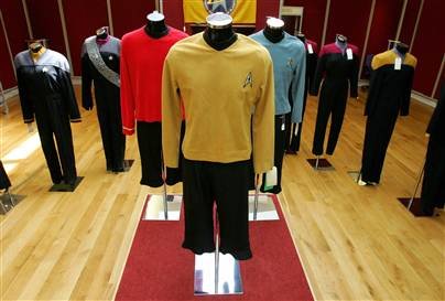
Here's a photo of the actual costumes from the show (you can see how short the pants are and get an idea of how they flared out).
-
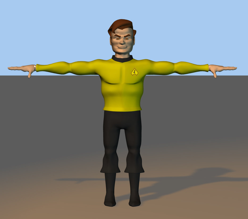
Nice work! Only comments are:
Chest looks a bit... Boxey. Squeeze the diaphram a bit, I think.

The pants are distracting. Either they shouldn't flare so much, or need to be longer. (Or maybe his knees are too skinny?)
The uh... Boots like like girl's boots. If that's intentional, it's funny. If not, lower the heal and make the toe bigger.
That's all I see, right now.
Keep up the great work!Thanks! I think I need to figure out how to stretch the chest out in the Z. It seems too wide and not deep enough. It looks okay in 3/4 view, but it gets weird when it goes from being wide from the front/back to thin in the side view. I'm going to have to figure that out.
I'm definitely wanting to emphasize the pants. I'm parodying the look of the actual costumes. I'm not thrilled with the boots, but they do have to have heels and a fairly pointy toe (again to lampoon the actual uniforms). I used a picture of latin boots as my guide and they are kind of feminine looking.
-
Thanks, Al! I'm with you about the Original Series stuff... although, I would say that the movie Enterprise is the best-looking of the ships.
I'm slowly picking away at this. I've just put together the Captain Krok figure. There's some things I see with regards to the seam that are going to need some attention, but it's getting there. I'm figuring that after I've done a few people models, I may end up coming back and re-doing the whole figure.
Here's a render and a quick turnaround...
-
I agree! All of these models have been great, but this last one is super-great!
-
It's my understanding that Lucasfilm has an informal arrangement where they turn a blind eye to fan films that do not seek to be commercial ventures. There are also Lucasfilm-sanctioned fan film contests. At the least, it could be finished to submit to one of those. As much as I can remember they usually require there be no copyrighted materials in them (like the music).
It does seem a real shame to waste all the time and effort that's already put into it. Especially when there seems to be real interest in the project.
-
Good luck, dude!
I would hope your school would recognize how pervasive 3D art and animation will be in the future. As media shifts away from paper and printing to online media and future technologies like electronic paper, motion graphics are going to be hugely important. 3D will be everywhere.
I'm sure they'll see the educational value of giving the students the tools to explore that.
How's that for an endorsement? :-)
-
Cool character!
If he's an alien, I think you can make up your own proportions for the eyes. But if you're not wanting that, the normal human face is 5 eyes wide. So there's an eye's width between the two eyes and an eye's width between the outside of the face and the eyes.
-
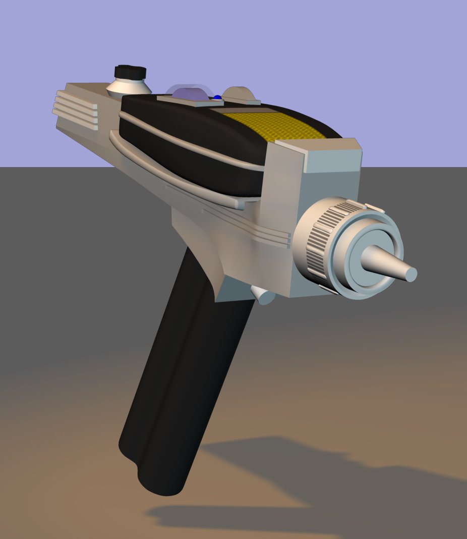
Ooooo. Nice phaser so far. I really like it.
Thanks, Zaryin!
I think the TOS phaser may be one of the coolest-looking props from any tv show ever. I was really disappointed when TNG went with those "dustbuster" phasers.
-
Cool stuff, Bruce!
Dig those Three Jive Mice!
-
Still pushing along.
I'm pausing on my Captain Krok for a breather and to figure out what I'm going to do with his height. In the comic, I made him really short to play up the contrast with Mr. Spott who was reall tall and thin. I did recognize, though, that I kind of cheated his shape between pages (and some times even between panels) by sometimes making him proportionately short and sometimes taking height out of his legs. I definitely want to have the contrast, but I'm going to have to commit to just one body shape for this.
Just to keep the ball rolling, I started building a type 2 phaser. (The type 1 phaser is the black "box" on the top of it. I did make it complete, so it can be used separately.) They didn't use any phasers in "Amok Time," but how can you do a Trek parody without having a phaser? :-)
There's a part of me that thinks of this as making a virtual toybox and filling it up with cool Star Trek toys. :-)
-
Thanks, mfortunato and nyah!
The captain is looking good so far.The only thing I did notice might be that there is a little bit of pinching at the 4 corners of the mouth.
This is more noticeable in the front view and the angled view.
Unless this detail is intentional, in which case please disregard.
You're doing great!
I see what you're talking about, nyah. I'll get in there tonight and figure out how to fix that. There's also some awkwardness still with the front of the hair that needs some serious attention.
If this Trek parody doesn't work out, maybe I can just stick a flashlight under the head and do "In the Year 2000" gags. :-)
-
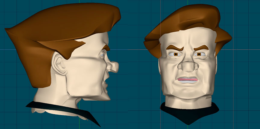
Looking great so far. Although I have to say he looks a little like a caracture of Conan O'brien.
Holy Cow, he does!
-
Here's an update of how the Captain Krok model is coming.
I had a time trying to figure out how to model the hair. I had a bunch of false starts before I finally got it to go the way I wanted. There's room for improvement, but it's coming out way better than I thought it would, so I'm not focusing on the negatives. :-)
I just put in a temporary bump map for the ear lobe wrinkles. I think that'll work.
Now onto the rest of him...
-
Well, you can right-click with the Mighty Mouse, but you can't left-click and right-click at the same time... a trick that A:M depends on a lot. I went out and bought a 3rd party mouse to use with A:M. It works just like it would on a PC and the scroll wheel even interfaces with the zoom tool.
It's a decent mouse and it cost me less than $30, so it's hardly a big investment.
I still go back to my Apple mouse for using other applications. The transition is a little jarring, but the 3rd party mouse is too "clunky" for things where I want to be precise (Illustrator, Photoshop, etc.)
I'd definitely say go out and get one, though. Makes things much easier in A:M.
-
Nick Porcino made a bridge of the Enterprise that I used to demonstrate Artic Pig plug-ins. The bridge is simplyfied to 2040 patches and could be modified to include more detail. I think it would be perfect for a animation set, and I would look him up and ask for permission. He has quite a crew as well fully rigged.
Thanks for the tip. I found Nick Porcino's website and checked out the models. The bridge set is impressive in it's simplicity and his Enterprise model is fantastically cool. He does have a disclaimer against the models being used in anything of a commercial nature, though. I'll most likely never see a cent from this, but I'd like to keep the option open to sell DVDs or "photo"-comics of this at conventions someday.
It's really cool that he's got them available. The Enterprise model is a wonder. The way the lights reflect on it and the level of detail. Definitely something I'm going to have to study.
Here's the url for his download page, if anyone else is interested:
-
You, sir, are a gentleman!
Thank you!
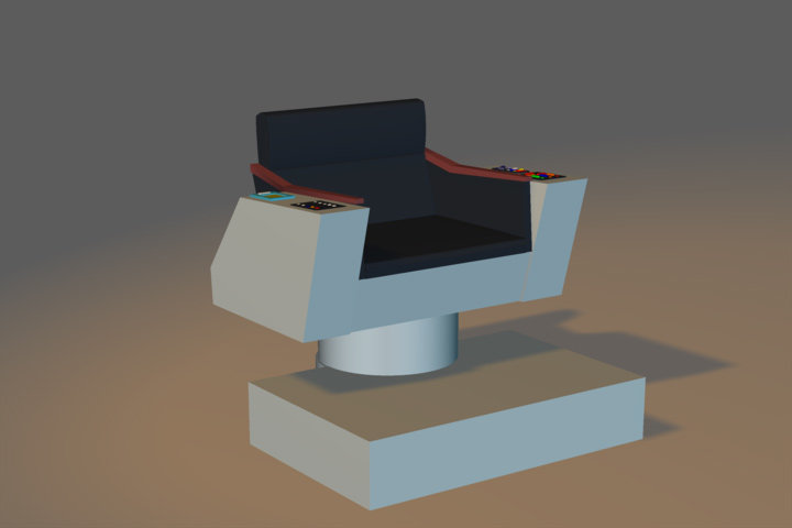
These are great! Especially the details on the consoles. I think it will be really trippy to move around the bridge set when it's finished.
That is a bummer about the sickbay, but it's not nearly as familiar to folks as the bridge set, so I think cheating will be okay there.
These are definitely more polished than the ones I found online...
Thanks again!
-
If you need any other blueprints, let me know. I have an original hard cover copy of the Star Trek Technical Reference from the original series. Bought it many, many, many moons ago. Although, I am pretty sure that anything in this book is already on the web, it may make things a bit quicker and easier than searching for them.
Al
That would be awesome, Trafalz! The blueprints I found for the bridge seemed to have been done by a fan who built his own bridge set (for real) in the '70s. I'll try to post a link to one of the images tonight when I get home for comparison. (Don't have them at work with me.)
Did the book have blueprints for the Sickbay set? All I've got are some tiny line drawings in an old paperback book...
Thanks!
-
Amok Time?
Wow.
So.... are the ceremonial bell ringers going to suffer an unfortunate accident this time?
..... PLEASE!!!!
I hadn't thought about that, nyah. There was no audio with the comic, so they weren't nearly as annoying. :-) It would be funny if they kept getting accidentally wiped out during the fight.
A bunch of the gags in this are a play on "dog" jokes. "Mr. Spott" is a Vul-canine and the Pon Farr is basically them going into heat. There's little things like the soup "Nurse Temple" brings to Spott is in a dog dish with his name on it and "Dr. McGruff" calls it "Pew-Ree'nuh Soup."
The title of it is "Amutt Time," since Spott is a mixed breed. :-)
-
That's really awesome, dude! The fur on the ears looks especially cool!
-
Thanks!
I think I may be wishing this had been live action before it's all through, goodguy! :-) There's a pretty big cast in this.
Still, there's a simplicity to the designs in the old Star Trek that makes it seem attainable... with a lot of time and patience, of course. I'm taking the attitude that I'll just pick away at it each day. In May of '05, I knuckled down and lost 120 lbs. Took me almost a year and a half, but it was the same sort of thing. Every day a little bit.
I've got the story pretty much narrowed to 4 sets: a hallway, sickbay, the bridge and the arena on the planet. (This is a parody of a specific episode, "Amok Time.") I've found some pretty good reference for most of it. I found a website with blueprints of the bridge (that's what I used to make the captain's chair) and a lot of the props (communicators, medical scanner, tricorder, etc.) It'll help to be able to keep everything to scale.
And then there's the Enterprise (or "Secondprize" as it's called in this.) :-)
I can't really think big picture on this, though. It's too daunting.
Baby steps. :-)
-
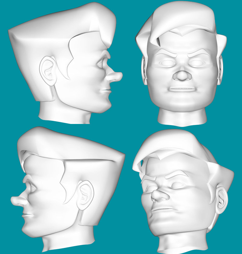
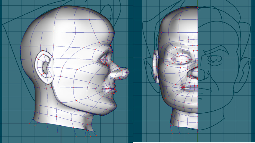
From a personal taste perspective I think the ear is too far back on the head. You might want to add some folds to the eyelids (upper and lower) but a shaded wireframe view would be advantageous to gauge how animatible the mesh will be.
Cheers
I'll have to consider that. There's definitely an aspect of wanting to create a dimensionalized version of my original, so I don't really want to stray too far from the designs of the characters, but I'm not too married to them. I think that once the hair is on, it won't seem as dramatic.
Here's the mesh:

-
My first time around with Animation: Master in 2004, I had wanted to do an animated version of a Star Trek parody I'd done as a comic. I only got as far as creating one model and it looked pretty terrible. :-) I eventually reached a point of frustration and abandoned it.
This year, I decided to give A:M another go and this time, I've been making a real effort to learn it.
So, I'm giving my Stalled Trek (now the name's even more appropriate!) another go.
Here's the scary head I made of the captain back in 2004:
It's even scarier than I remembered it being! :-)
Here's where I'm at with the new version:

It's like night and day! I'm not entirely satisfied with the ear. I'm figuring that one out still, but I'm feeling a lot more comfortable with the tools and the proceess. I've got a ton of work ahead of me, but I'm really looking forward to seeing how it turns out.
On the side, I've started building set pieces. Here's the captain's chair from the bridge set:
Only about a billion more things to do. :-)
-
Thanks, everyone. Once I figured out how to make the pose slider (I hadn't done that before), it was relatively easy. I set up the movement of the hands to go through 12 hours. I started with 12:00 and made each 2% increment 15 minutes. I reached 12:00 again at 88% and changed that to the max value on the slider.
Now all I have to do is set the time on the slider in the first frame and the end time on the last frame. Very cool!
Here's a short test clip. This is the speed it goes going from 12 to 12 in 30 seconds.
Again, my thanks!


Stalled Trek
in The Wannabe Way
Posted
Question for the gurus:
I'm getting a white patch on Krok's right wrist. I noticed on the renders I did yesterday and it showed up on this one I did this morning.
I looked at the model last night and the normals are facing outwards in that area and it's not visible as being white in the modelling window. It's also a 4-point patch. Any idea on what's happening and how I can fix it? It's just a duplicate of the left hand, which doesn't have this showing up.