


NancyGormezano
-
Posts
7,863 -
Joined
-
Last visited
-
Days Won
15
Content Type
Profiles
Forums
Events
Posts posted by NancyGormezano
-
-
Looks terrific - tho I must say I would have a very hard time picking which one I liked better - the first (2005 new) one that you posted has a different - more dusty feel to it - this new render looks cleaner - crisper - Love them both - also can't decide on which orientation is better - must mean the composition is PERFECT.
-
Great Great fun character -
The soles look a little strange - but we'll just have to wait - also wondering how he's going to blink? or is he permanently in a hypnotic trance?

Great job on the clothing
-
That is looking reallly goood - excellent progress
-
Mr Fwuffy has grown up...Shall we say: More manly, More of a Pwofessor - here is a FatCat walk test with hair (developed for Bootcamp ex 6b) - will have to work on tail action - still working on facial expressions, phonemes, smartskin (cp weights). Yarn Cat type will transform into some other creature eventually...
-
It is a wonderfully gorgeous image - (Chris - I think Brian said 6 hours, in first post) -
Speaking of rendering times - given that these images take so long to render - Brian: What is the process that you go thru to tweak your settings ? I haven't tried this photon stuff as I have a hard enough time when an image takes 1 minute to render...
-
I believe for IKARM off - you can set the "lock" for the forearm bone while animating - that way you can move the arm bones as you like -
-
Great stuff Vern, amazing amount of work - Large image is gorgeous - knew the entry was yours as it had your wonderful trademark goopy-dna-humor smeared all over it...
-
Wasn't it Sigmund Freud who said, "Sometimes a cigar is just a cigar"?
I think it was Bill Clinton
-
I will work on the grey painting. Actually, I had originally just forgotten to put an image there and then someone said "nice gag about the blank painting"
I loved the grey painting bit - I thought it was really clever - I mean - how many times have I been to a gallery and there's a 1 color painting? (usually red) - I thought the gag was a parody of a cliche...
-
I love the coloring! don't change it - I think it's the way some peoples monitors are calibrated - He shows up wonderfully here...Also I think his motion is terrific & well suited to the character...I'm really looking forward to seeing the completed piece -
-
Which motion were you thinking about particularly? There is a lot there that is a bit floaty so I could do with knowing which is the worst.
I was going to place that shot after some credits - maybe it would work better then? The idea is that she looks dazed and confused. I am thinking of also having her wake up and start dancing wildly around the room.
It's hard for me to suggest fixes on the "floaty" as I tend to have lots of that in my animations, & have been criticized for "lack of snap". There are so many more qualified animators than me, who could analyze it and suggest where snap might be appropriate (if at all - since that is a style - a pixar? style - and this is an individualized piece) - I hate to see everything look the same - (think anime) & love when someone does their own style.
I'm conflicted in that the character lends herself to being "dangly" in the way that she's constructed - but in one of the shots (where she is looking up at the 1st painting and walking away) - her arms are moving mushy - (again maybe thats the way she's supposed to move?) - also when she's looking at the gray painting & turning towards camera - motion is a bit wobbly mush again - BUT the running after shot is fantastic!, along with the slip -great!
Also forgot to add - love the camera work - great angles
As for the last shot - maybe you could zoom in (real fast) with the camera from the previous shot, when she's lying on the floor - and swing around to her face from above - and have the credits rolling inside her black pupils - and zoom up close to the pupils -
love the lighting as well - tho something funny with the lighting happens in the scene where she falls to the ground.
This has been hard to describe without showing - so hope I comunicated ok
-
Wonderful John, wonderful! - I love the character - very imaginative, clever use of squiggly stuff - the paintings on walls are terrific (yours? I imagine?), playful appropriate color scheme - expressive animation - obviously could tell what was going on without sound - has universal appeal - cute little story, made me smile.
Improvements, maybe...: 1) some of animation is a little floaty, 2) didn't quite understand the implication of the last scene after she faints on floor - (other than we're just viewing her?). 3) Titles go by a tiny bit fast
All in all - It's a winner - thanks for showing
-
I like the test with the bird - this I can believe! The boxes seem to fall & interact appropriately for the perceived relative weights of the boxes (compared to bird) and for the direction and speed of bird at impact - looking good...
-
im just showing that you can make pretty good looking textures with the click of the camera. and plus doesent this look photorelistic in a way?
I think it looks warm, terrific & believable - and I'm all for doing things the simplest way
-
it looks good - but I feel for some reason the boxes fall too slowly for what I "imagine" is the weight & speed of the ball at impact - I would expect the "cardboard?, empty? filled?" boxes to fall more chaotically, and faster and with more sideways direction - I imagine the ball to be like a bowling ball? & the boxes appear lightweight ? - only you know how dense the items are supposed to be - so it's hard to judge (and maybe I haven't read all the posts to see if you mentioned what they are)
-
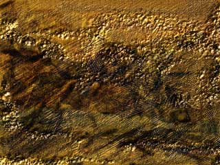
And to be complete - also added combo of two images (rt click - add image) to bark (non-canopy groups) - images combined 50-50 - also again from previous projects -
By the way - did I mention don't get too close to tree - thats when the fakey takes over . This is all meant to be viewed in a static image at the appropriate distance. Unless you're like me & love the inauthentic.

-
and just to be complete here is the noizy ground pattern that I created in painter to repeat on the big ground plane - pattern done in another project (originally for a stone wall type thingy)- applied 50% to a ground plane group which had dark green as the surface color.
again MORE NOISE
-
And here is the emitter - looks nothing like leaves - but has a gradient applied (black to white) - I colored the non visible with ...ummm...puke mustard so that you can see the shape of the emitter

-
This is the tree - with two emitters but using the same image for both emitters - but each emitter colored by a different decal - mo' noize mo better

-
Like I said before - I used 2 emitters - I found that if I tried to use something that resembled a leaf - it looked too fakey (which I usually love - I love FAKEY) - this is the tree with two different emitters, each colored by a different decal - pretty - but not enough variation or noise.

-
I decaled the canopy surface with two different images, to use for coloring the leaves - the decals were both images from previous projects I did, -just liked the mix of colors in the images - and also added an image to all canopy patches that was just a blank (alpha all black) so that the canopy would be invisible, but that the hair (leaves) would take on the decal colors
here's the decal images on the canopy (1st is used for emitter 1, second is used for emitter 2)

-
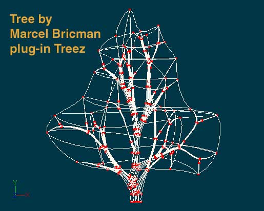
Here's the tree in wire form - (beautiful canopy shape - lovely limbs) - as I said before - procedurally generated - I did click a few buttons - does that count? Probably not.
-
must be great to be able to model so nicely
Uhhhh, bluhhh...Model? Me?
Wait a minute youse guyzzz - this is all procedurally generated - the tree is from marcel's plug-in, the leaves from Hash hair, & the ground plane is 1 big FLAT patch with image added (repeated 10 x 10, seamless). And of course the sky is a rotoscope (actually 2, cloud form - superimposed on a squished gradient)
Now I will take credit for all the textures used...Details to follow.
-
try to picture him with some hair. Also the shinyness is just so I can see lumps better to work them out.
One thing I've noticed is: if you're going to give him hair (of the Hash kind) - you REALLY don't have to worry about lumps. All modeling sins get obliterated. (Maybe not ALL, but creases for sure)
but as an exercise in purrr-fect modeling - Spline on as usual.
Fat bunny model
in Work In Progress / Sweatbox
Posted
Hair - the hair material color will be determined by the surface (patches) to which it is applied - eg if you make the surface property of the patch red, the hair color will be red. If you want the hair color to be varied (not just along patch lines) then you can apply a decal (that you've "Painted") to the patches that you want to have hair and set the properties of the decal to drive the hair color - There is a better explanation of how decals drive hair color in the online html help.. I've just provided a very scant intro. BUT be forewarned hair is processor intensive - so you'll have to play with the density (and other properties) of the hair material if you want to be able to render in this lifetime. You're young, so that might not be as important to you as me....