

nyahkitty
-
Posts
524 -
Joined
-
Last visited
Content Type
Profiles
Forums
Events
Everything posted by nyahkitty
-
Now that I've seen this character, it occurs to me that she might fit nicely into one of Brian Prince's photoreal scenes, sans whatever costume works for the scene.
-
Now all we need is for someone to animate a photoreal character within that scene.
-
Mr. Robinson: I just looked at your website..........wow. I like how....er, it's interesting that it... um.... oh good grief! The format is excellent and navigation worked great. The site is dense with information, but it doesn't feel overpopulated. I see what you mean by keeping things simplified. I like how you included a story with each piece of finished client work. Definitely a site to learn from. Mr. Hankey, the christmas poo?!!! Oh yeah, I heard of that thing.
-
Noted. Responses below: -It would seem there are two camps for visible trap lines; those who think it works well for directing and keeping the viewer's attention and the other's who would rather that the things just go away. For some reason this strikes me as humorous. However I would place this within the category of Personal Asthetic, on the verge of Controversial, but definitely attention getting. I could knock one or two pixels off the lines to thin them out. They will turn into a straight value/hue if I go much further than that. -I lean towards a simpler, no-nonsense approach in design. Just get the message acrossed and do it in the most direct, utilitarian manner possible. One of my great limitations is lack of balance, which is why I solicited critique's from this forum, since what I do relates directly to work on the computer. That pesky generation of youth seems to want things more fancy, but streamlined = sophisticated. -I'll see about adjusting where the eye's are looking. I agree that this does help as a trap. Speaking of which, it seems to me that the ear on the right hand side acts as a border to stop the viewer's eye there so that it'll have to go back to the text. -Anyone notice how some of the revisions have super bright colors and other's are more subtle? For a while, the forum server was displaying Jpeg's produced directly from Photoshop and Illustrator. Now I have to either produce a GIF of the thing or process the Jpeg through IrfanView (which makes the colors more bright). Control of final output is neccasary in any visual business, so it'd be nice to know why this is happening and then solve this issue. NOTE: the error message states that the image cannot be displayed because it may have errors in it. Anyone know how this is happening? I've always had trouble getting photoshop to accept the alpha channel when opening a TGA or TIFF. To solve this, I resort to opening the image in Illustrator, copying it, then pasting it over in Photoshop. This preserves the transparency. At this time, Photoshop 7.0 (I think that's the one before CS) has never accepted alpha's from my TGA's directly. The online doc says use TIFF's or Pixar format... still nothing. -I will do a version without bevels, glows, or drop shadows. I have found that the composition lacks definition without those details. Again, two camps. -I agree that a split complimentary color set would push and pull the visual elements more, and I can try that (the wonder of computer imaging = infinite revisions), but my initial reaction echoes the concern mentioned regards the text boxes and the background clashing. The aim is to catch the attention of the viewer pleasantly, without assaulting it. Probably desaturating the box colors just half a step may be all that's needed to resolve the figure/ground issues. Someone who reviewed this in person expressed concern that the character in mid-ground didn't have enough contrast to draw it out from the background. Of course, they were looking at an enlarged printout (8 1/2 x 11) from 25 feet away. A proof at actual size should show whether this is the case, though I doubt it is. Also, the reaction of a number of people in this same session was that positioning the character midground made them curious, so that they wanted to lift everything else to see the rest of him = their attention was fixed on the card, instead of being bored. Good, good. -The font is Arial. One of my other limitations is Typography, due to inexperience. Something that will need to be addressed if I'm to do much graphic design work. Anyone recall when Helvetica was THE font to use? -Un-overlapping everything sounds interesting. I'll have to try that. The purpose of overlap (and beveling, drop shadows, etc.) was to steer the attention of the viewer by implying depth and mass. Since part of what I do is 3D, it seemed further appropriate to use those sort of details. My site will be featuring greater variety soon, to accommodate my talents and how I promote them = 3D modeling and animation, graphic design, Visual FX, etc. After the long set of notes on my thoughts for changing my website strategy, I think I've got this figured out. Josh Bruce: That professor sounds very..... um, visually alert, detail oriented, savvy = objectively hard-nosed Actually, it sounds like once you get past whatever rough edges of his personality, insights into his professional perception might be useful (he's cool, once you get to know the guy). -Ah! I see it now, I know just the thing for the character's proximity and what he's looking at. Thank you to everyone for the insightful comments. If I ignored it all, I'd be ignoring years of experience dealing with the audience's inherently human perception. If I abide by it all, my design will never get done. Once again, balance is the order of the day. I do believe I am leaps and bounds closer to what's appropriate for promoting myself. Although the Hash Inc. forum is primarily related to the software itself, I do believe this will be a useful thread for those striving to develope a strategy of self-promotion in the 3D industry and business in general. Again, thank you.
-
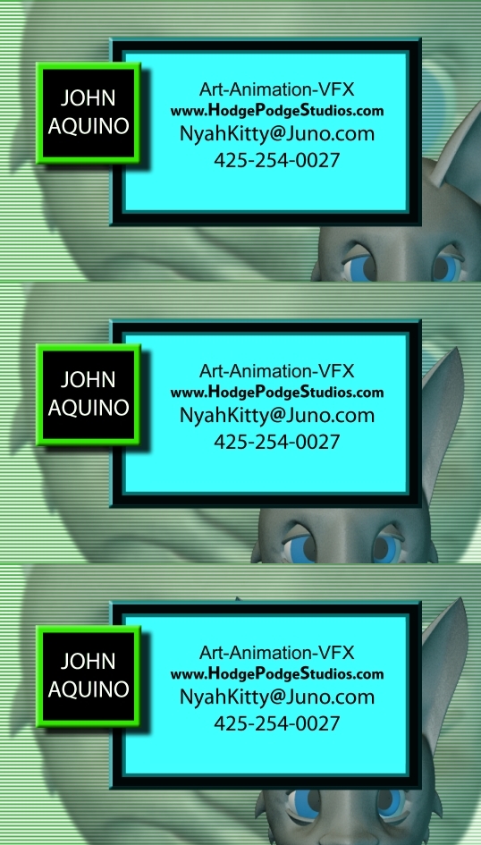
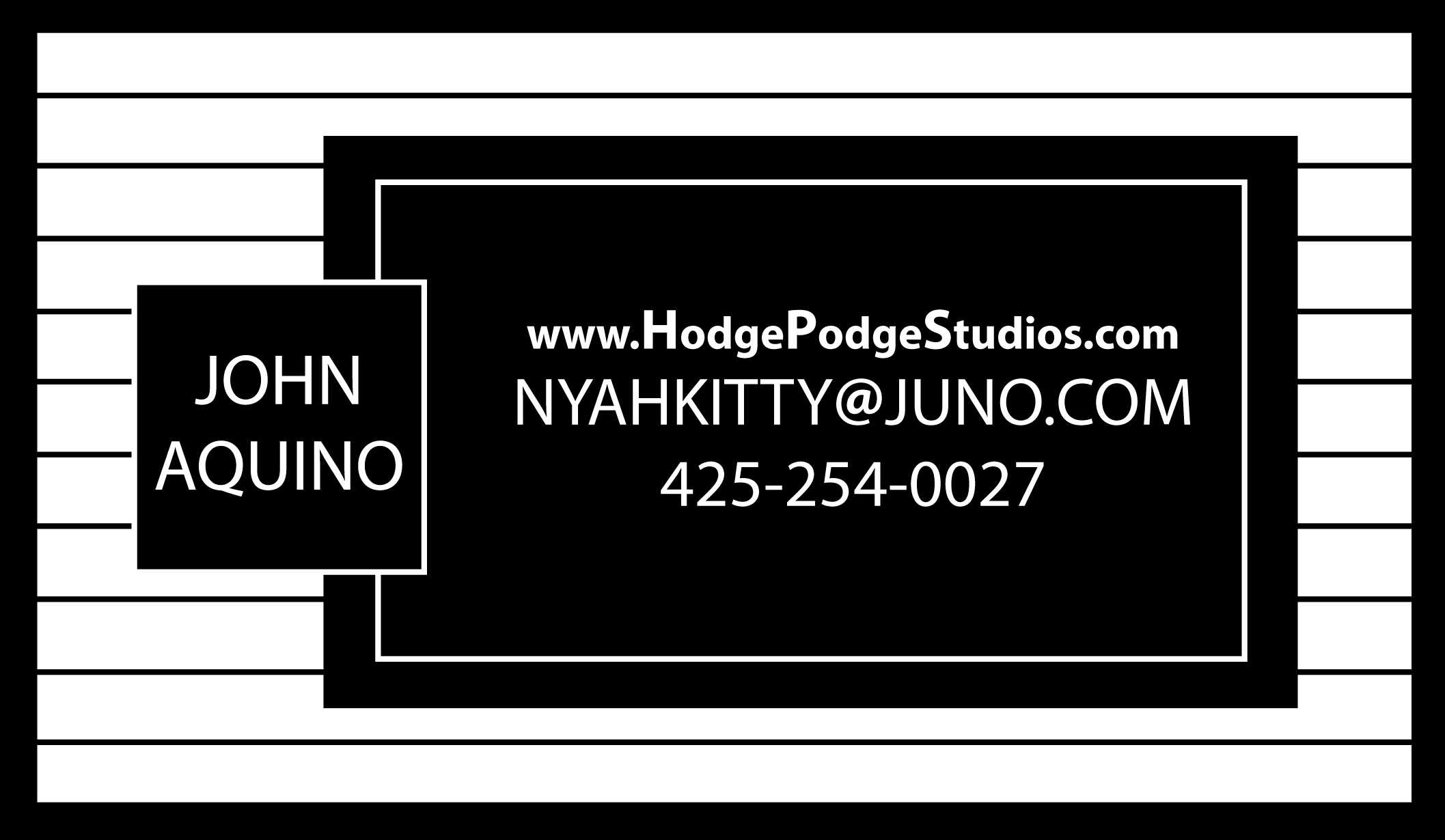
Revision #9 This should solve the readability and general clutter problems.
-
Revision #8 Text and bevels soon therafter. Working.....
-
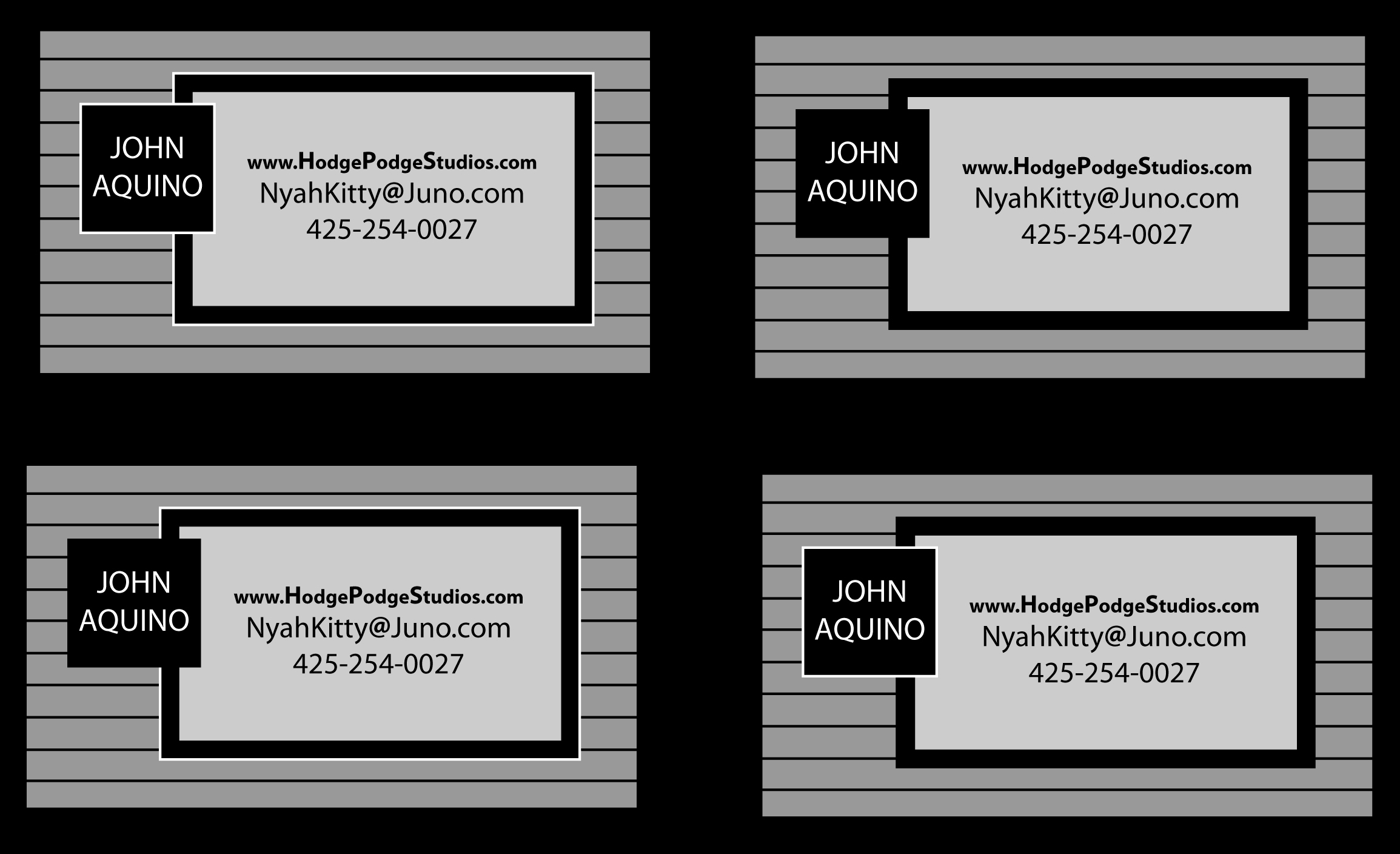
Revision #7 I think I've got it. Comments anyone?
-
Revision #6 I think I may be on to something. ChrisThom: Yes, I'd like to see contact Info for that company which produces color business cards. Thank you. EDITED: Had some trouble with the server recognizing my Jpeg. Yay! IrfanView did it. Now I wonder what's up with Photoshop and Illustrator. Anyway, critiques please.
-
Point taken. Incidently, someone else commented that he thought the design was for a business that installs siding. I personally push myself to be very organized and rigid to compensate for my lack thereof. One category of humor I like could be considered "dark" (e.g. Tim Burton). However, I do agree that one's strategy of self promotion should represent a united front. I do all sorts of things, thus the name Hodge Podge. At the time of building the site, I mostly had furry character illustrations on hand. It's sounding like an overhaul is in order. I would think that the Gallery would be a general collection of things I've done, while Folio holds my "demo" work. Hmm... originally I'd figured on one website that covered everything. Considering the comments in this thread, it might do well to separate the professional and the personal (with a link to bridge both) so as to avoid confusion. So.... Folio could be renamed Resume, and Gallery could stay the same or be renamed something like Demo or Folio. Unless I actually have anything to sell, which may happen eventually, the Store could probably be deleted. Obviously the spelling of Hodje Podje in all the gem art would need to be changed to Hodge Podge. As has been pointed out, there is the challenge of wanting to do everything, but needing to solicit for a limited range instead. So let's see.... if I had to pick any one job to apply for, it would be animation. I've often threatened to make a shirt that says, "I'd rather be animating". So having the pro site featuring a demo of 3D animation or even character animation specifically sounds like a good start. It is not unheard of for a studio or individual to handle a project in it's intirity (that is what Hash A:M is purposed for) such as V/A editing, 3D modeling and animation, 3D asset design, graphic design to complement the project, and VFX compositing and creation. An additional video demonstrating this specifically might be appropriate. Presumably these two video's would go in the Gallery section. Demo reels from previous years could go in a different spot on the same page, so that the viewer can track what progress I've made. It sounds like a miscellany of collected art and video would better serve my personal site. Card revisions soon to come.....
-
Revision #5 Yay!
-
Hmm... I wonder if I make the border on the name box just slightly thicker... will that make it seem to jump out more? Working......
-
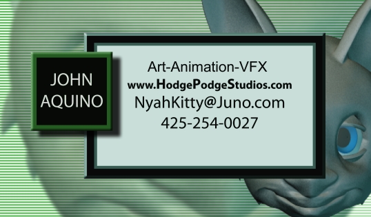
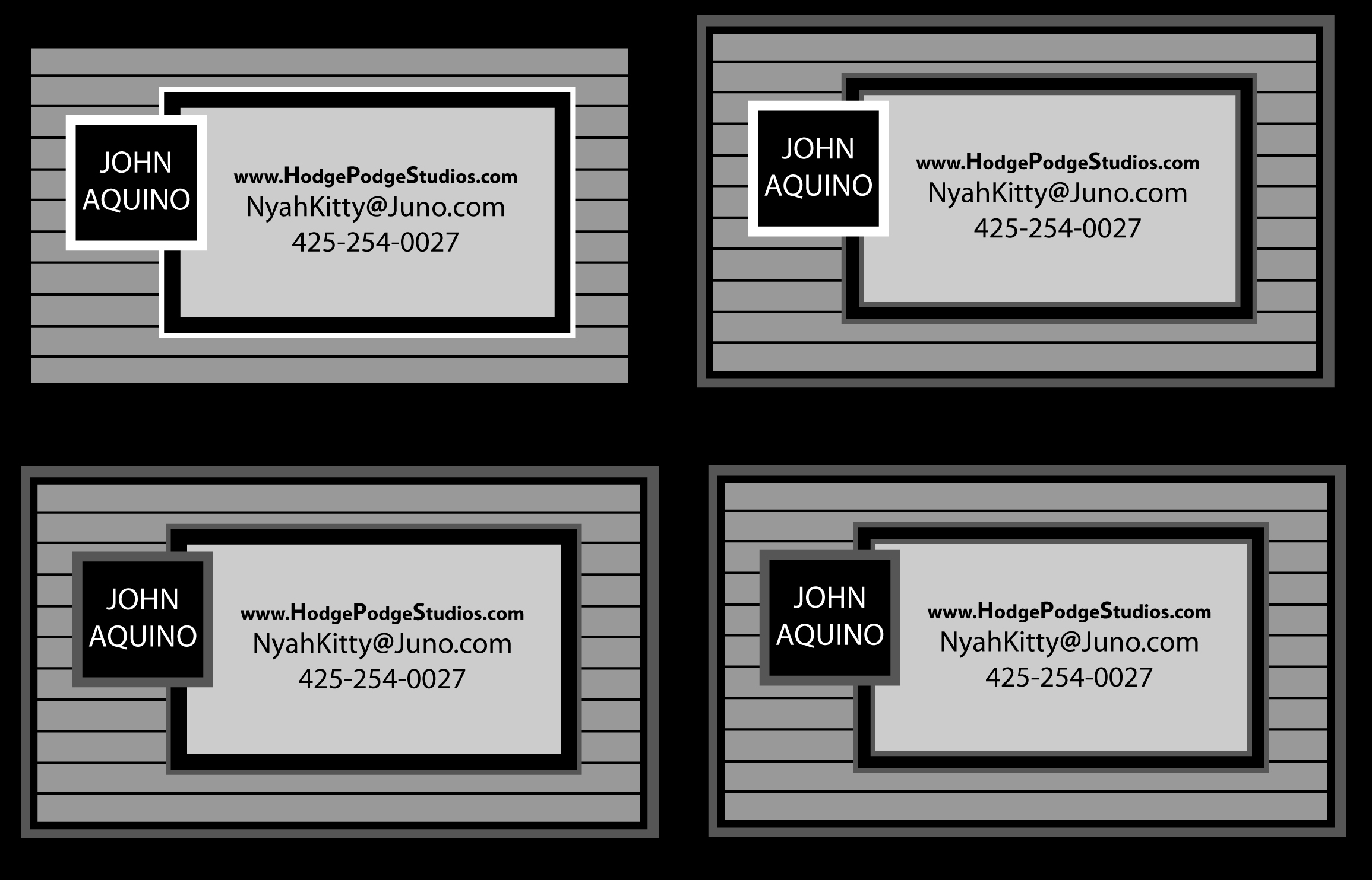
Revision #4 I like the first one and included the others to show what would happen if I remove any white borders.
-
Suggestions noted: -I'm guessing a domain name would be something like: NyahKitty@HodgePodgeStudios.com Yes? I agree, presentation is 75% of the sale. I endeavor for this inspite of being a stickler for straight-laced communication in a product. -B+W is what I grew up on for most of my art production. It seems like the answer must be within the balance between being simple and being effective. The more it works for the less detail involved, the better. Your ten minutes worth of work confirms my suspicion; I am excruciatingly slow. How long have you worked with graphic design? Yes, please relay the contact info of the print company that makes cards. -Considering that I'm presenting myself as someone who works in a visual industry, my card better communicate that I have sufficient grasp of the subject. hmm..... So it comes to this: -I'm exceptionally talented, artistically. My conscious awareness of the principles I've used for years is just beginning to come to light. I'm a slow worker. Anyone know of a niche' I can fill in the industry with these circumstances and the previously mentioned skill set? Yes, I am well aware that competition is fierce in the job market, but let's assume there are still positions available out there I can fill. Suggestions?
-
Revision #3 Just a moment, let me try something else, just for fun.
-
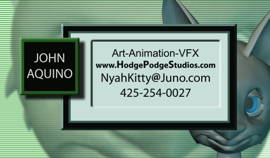
The idea for the redesign was to make the text more readable by inverting the values. That way the viewer's eyes don't have to work so hard. I had thought of inverting only the name box before, but then I wondered why not do that to the other text box as well? As you can see, I'm big on geometric unity. However the weight of the two boxes must be balanced, besides being readable. So, yes, slightly offsetting the name box seems to help. I think I'll make it wider as well, since there's barely any room for my name. So is black text on white ground easier to read, or is it the inverted value scheme that's easier? Or is varying it, as in the two latest examples, what's called for? When I first designed the card, I found my talents covered a wide range of activity = generalist. Besides, I thought adding another line might throw the balance off. I figured at the time that my website that I listed on the card would speak for my talents. However, what manner of position could be named for what I do: -character design -creature design -sci-fi vehicle design -sci-fi robot design -3D modeling and animation -character -titles and logo's -VFX -Graphic Design -writing -video editing -compositing VFX -etc. Would this qualify me as a "Multi-Media Artist" or is there a more specific title? And finally, I am aware of the advice to specialise and do well in one field. The problem is, I'm spoiled for choice. New revisions posted soon. Please stand by.....
-
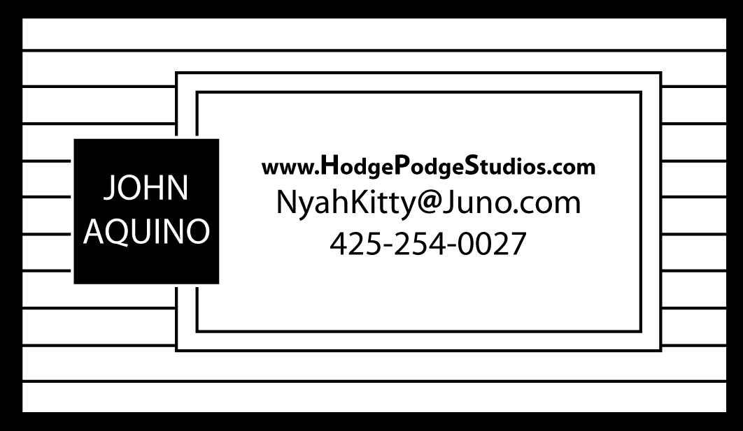
Revision #2
-
Revision #1
-
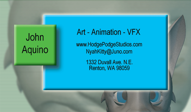
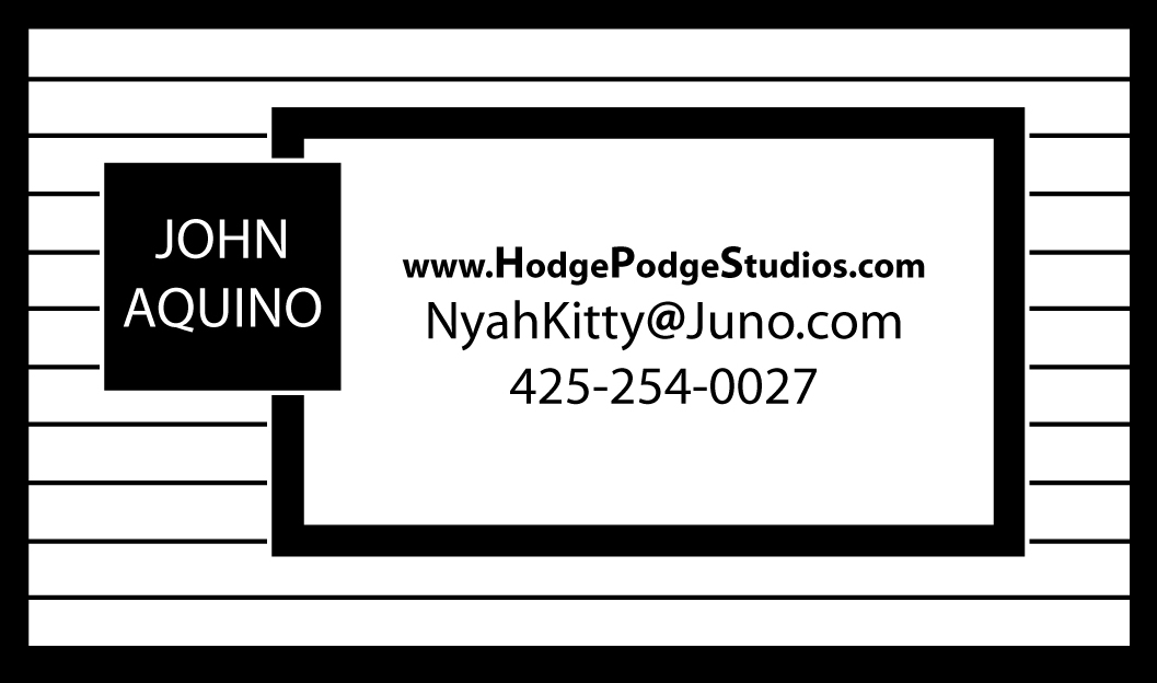
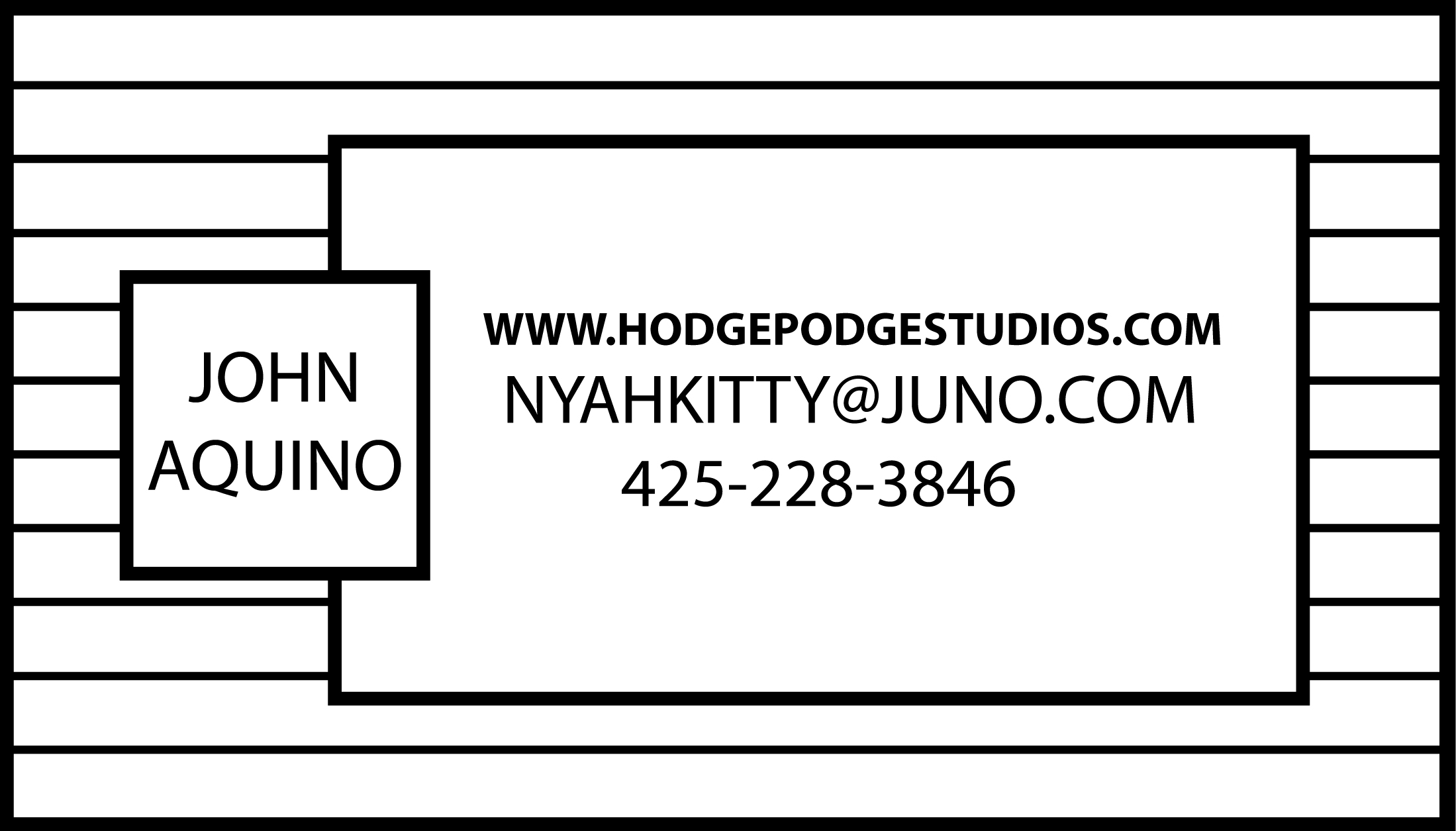
Here's the original, revision will be up in a moment.....
-
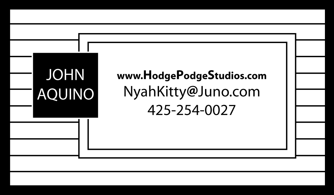
Hello, I've attached to this post an image file of the current redesign of my business card. Critiques please.
-
Fleebag Studios Presents "Skeeters"
nyahkitty replied to fleebag's topic in Work In Progress / Sweatbox
Yay Skeeters! Like, huzzah and stuff. Hopefully this marks a trend of renewed productivity in animated content. I'm looking forward to seeing more. -
Unless it's part of the blue prints, I'd think that the jet intake at the front of the car needs to be more roundish instead of looking like someone took a sledge hammer to it. Also, the decal on the ground right underneath the car needs to be a bit more crisp, not so fuzzy. This is something I've run into a few times and I've yet to find a solution except for maybe a higher resolution image for the stamp. Otherwise it is a most excellent rendering.
-
Did you compose the music yourself? If I find a slot in all of my incredibly vast reserves of spare time (flippant) I wouldn't mind producing an animation set to your music. Please take a look at the Folio page on my website to see some of my video's. The link at the bottom is aimed at my site.
-
"You suck! You suck!..... You suck!" Funny. Rather crass, but with feeling. Not to say that the show needs lots of ...... potty mouth.... to make it interesting but rather the show has potential for genuine expression of character and emotion. Looking at the second episode, it looks like you're definitely getting better as you go along, the space ships and lighting are starting to look cooler. Keep up the good work.
-
YAY!!!!!!
-
Dude! I'm, like, sooo there. Don't forget to let us know when beta testing is due.