anzovin
*A:M User*-
Posts
279 -
Joined
-
Last visited
Previous Fields
-
Interests
Parenthood, husbandhood, books, film, animation, cooking
Profile Information
-
Name
Steve Anzovin
-
Location
Western Massachusetts
anzovin's Achievements

Craftsman (5/10)
0
Reputation
-
Morgan will be looking into this after her current project... -Steve
-
We'll be adding to this as time goes on, but here are answers to the most common problems. Q: "Where's that dang manual, anyway?" A: http://www.anzovin.com/TSM2manual/ Q: "How come the models gets all distorted when I move the rig?" A; Yoou probably are trying to animate the model using the geometry bones, not the final control bones. Be sure to run TSM2 Rigger before animating. Q: "What are all these extra bones for?" A: The TSM2 rig has extra bones to provide advanced functions like stretchiness. These "extra" bones are hidden after you run TSM2 Rigger. Q: "Why is this rig so hard to use?" A: It isn't. Make sure you have run TSM2 Rigger before animating. Q: "I'm trying to animate and nothing is happening!" A: Turn on the TSM Constraints pose. Q: "I'm putting the TSM2 rig into a model that had a rig and nothing works right!" A: Make sure to delete all poses as well as everything left over from the previous rig. It's best to go back to pure geometry before working with TSM2. Q: "I don't like your basic skeleton. Can I throw away bones in the spine, neck, arms, etc. before rigging?" A: No. TSM2 needs all the bones we provide. You should have the functionality you need after the model is fully rigged. Q: "I give up, this is too frustrating, I don't get it." A: We do have a money-back guarantee if all else fails.
-
One last Duel clip before we release it: http://www.anzovin.com/Duel4.mov All manner of amusing little problems in this test render, notably the shaky trees. All being fixed now. Steve Anzovin Studio
-
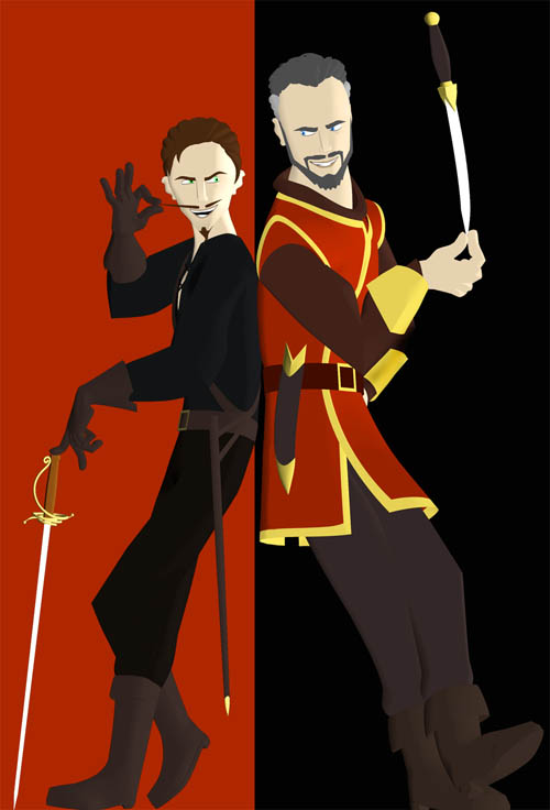
We've been fooling around with other ways to use the Duel imagery, and Raf came up with this mock comics page. Repurposing is definitely my watchword these days. We are down to the last handful of shots on Duel. Should be something substantial to show soon. Steve Anzovin Studio
-
Raf's off at the "Robots" premiere today, but I can answer this to some degree (he may have more to say when he gets back). The storyboard for Duel is very rough, and does not specify the exact choreography of each sequence. Fight choreographer William Hobbs (The Three Musketeers, The Four Musketeers) was a strong influence. We are looking to reproduce much the same sword-brawling style; anyone out there who is a trained fencer or broadsworder will see right away that we aren't adhereing to any formal style. As you'll see in the final movie, there's also a fair amount of acrobatics, though nothing that's wire-fu. Each character does indeed have his own fighting style, and these have evolved almost on their own as the short's progressed. The man in black is very catlike and acrobatic; he favors verticality. The man in red was originally conceived as more defensive and conservative, but now his moves are more open and powerful; he favors horizontalness in his attacks. The music is the primary driver of motion detail; as we mentioned before, this is very much an action ballet. Even relatively small movements are coordinated with the score. It's actually quite a challenge to do this successfully, so that motion looks natural and not forced. Raf develops the general fight chor in his head, based on his martial arts training and extensive study of swashbuckler movies, and explains/demonstrates it to each animator. But they have the freedom to reinterpret and improve the motion, especially if the improvements help drive the story, add interesting detail to the acting, or incorporate a good gag. People head into the main space or the back room to test out parries, thrusts, leaps, and twirls, or peer into their mirrors for facial expression feedback. BTW, maybe I should list who else is working on Duel: Dave Boutilier Tim Dwyer Cristin McKee Morgan Robinson Nat Stein William Young What we've shown so far is only a taste of the whole. Glad that people seem to like it. --Steve Anzovin Studio
-
Actually, it will probably still be a DVD or CD that we'll sell through the Anzovin store. The book would also come with, but we still haven't signed the book deal yet, so..... Steve Anzovin Studio
-
Here's a new Black and Red image Raf just did. Have a Happy New Year, and a healthy 2005! Steve Anzovin Studio
-
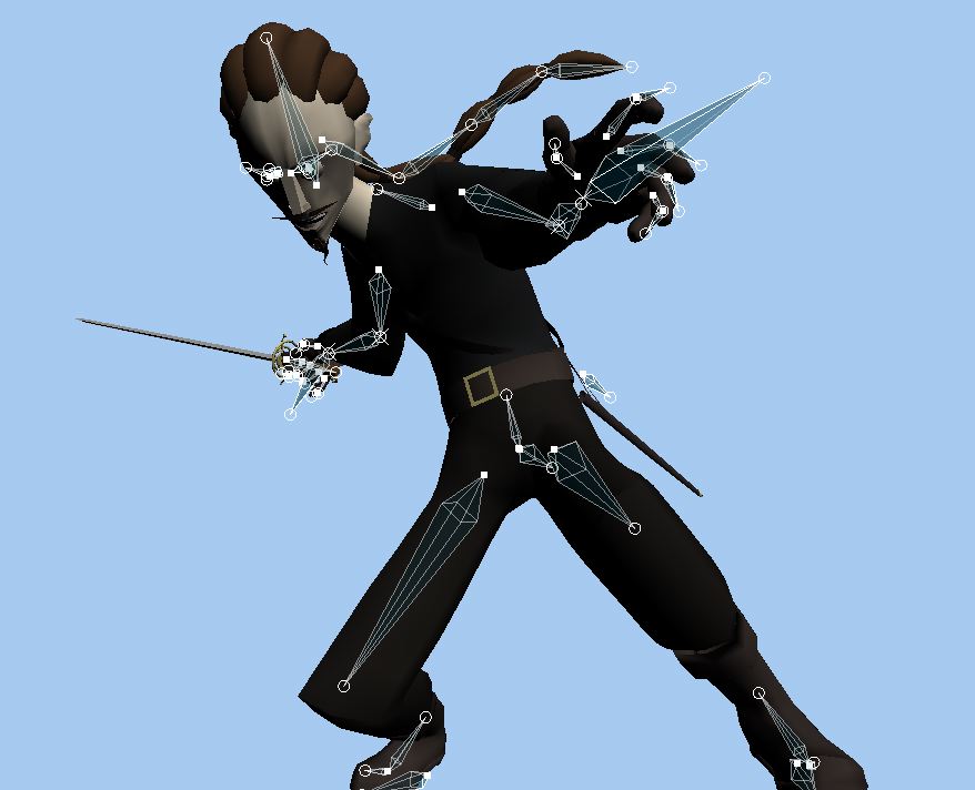
Here's a shot of the control rig for the Man in Black. As Raf mentioned, this fellow was the first character ever rigged with TSM2. You can see the various controls (the underlying geometry bones and all of Raf's many support, null, pointer, and loop-de-loop ;-) bones are hidden), plus some, like the eye rig and the scabbard rig, that TSM2 does not install and that were done custom. The geo skeleton has few or no intermediates because this simplified style of character does not require them. Overall, these characters are very easy and trouble-free to animate, though, as you can see from the shot group we posted, there are some passthroughs that will be addressed using SmartSkin before the final render. We are making particular use of TSM2's squash-and-stretch feature, which is indispensable for cartoony animation. Steve Anzovin Studio
-
A thing to keep in mind is that the motion in the entire film is tightly choreographed to the music, like a ballet, particularly in this shot. In order to hit beats later on, we can't spend the extra frames for the Man in Red to stagger. In fairness, I had the same exact crit when I first saw the shot, but Raf convinced me that it was a sacrifice that had to be made. Steve Anzovin Studio
-
Some character studies for a new short
anzovin replied to Raf Anzovin's topic in Work In Progress / Sweatbox
Neither, this is actually something I've meant to try for a long time. While I like the look of "realistic" CG, it's time consuming, and too easy to get wrapped up in the intricacies of rendering and lighting and give the animation short shrift. But I don't like the look of "traditional" toon rendering at all--it tries to directly mimic the look of hand-drawn animation, which is a losing battle since CG will never be able to beat hand-drawn animation at it's own game. No toon render can capture the elegance of a line made with a real pencil. So, I always thought that there had to be something in the middle, that didn't try to mimic drawn animation but wasn't realistically shaded either. I guess the thing I was most inspired by was Samarai Jack, which showed that flat areas of color could animate really well without looking "cartoon." Thanks! The look is achieved pretty simply--it's really all done by playing with the gradient for toon shading. Rather then using it to do two flat areas of color with a transition in the middle, as is done with normal toon shading, I'm using it to do mostly one flat color, but with a slight gradient at the bottom and top of the scale. This serves to keep it mostly flat while pulling out the edges a bit so you can distinguish some detail. You do have to be carefull how you model, though, and keep the final effect in mind. I haven't had a chance to model anything of the background yet. One of the drawbacks of this technique is that, since there is very little shading or lighting, I need to be very careful what colors I pick for background and forground elements to be sure everything reads correctly. What I'm planning to do is to keep his color scheme warm (he's got browns and yellows and skin tones) and keep the backgrond very cool, with greens and blues. He's dark, so I would normally make the background bright---but I can't make it too bright or his bright-white sword will disappear against it. It's true, I haven't tested this fully in animation. That's obviously my next task! One interesting question is how I'll deal with motion blur. Using an actuall blur seems wrong for something as graphic as this. I may try actually distorting his arms with a deformation cage as he swishes the sword, or I may take a cue from anime and add bright swishing shapes in post to make the motion read right. I think the reason that the foreshortened poses don't read as well is that the color of his shirt and pants is too close to that of his belt and gloves, so there's really no definition at all. In the later poses I tried bumping the brightness of his gloves, boots, and belt up, and I think it solved the problem. I should have some more tests to post soon. An animation test, and possibly another character. --Raf


