nglemb
-
Posts
52 -
Joined
-
Last visited
Content Type
Profiles
Forums
Events
Everything posted by nglemb
-
Nope, just good old transparency and refraction. I'm still in v13 I'm afraid.
-
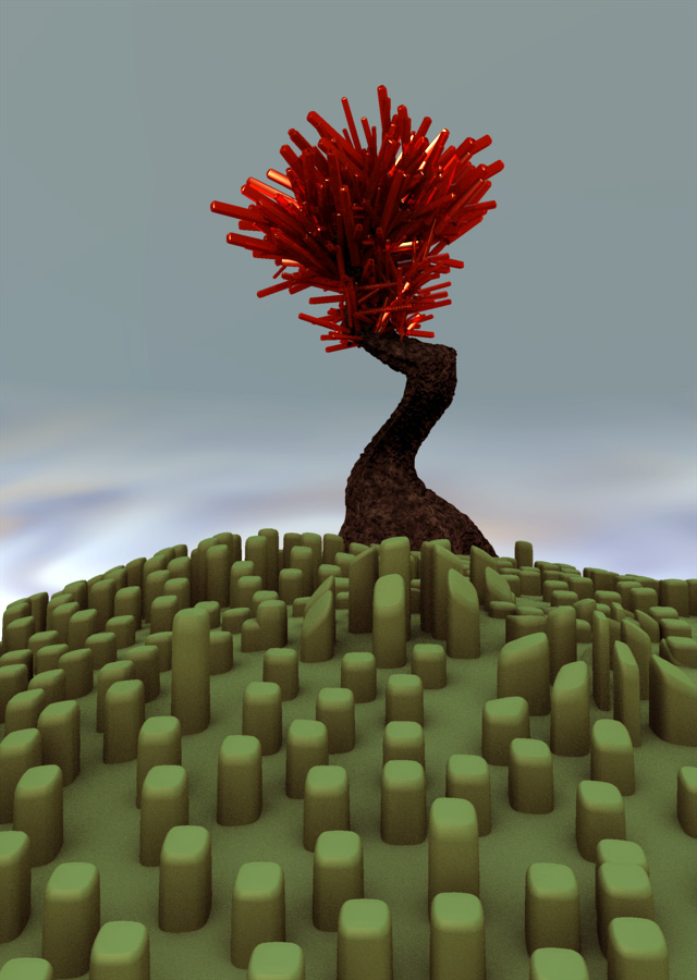
ah, it's been far to long since I've had a chance to work in AM. So to get back into I thought I'd just start fiddling, and this is what I came up with. I really have no explanation for it. -Nathan

-
Thanks for the comments. Yeah, it is really short. When you've been staring at a project for a while, it starts seeming like it's a lot longer than it actually is when you're pouring over every thirtieth of a second. Gotta love it though.
-
Actually it was just regular old motion blur set to 55% with antialaising. I honestly haven't messed with it much. Is there a big difference in multipass?
-
Well, it's not perfect, but it's nice to be done with something. Started this as an exercise and feel like it turned out alright. Would love to hear any crits before I start on another animation. Thanks! Here's Boxman VS Fridge -Nathan
-
Sorry about that. I fixed the link, hopefully. -Nathan
-
I got tired of getting bogged down in modeling and texturing to get to the animating part, so I made this super simple character and took a whack at it. Here's what I came up with in one run through. It definitely needs refining. Any help with the timing and just communcation aspects especially would be greatly appreciate. hungry fridge wip. -Nathan
-
Thanks for the comments! That's probably about the best place I could get a review from on a picture like this.
-
I made this picture for my mom for her birthday. I made myself stay away from texture and realism for the most part, and tried to just focus more on the asthetic value of the picture a little more. It took probably 6 hours over the course of the week. The fir is always the biggest pain. Anyway, here it is.
-
Sorry about that. Here's a download link. It is in divx. helium.avi
-
whoops, forgot to ad the link. I edited the post so it should be working now.
-
I finaly decided that it was time to tackle all those scary things like constraints and channels and get down to some animating. So I'm sort of going through the animation bootcamp setup. So here's a first animation with a ball. Pretty basic. Please critique as harshly as you want, especially with timing and weight and just whether the ideas, as simple as they may be, are comunicated or not. Thanks! http://media.putfile.com/helium35
-
Certainly! Here's a 1600 x 1200 version.
-
Thanks so much for all the comments guys! I really appreciate it. I've gone and posted it in the showcase area. One of those thing where I've been tweaking and tinkering with it forever and just have to be done or I'll never stop if you know what I mean. I have a bad habit of doing that with projects. On to the next one.
-
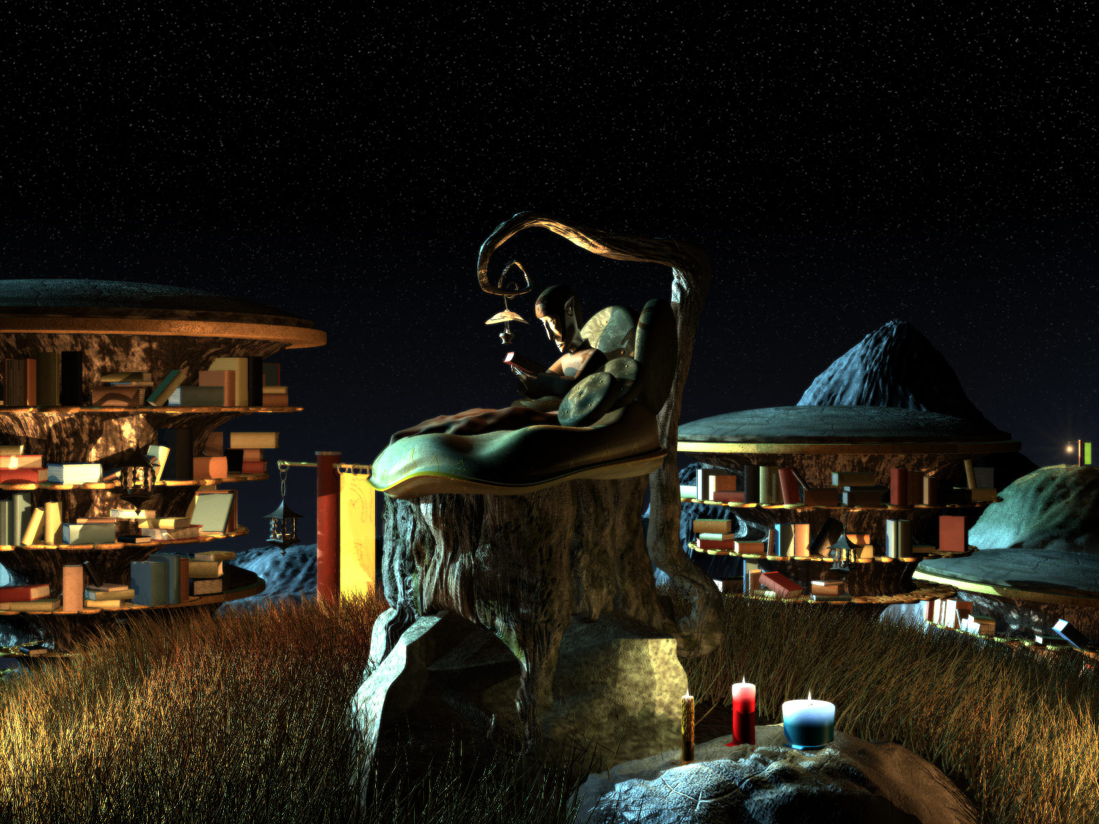
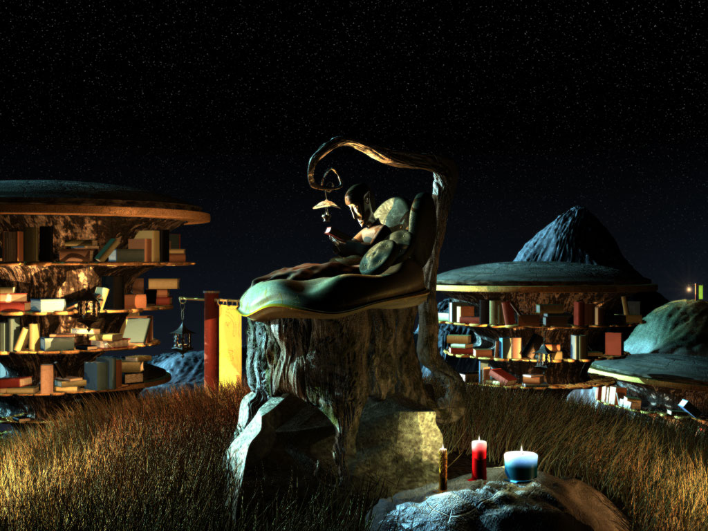
Hey all, This has been in the WIP section but I thought I'd post the final render here. It's basically supposed to be a place that centers around reading and reading comfortably. Even nature is focused on books. Feel free to critique. Hope you enjoy.
-
After taking a very long break from this picture I decided that I really needed to finish it, so I put together a character to be sitting on the stump and rendered it out. How's it looking? I tried adding a touch of bloom to gift the scene a soft warm feel, but I'm not sure if I like it or not. It's cool, but I feel like I'm sacrificing detail in that it washes things out a bit. Any thoughts?
-
Here's a little different arrangement of the scene. I think this brings out the depth a little better.
-
After some major changes here is what I have together of the scene so far. I'm planning on having a character sitting on top of the cushion on the stump reading under the lamp. The lighting and composition for this picture has been kind of different for me so I would love to hear and comments or advice on that aspect especially, but any critiques are great. -Nathan
-
Thanks for the comments! I see what you mean about the stump and cushion. And yes, there will defintely be more of a context when it's done to bring out the "reading" theme. Hopefully a character and a lot of books. Here's a wireframe view.
-
Here's a project I've been working on in my spare time for the last week or so. My wife and I both love reading so I decided to make an ideal comfortable, rich environment to do just that in. I'm still working on drawing out the surroundings here there's still a lot of tweaking to be done on the textures and what not for this model, but thought I'd start a thread anyway. Feel free to blast away. Comments are always helpful.
-
The Janitor is about 8 feet tall. I know what you mean about the miniture feel though. I'm not quite sure why that is. Nothing really real to reference it to I guess. I would do a render from a birds eye for you Mega, but I think you'd be some what disappointed. The landscape is three separate models. One that The janitor is standing on, one that the ship is crashed on, and cliffs in the back ground. Very much an optical illusion of sorts for the sake of time. Here's a pic to show you what I mean.
-
The two little robots pick up junk and place it in the janitor's dumpster bucket. The janitor is cutting up a piece off a ship for the little bot, and the bot in the background is flying something in to throw in the dumpster. There's three lights. One sun light, one blue sun light from above for the sky, and one klieg coming from the ground on the right. Here's a wireframe. Thanks for the comments!
-
Sorry about the link trouble guys. Thank you josh for posting the right one! Yes, I agree on the laser. It does kind of detract from everything else. Back to tweaking materials.
-
Here's a hi res image of my contest entry. Wanted to see how well the textures would hold up at that size. Any crituques would be great. Thanks http://k.domaindlx.com/nglemb/janitorofwarforweb(huge).jpg
-
I took a few of the basic spash models that I used for the ground spashes and scaled them as necessary and placed them on the arms. There are actually only two models that I used for the 150 or so spashes in the entire sceen. After placing them I just went through and tweaked them all by hand to try and keep it from looking too copy pasted.