-
Posts
2,579 -
Joined
-
Last visited
-
Days Won
19
Content Type
Profiles
Forums
Events
Everything posted by Simon Edmondson
-
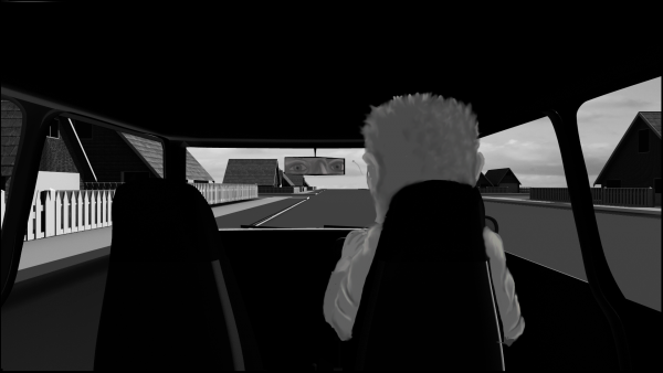
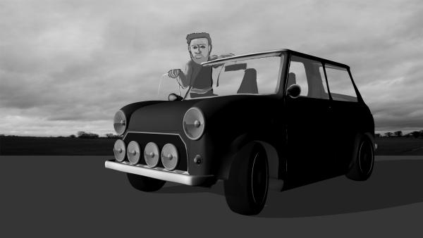
Robert. Thank you for your feedback and encouragement. The reflection in the mirror will need some adjustment. I couldn't get it, and the figure, to line up together in one layer so, I had to cut out the reflection and do it as a seperate layer, which was a bit tedious but, got it there, almost ! Going to try the motorbile and the scene staging next. The way I've been doing it is to set up the camera angles and staging in AM, render that out as a lines only, print that, then use it as a template to draw the figures against. The one you spotted in the mini, was a first attempt at using layers, forgot to remove it and, luckily, it was a good guide for the actual drawing. regards simon
-
This should have been the first scene. OK up to the tilt in the mirror at the end ? Next is to see if I can get a result with a figure riding a Trial motorbike... simon Mini Comp One 000.mov Ps 720 version of 1080. This is what the whole sequence should look like, Minus the wonky mirror of course. Mini.mov
-
With a VERY BIG Thank you to Robert for his helpful video. This was, very roughly, the intended look. There is much detail to be resolved but, the process is there. simon Mini Comp Clouds.mov
-
Robert Thank you very much indeed for your help. Much appreciated regards simon
-
Steve Thank you very much. Its a bit of a struggle at the mo but, an enjoyable one ! regards simon
-
Had hoped to composite this into the car as it was driving along but something has gone wrong andI'm not at all sure what it is ? Driver.mov I rendered the Chor out as a line only, took that into college and printed it out at A3 scale. Brought that home and used it as a guideline to draw the figure. Photographed that in Dragonframe and tried to composite the frames into the AM render. somehow or other the position and scaling of the picture elements has changed. Back to the drawing board. simon Ps I was trying to avoid using Photoshop or other digital media for the drawing part because I wanted to retain the 'messy' feel of the ink ddrawings.
-
Tore That is outstanding. The cinematography alone is worth the look. Wonderful. regards simon
- 1 reply
-
- 1
-

-
Rodney, Mat Thank you for your encouragement. Not as intended at the start but, at least its a start... Hope to get the process sorted out and some alternate viewpoints too. regards simon Mini One.mov
-
May well have gone about it the long way around but, this is todays initial test towards an interior view as it drives down the street. Hope to use analog rather than digital painting for the finished thing but, need to hole punch some paper first. Critical comments very welcome.
-
First test of the process for the project. This is done with Photoshop, you can tell because I struggle being able to draw with a wacom tablet. The intentioin is to draw them analog and have them imported as cookie cutters in AM. The model has been done in the past two days or so. Any critical feedback very welcome. simon
-
Initial test of idea, any critical feedback very welcome. Please be as critical as you can ? My concerns are the speed of the transition into BW and, once there, the slightly wobbly horizon line caused by rushing the process in Photoshop. simon Intro.mov Big thank you to Robert and Rodney for their help in getting this far.
-
Rodney, David, Thank you very much for your feedback. I'm starting to enjoy the project again after being stuck in development doldrums for a bit. It wasn't intentional but, the thinness actually works to the advantage of one of the themes in the piece. I had intended to use a 'House of Cards' type structure because of the fragility it implied but realised that was being a bit too literal, so that will be part of the titles and credits sequences instead, but the fragility could be retained by the thinness of the newer version (?) . I will try the sharpen filter you suggest though to see what it looks like. I've not tried GPU renders, is that still possible on Macs or is it a PC option ? Would the sharpen filter in Photoshop or After Effects have the same sort of effect you refer to, I'll give it a bash later on. The newer version was only a 720 render, the final version needs to be 1080, so the render times will be very large as it was taking up to 10 mins per frame before. with no multi pass option selected. I am very grateful to Mark who introduced me to the "Multiple Master" option a few months back ! regards Simon
-
Newer take on the same idea. Thank you to Robert and Rodney for their help in another thread. This still needs some adjustment to timing. simon Time Lapse.mov
-
A bit rushed but tthis was ( very) roughly the idea. A better version going through over night. simon House Test 0.mov
-
Robert Thank you for your help. The test is taking quite a whie to go through but should have the first version done later today. I will try the transparency method next as it was a bit complicated to set up on the model as it is at the moment. A variation I was thinking of would be, to divide the model into groups, ( vertically or horizontally ) independent of other settings, then hide or make them transparent as required? I'll see if I can post an example later. regards simon
-
Robert Thank you, I'm hopingtotestthe idea in the next few days regards simon
-
Elegant solution. Thank you Robert regards simon
-
I've often made use of the ability to hide CP's in the object so they don't show in the cho when animating, hiding the rest of the body when checking two figures hand positions in a dance sequence for example. I wondered if there was a way to set that up using pose sliders so as to get a timelapse effect ? What I want to do is to hide parts of a house and have them revealed over time so as to get a time lapse effect. It would be possible to do it with iterated models, substituted as the the chor progressed (?) but I wondered if it was possible to hide the cps viapose sliders or another mechanism ? simon
-
Nice work. Full figure next ? I used a similar process for previous projects. I found it taught me a lot about spline setup and continuity as well as getting the results. regards simon
-
Hoping this is the final settings for the lighting (?) but, will need to change the house design again. Although that will be in the WIP thread Thank you to Robert and Rodney for their help. simon Estate Two.mov
-
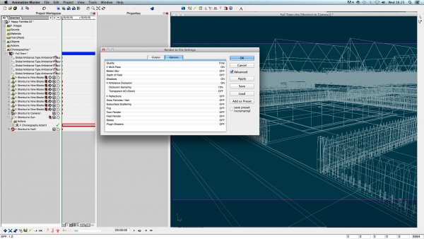
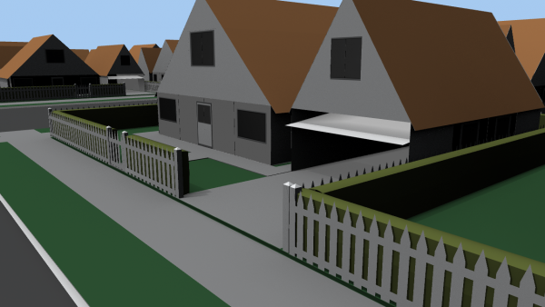
Apologies for the large file size, couldn't convert it without losing the quality that would enable critical feedbak. This was the overnight test. Go set to 50% Sun set to 50% intensity shadowsset to 75% on the sun light. I found the shadows too dark on 100% Following Roberts observatiuons re the house design, I realised they were too tied to the original idea of the 'house of cards' so, intend to spend the rest of the day redoing the house ( again ! ). The 'small pegs' below the hedge were supposed to be the trunks the hedge body was supported by but, they will go inthe new version too... simon Estate 04.mov
-
Robert Thank you again. I shall try that now. Another over night render coming up. regards simon
-
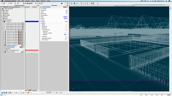
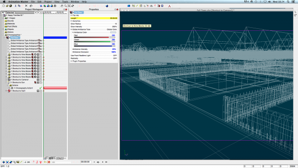
Rodney and Robert Thank you for your help. Much appreciated. This is the large version mov of the file. I hope these are the screen grabs you were asking for? regards simon Estate 03.mov
-
Rodney Thank you for your reply and feedback. I had alook and shadows was turned on but, thinking it may have been the camera angle and vga size, I reset the camera position and have a new render going through now. This is a still from that. regards simon
-
Take Two on the Estate theme. It went through a lot faster this time... Estate 02.mov


