stephen
-
Posts
45 -
Joined
-
Last visited
Recent Profile Visitors
574 profile views

stephen's Achievements
New User (2/10)
0
Reputation
-
Oh, wait, nevermind. Steve just announced the voting for the contest. Sorry
-
You could try sending Steve Sappington an email to ask if it's alright if you enter the competition a few days late. I think people have done that in the past. It doesn't hurt to ask...
-
A Mac version was done not too long ago. http://www.hash.com/forums/index.php?showt...135entry24139 That address should take you to the appropriate post.
-
Yeah, I've noticed that too. I plan on making it a bit smaller so it doesn't stick out as much, so it'll look less blocky. The body is still based on my early ideas for the body, so I still need to update it.
-
And here's an angled view.

-
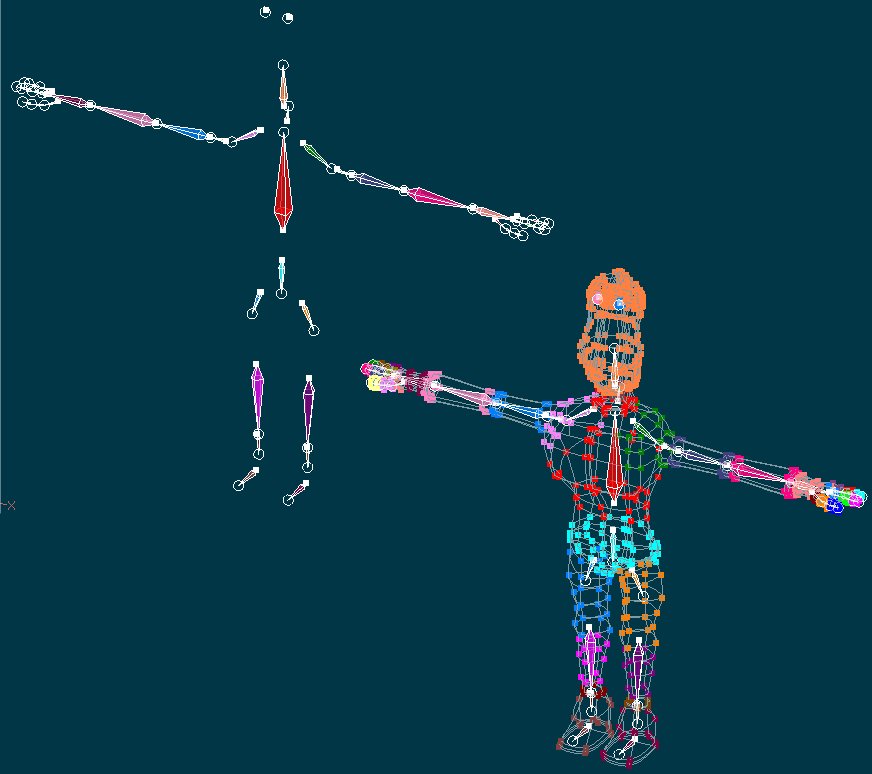
Thanks again for the input. Firstly, I currently don't have any plans to open his mouth. In the past I've tried making a mouth, but nothing ever looked good. If you want, I can dig up some past screenshots when the head had a mouth. But for now there won't be a mouth, however, if I can find a way to add a mouth without losing too much of the look of the face, and have it look good, I might add a mouth. Andrew, you're right about the wrists. When I move them in certain angles, they do kind of fold over in an unflattering way. Any tips on how to improve the wrists so they are more animation-friendly? Ross, I tried lowering the splineage on the body yesterday, but I lost some of the look I wanted, and it also made it look worse when animating, so I think I'll leave the body how it is. Thanks for the suggestions though. Phil, I have had him rigged for a while now. The thing is, I'm not very good at rigging. I don't have TSM, and I also don't really know all there is to know about bones and rigging. So far, it's a very simple rig with nothing special. I'll include a few screenshots of my rig setup. I based it on setups I've seen from other people's models over the years. I just tried to add bones where, 1) I'll be able to move the body, and 2) where other people have had their bones. Any suggestions on improving the rig would be greatly appreciated. Or, if anyone knows of any sources (websites, etc) on learning about bones and all the different types and settings, please let me know.
-
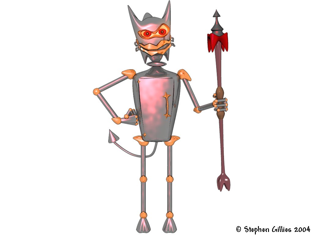
Thanks! The red light is actually apart of the metal. I wanted to have a red-like glow on the body. I feel it adds to the effect and the whole "evil/bad" idea. Adds character Here's another render of the evil robot. As I said before, he doesn't really have a name yet. I just usually call him Evil Bolts for now.
-
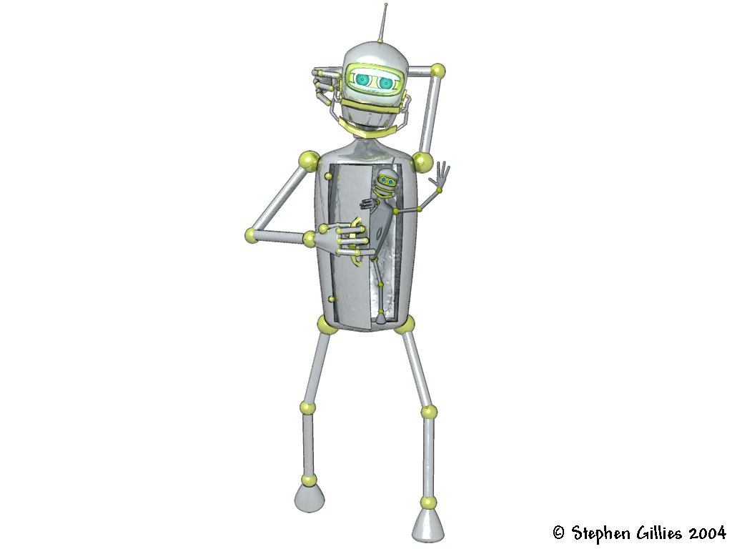
Thanks for the comments! Rodney, you're right, it is toon rendering. In v9.0q, it's a standard toon render with a line thickness of 0.5. I found the deafult 1.5 was too thick and ugly, but the combination of the 0.5 thickness, white background, and the textures of the robots really worked. Actually, I also set all the lights to white, too. So it's a white background with white lights. I was mucking around one day and found these settings turn out really well, so I use it often. Ross, thanks for the comments. The evil robot (no name yet) isn't suppose to be a cat. It's just suppose to be evil/bad. The big head is suppose to be horn like (think of a devil). I'm not sure if the cabinet thing was something I decided to add in from my own imagination, or if I was inspired by Bender's chest from Futurama. I don't really remember if it was my idea or inspired. Here's a render I did a while back with Bolts (he's the white/good robot). Also seen is a smaller, inferior version of Bolts I made. I'm not really sure what it is, or what its purpose is, but I just call it Toy.
-
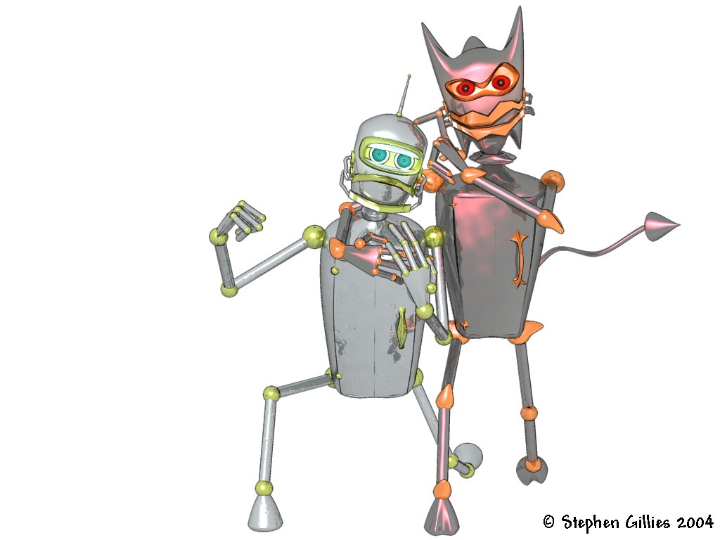
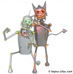
Here's a picture I did recently with two robot characters I made. While the robots are still technically WIPs, this is a nice looking final render of the two. Feedback welcome and appreciated! Cheers!
-
I'd love to upgrade. Part of the reason why I haven't is because I've been a student and haven't been working. As such, I haven't really had a lot of money. And I know $99 is quite cheap for an upgrade, but I come from Australia, so that's $USD99 + $USD35 International shipping (from the Hash website), which works out to be $USD134 for the cost of the upgrade. Then, I have to convert that to Aussie dollars, which works out to be about $AUD175.37. And even that won't be the exact price, as the exchange rate is always changing, so it could be from anywhere between 170-180 Aussie dollars. I'm not complaining or anything, I'm just explaining why I haven't upgraded yet. At least the original version of the plugin you released works with my version. I still have fun making trees with it!
-
Thanks for the comments! I have tried lowering the splineage on the head a lot more, but I lose the look I want, so there's not much there I can do. Do you also mean lower the splineage on the body? For the body, there are some bits where there are too many patches, but I did that for texturing purposes. I probably could cut it down, though.
-
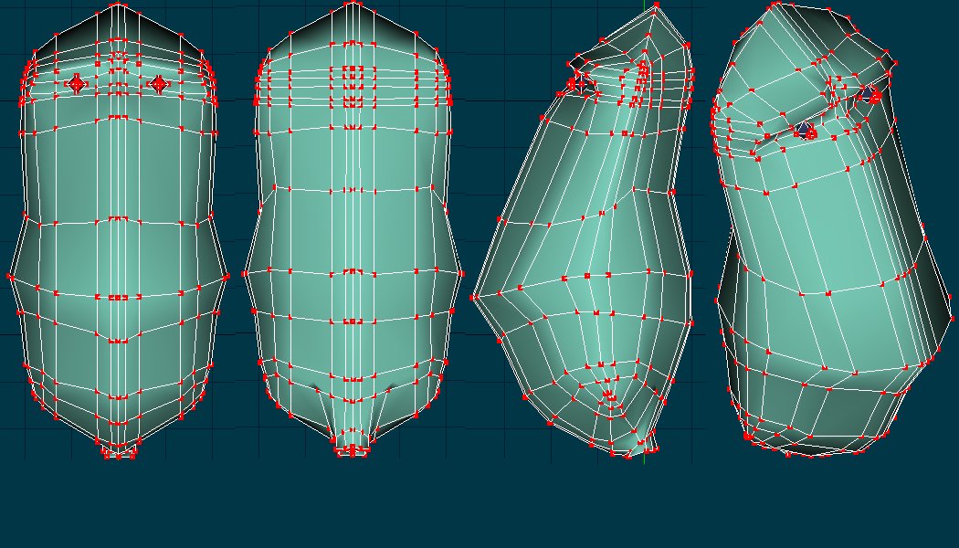
Close up head shots. (Last one!)
-
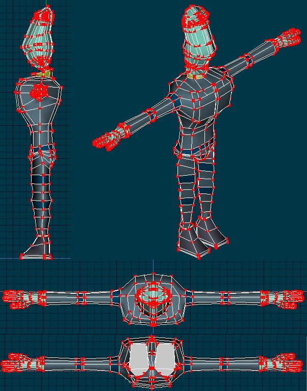
Side angles and top/bottom view.
-
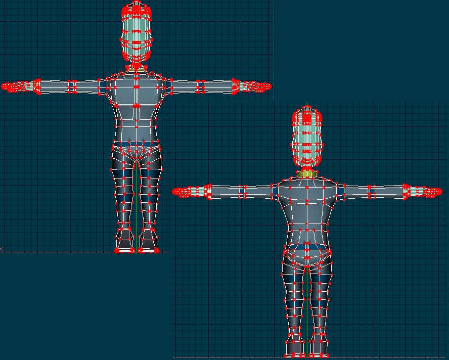
Wireframe front and back.
-
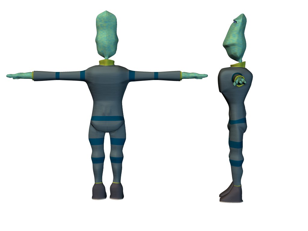
And again (different views).