


Dearmad
-
Posts
875 -
Joined
-
Last visited
Content Type
Profiles
Forums
Events
Posts posted by Dearmad
-
-
Yes! I'm just a big fan of stylistic modelling.
-
Didn't want to go for a larger scale head to body proportion? That head was looking sweet, to me.
-
Wow, that avatar is loaded with features... boy howdy!
-
I just can't leave off like that- you've my admiration for setting out a task before yourself and deciding to learn about it. That deserves accolades, man.
There's a link I should send you once I find it about lighting... it's very well written.... Will edit when I find it.
Here it is:
http://www.itchy-animation.co.uk/light.htm
It's been updated since I last read it- it's even MORE thorough now. The guy knows his stuff!
And a thread about it:
-
Did that come as a single volume, or is this a set? Looks nice- I've been meaning to read the series of books for awhile...
-
Warning, strongly worded opinion ahead, NOT meant to offend. And remember, it's JUST my *opinion.*
The lights seem too hot in this shot. The shadows appear to have been considered the enemy in this shot. Shadows are not evil, they are your friends.
The lighting on the "head" makes it appear as if he's standing *very* close to a *very* bright thing... and it must hurt.
The self shadowing on the "guy" is far too minimal to enhance contour. This is due to poor choices in lighting angle, and/or too manyu lights killing out each other's strengths.
The shading (not shadows, but where colors should be richer due to variance in light levels) is very very flat.
The highlights are too white without some sort of bloom to help define them; they look flat as they are now. But I wouldn't push for bloom, I'd push a look that says: "proper exposure" before I went there.
Not addressed to you, but in general, all the pixelated shadows I'm seeing from almost everyone's skyrigs and multipasses... just look plain bad. It's like dropping back to 1994 and using POLYray or POVray again. And the complexity of a skyrig (which by its nature ha many light sources) is clearly too much for most people to handle well.
I don't understand why it's such a common error in CG for people to start with 10 lights and try to make that work... as if you had any chance of figuring out how to make all those variables come together. Also, critiquing an image where so many lights are used bbecomes VERY hard unless you're some sort of lighting god who can discern where the sources aare....
I've been a professional photographer, and have worked in theater design; I have a better chance of figuring out a light setup of 10+ lights better than most people in this forum, yet, I wouldn't approach with initially more than 2 lights ever. Rather, it is simpler (read: still REALLY HARD) to start with one light. Try to make it work, then *add* one more light, figure out what it does... try to make them both work, then add another... Then STOP, why on earth is 3 lights not working? That's WIERD! (There are good reasons why it might not, but I suggest figuring out why before moving on.)
 I *sincerely* hope I haven't offended you.
 -
Whoa, that's a hurricane!
 Neat stuff, all the simulation things AM has added.
On another note, John, what's your Avatar? Can't quite make it out at that scale... is there a larger one to d/l? And for that matter, any other new bits with those two "heroes" of yours?
-
-
The logo part? Is that the animation you did?
-
Oh, I should add. I wish I had more time for this script, because it is so yakkity-yak filled- it needs more than a cleaning up, but reworking. It's a good story that could really stand to be more heavily edited, especially toward the end. Tthe visual elements of the story are just lost in yakkity-yak right now.
That "flavor" of older english, sort of garden-pathy grammar could still shine through if they spoke about half as much- just when they speak, they speak that way.
Maybe storyboard it out is the next step now, and go into tandem editing so that the visuals can force their needs upon the script more; and those people who are unfamiliar with this idea will begin to understand the need better.
-
We have: up, down, up, down, up - which is a classical "double-dip" story arc.
One thing that bothers me with this double arc. is that after Nimmie Amee rejection scene, this is the end of climax for the viewer. And until the viewer sees Tin Nimmie and discovers that there is still hope for Tin Woodman love, there is a long gap where the purpose of getting the story going is missing. An arc, to be effective must have a goal set pretty early.
So I suggest that right after Nimmie Amee rejection, when Tin Woodman is completely devastated, Woot and Scarecrow finds way to spawn hope somehow. I'm thinking that one of them could say something like "There will be other hearts around that you shall love. Let's get going and seek for that heart". Something along that line but stronger and subtler (This is where I wish english was my native language).
The important point is that at this point in the sccenario, the viewer should get a feeling of the purpose for continuing the story after Nimmie rejection.
I agree with the need. I think the fate of his breaking heart is the natural arc, and viewer concern with what will happen if it completely shatters, as it should be progressing toward since he cannot have Nimee.
So the journey becomes what to do with Tin Man and his heart, in essence.
-
Well, without going into the script and *really* drastically changing its form and method, I've tried to make it more concise by trimming a few pieces.
--
Throughout, tried to tighten dialogue and strengthen it.
Throughout- tried to cut as much yakkity yak as I could especially when action could speak louder than yakkity-yak.
Re-ordered dialogue in castle scene a bit to help with Nimiee Aimee story flow, and: do away with wishy-washiness of the decision to go on the journey, and made the progression more to the point, with only one moment of doubt to it- thought there was too much back and forth for such a small story point to be made.
Cut part where woot's involvement was in too much doubt- TW's acceptace of him at the end of the castle scene is good enough, IMO.
Cut leaving behind Woot request by Tinny prior to loons- that piece makes no sense to me in the plot and in relation to the characters- Woot did all the travelling he did alone before this!
Cut a lot of redundant dialogue that better be obvious by the acting, and/or was already stated and/or is heavily implied.
Cut some small dialogue exchange I can't remember now toward the end.
--
-
First off, wow you're working hard on this and coming up with some fabulous solutions. This solution seems promising, but then the last one seemed so to me as well.
I'm wondering if the cloak can move even more freely than it does in this test. The front edge (the vertical shape of it) to both sides looks a little locked into place. When her shoulder pivots to her left for example, the entire cloak travels that way, without a trailing edge at the bottom; it moves "of a piece." Note, this is a VERY MINOR quibble.
Is the rig pretty much the same as before only constrained differently now? I mean as many bones as the first test you shared but with different constraints.
On another note, the umbrellas are ingenius, man. That is too cool. However, they seem a little small, IMO. Seem like they should be thicker and weightier, almost twice what they appear to be to me, at least the handles....
I really like this character, and can't wait to see more of this project of yours.
-
Looks beautiful!
Is there any way to get rid of the reflections in the window of the overhead light housings? The seem to draw an undue amount of attention to themselves.
Actually, there might be... That balance between reflection and transperency is always tricky. I'll play with it. They're color might be part of it too...
I did notice that glows and lens flares don't work in reflections, so filming this section was t r i c k y.
Luckbat:
Wow... that's an interesting plug-in. Can't activate it in 8.5, though... heh. Well, I'll save it for that bright, wonderful day, when I finish this film and can move on to the rockin' current versions of A:M... -sigh- Can't believe 8.5 was hot off the press when I started this thing.

-
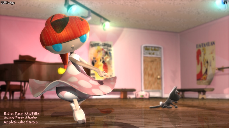
Second still- this frame, to me, is iconic of the whole film. It really captures everything about this scene that is important: the dance, the laconic/dreamy cat, the lighting. This is, in a way, the entire point of the whole film right here.
-
The past few weeks have been tough for various reasons... but the ballet sequence (part 5 of 12) is finished. Because of how this scene *must* tie to music, I had to animate it while doing the sound at the same time, so it meant sloooow going, but finally I've got it all worked out and timed.
Now I'm working on Part 6- a quiet little scene, around the little black girl's bed in her room.
Anyway, here's two stills for you all to enjoy (at least I hope you enjoy them). Loads of pink. Thanks to "Pixar" for giving me a heads up (even though he took it back) about the girl's dress... my wife looked at it and said the color was all wrong too, so I rethought my color approach...

-
Yes, nice modelling. Really professional. Cute rounded front end, I like that look.
Could I ask about the shadows, however? They seem banded or "dirty." Especially around the door in the view from the rear, and in the front. They look like z-buffer soft shadows, which I've gotten to work very nicely in my film, but maybe the map is too small or the bias a little off?
-
I think Martin could croon a few songs... wasn't he a professional crooner at some point in his life?
-
That's really great... I like the framing (as in out of frame) and poses a lot.
-
I like the style too. Nice balance to the colors.
Interesting that the file compressed about 10:1 in the archive...
-
Looking really nice. Foreground shaggy looks a little hot to me. Um... lighting-wise that is. The lighting on him is a little too detailed (shade/highlights read as if there's too much variance to me). Overall, though the balance seems about right.
Almost looks like the entire cg component could use a light in the slightly lower left forground that doesn't cast shadows to help buff out their self-shadows.
And thanks for illustrating the slightly creepy element to shaggy... "the shaggy in the shadows..."
-
wireframe view
-
There IS something intrinsic to shaggy that is funny... looks like a fun little project!
-
We need more threads like this... so ripe.

personal lighting study
in Work In Progress / Sweatbox
Posted
If it's in front of the character it's not a rim. That could be a key or a fill. Which purpose does it fulfill? Not so important to get the terms right, anyway.
This looks much better. It's decently lit. From here I'd say you need to decide *why* you want the scene lit to make the *how* part final:
what mood? (happy discovery of blocks at midday?)
what's unimportant? (the orange block is not what I was looking for...)
what's important? (THERE'S my YELLOW BLOCK!)
what colors should be brought out? which blended in?
how do you want the shadows to help the scene? (maybe oprange block should be repositioned to be half in the guy's shadow and half out?)
how do you want shading to help the scene? (fake some radiance to the yellow/orange blocks?)
how do you want highlight to help the scene? (Yellow block just glistens beautifully... that's why I was looking for it!)
do I need a rim light to seperate my character from the background?
So, for example, if the YELLOW block is the key piece, then maybe a fake radiance light (colored yellow) will help, aim it a little at the guy across the block so it looks like yellow light reflected from it off the sun. A subtle effect noticed unconsciously most likely. Probably a no-shadow light and not very bright at all...