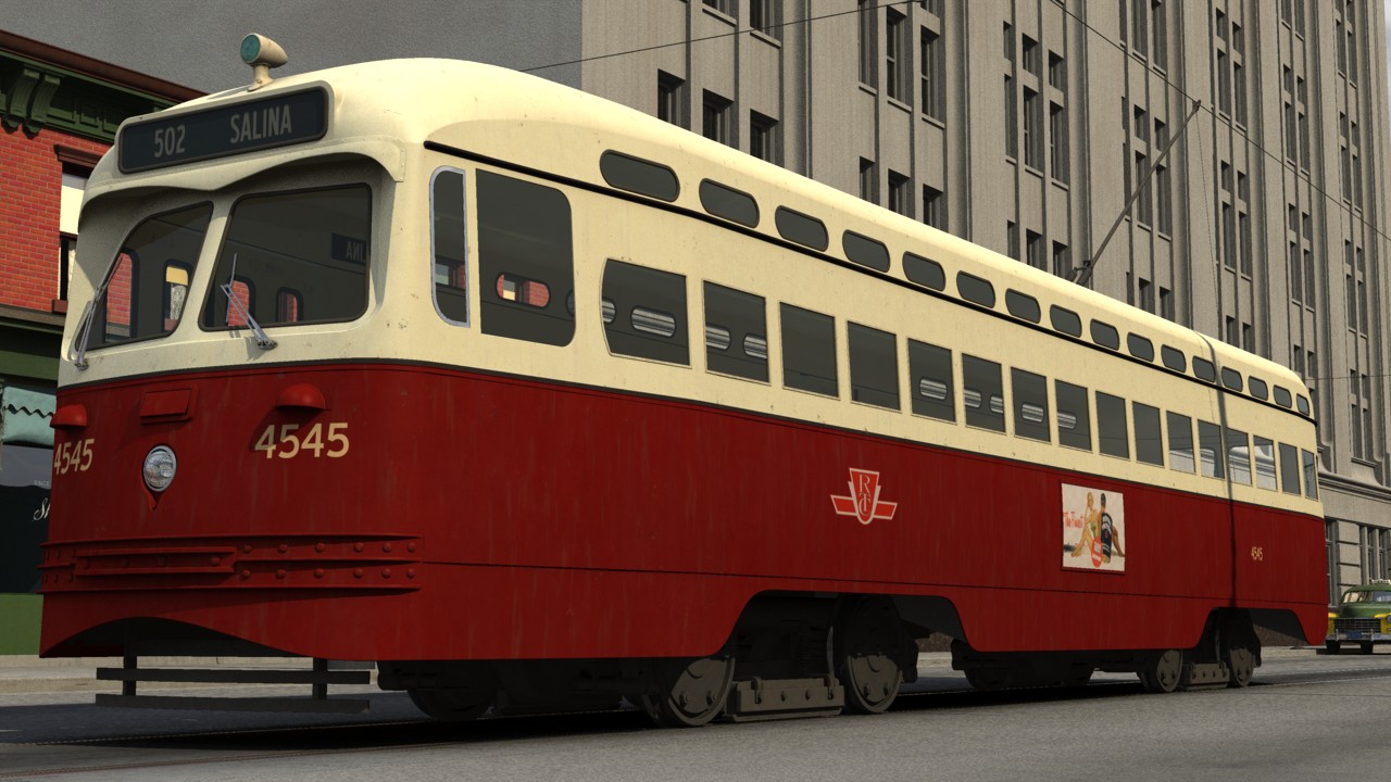
HeadlessBill Posted March 1, 2005 Share Posted March 1, 2005 Well, here is the latest incarnation of the continual WIP, I call 'the teaser image for my animation project'. I also have a probelm with a decal that I cannot seem to fix. Thought someone might be able to provide some suggestions. Link to small version of image with enlargement of problem. Link to full size version of image. Quote Link to comment Share on other sites More sharing options...
NancyGormezano Posted March 1, 2005 Share Posted March 1, 2005 I can't quite see the problem, but since you say there's a problem: Have you tried looking at the mapping of the decal via the UV edit to see if your stamp is aligned with the splines the way you want? Quote Link to comment Share on other sites More sharing options...
HeadlessBill Posted March 1, 2005 Author Share Posted March 1, 2005 Thanks for the suggestion, but I'm not applying the decal via the UV editor, I'm just slapping it on the old fashioned way. Anyhow, here is a clearer view of the decal and the problem. Quote Link to comment Share on other sites More sharing options...
NancyGormezano Posted March 1, 2005 Share Posted March 1, 2005 ok - I now see what you are referring to as a problem - but unfortunately I don't know what may be causing it - other than perhaps the resolution of the image that you're using for the decal? or perhaps you have some extra splines in there (wild guess). As for the UV editor - it's in ver 11.1b, c (not sure if earlier) - and I'm on a pc- One still applies decals via the old method of "apply decal" but once the decal has been applied, the UV editor can be used for precisely modifying & controlling the placement of the stamps. Right click on the stamp - and choose edit - the UV editor will come up and show you exactly which splines are "stamped" - you can then fool in the UV editor with the splines to vary the stamp Will Sutton has a mah-valous tutorial explaining it much better than I. http://www.zandoria.com/uv.htm Quote Link to comment Share on other sites More sharing options...
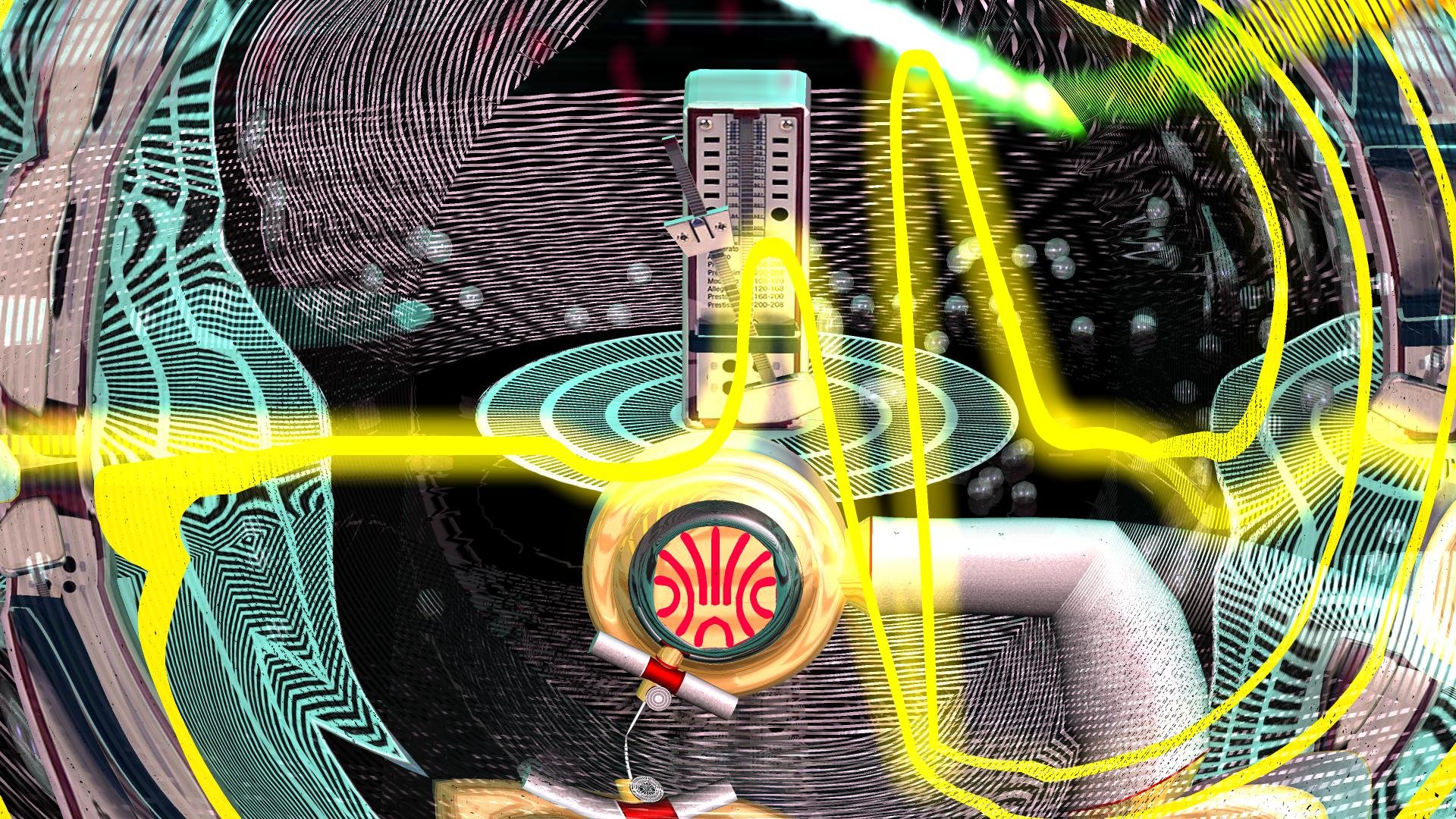
HeadlessBill Posted March 1, 2005 Author Share Posted March 1, 2005 Thanks Nancy. I'll give that a look-see and see what comes up. Any critiques on the composition of the image? I've been looking at it for so long, I've lost my focus on the image. I keep thinking it needs more, but everytime I add something else, it looks too cluttered. Quote Link to comment Share on other sites More sharing options...
NancyGormezano Posted March 1, 2005 Share Posted March 1, 2005 Any critiques on the composition of the image? I've been looking at it for so long, I've lost my focus on the image. I keep thinking it needs more, but everytime I add something else, it looks too cluttered. As an image it's interesting - makes me wonder what's to come, I like the composition and don't feel it's missing anything - I find the cards intriguing. Some funnies I might see is: 1) the texture of the desk looks too pristine, & regular in contrast to the wonderful texture on "tart paranormal Investigator" and 2) the placement of the object by the "i" of "Investigator" is confusing - it looks like it might be floating? when I think you want it to appear to be laying on the desk. The other thing to consider for deciding whether it needs anything more is how this image will be used (which might be part of your dilemma) - if it's for viewing as a still, then more detail involves the viewer & gives them pleasure in discovering new elements - if its for an animation - then how long does the viewer get to look at it? - more detail might be wasted and frustrating to the viewer. Quote Link to comment Share on other sites More sharing options...


Recommended Posts
Join the conversation
You can post now and register later. If you have an account, sign in now to post with your account.
Note: Your post will require moderator approval before it will be visible.