

HeadlessBill
-
Posts
389 -
Joined
-
Last visited
Content Type
Profiles
Forums
Events
Everything posted by HeadlessBill
-
Someone else working on a UFO scene, eh? Are you doing everything entirely in A:M? Or are you doing some compositing in another program, like After Effects? I just turned in this in my Motion Graphics class. It needs a ton of work still, but the teacher thought it was fine and I was being too much of a perfectionist. Considering what you're doing, I think compositing would probably be much easier. FYI, the UFO wasn't done in A:M. I would have loved to use A:M, but I needed something that would render faster on my Mac. I still didn't get all the frames I needed rendered, though.
-
WIP: GAIL Female Android [SLIGHT NUDITY]
HeadlessBill replied to patrick_j_clarke's topic in Work In Progress / Sweatbox
I'm kinda partial to the mini-jack myself. -
WIP: GAIL Female Android [SLIGHT NUDITY]
HeadlessBill replied to patrick_j_clarke's topic in Work In Progress / Sweatbox
I'd be interested in learning this. I may have to resort to that for my own project and would love to know how to tweak an existing modeling to more of what I need. My modeling skills are pretty sub-par, but I think I can handle tweaking. -
Do you know who this is supposed 2 be?
HeadlessBill replied to bentothemax's topic in Work In Progress / Sweatbox
I'd been thinking of modeling Feathers McGraw for awhile. I have plastic toy of him standing on my TV. Maybe I'll try and do Shaun. -
Ah, spike tape. Not something that would have crossed my mind for a 3D image, but lingering in the back of my mind, "Gee, those look familiar." But, I am aware with spike tape, having had to lay down miles of it for various productions I've either crewed, directed or performed in. I think I may have a small roll of it laying around, somewhere.
-
Isn't it amazing how sometimes I small change can make an big impact on what the final image will look like? The second image looks much better. I'm just curious to know what the yellow x's are. Confetti? Possible changing them to ticket stubs might help with the composition.
-
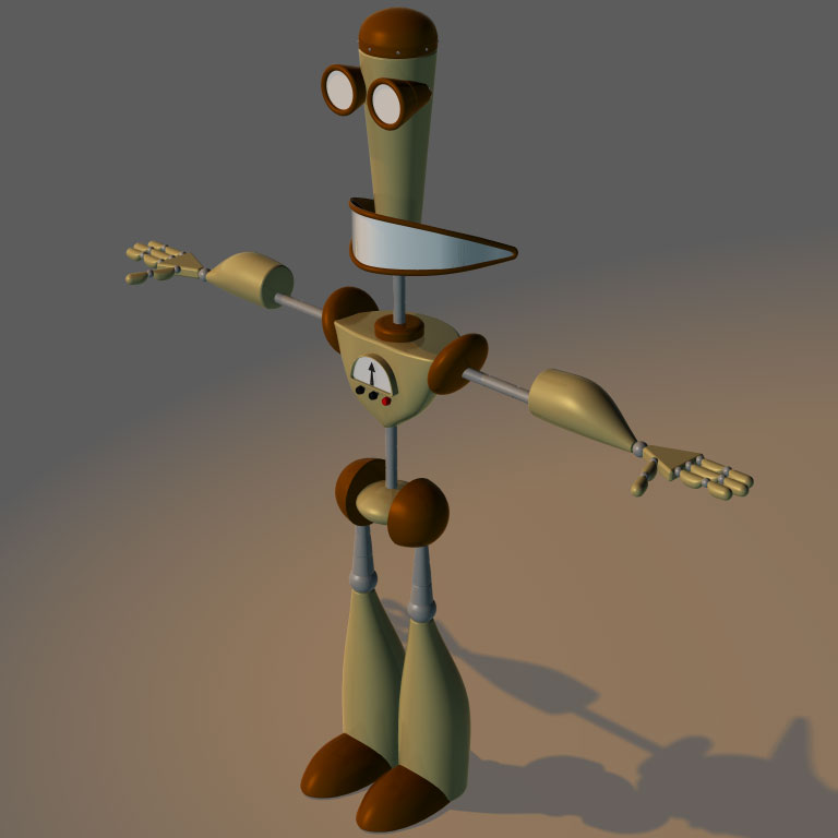
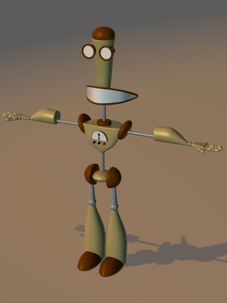
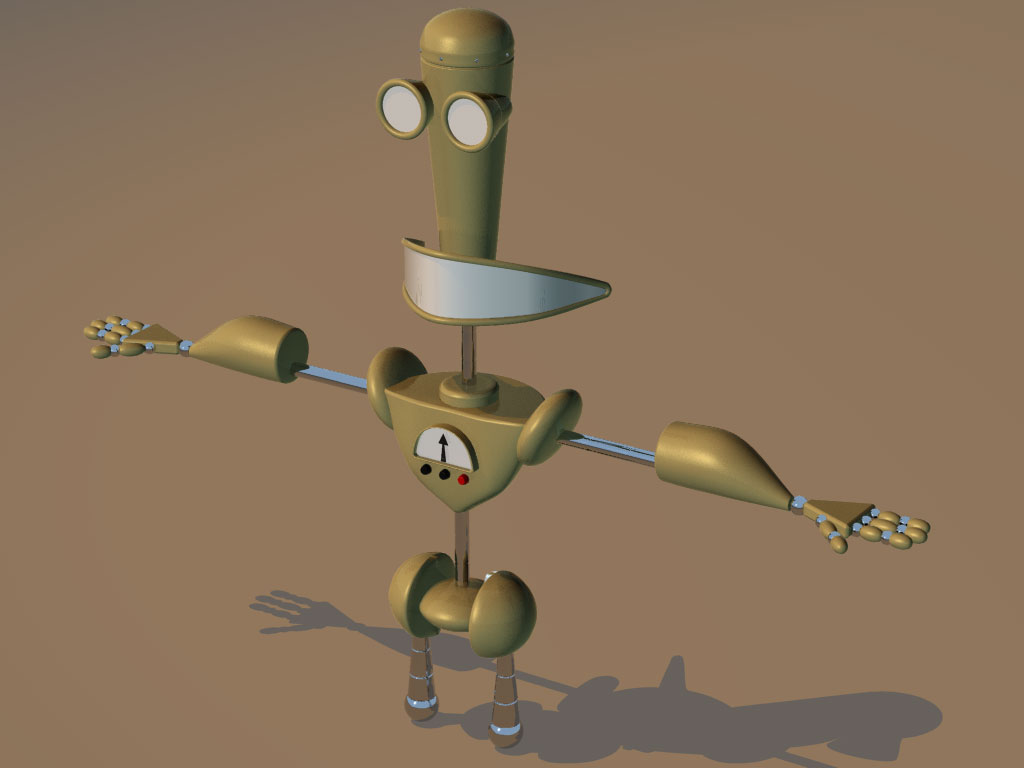
Well, I think I got the fingers to an acceptable point. Not perfect, but not too bad. We'll see what happens when I get him rigged. Oh, and Rodney, here is an image of the character. I was trying to find the turn around I was using to make the character, which would be better at showing why the mouth is the way it is, but it seems to have disappeared sometime since I last worked on the character.
-
Actually, he's a variant of a character from the canceled Cartoon Network show, Time Squad. I made some minor tweaks to him. He is going to serve a dual purpose. One to finally get to use TSM1 on something. I purchased it during its beta stage and never got a chance to actually rig a character with it. Secondly, I'd like to mess around with doing some actual animating. Anyhow, here is the rest of him, minus fixed fingers.
-
I thought I'd try and finish a model I started awhile ago. And would like some feedback and suggestions. I got this far on the model last night, but I'm not very happy about the fingers. Possibly cylinders for the digits. I'm probably going to replace the chrome bits with the PowerBook material I made. The beige parts of the Larry 3000 were done using a biege (obviously) version of that mat. Anyhow, on to the image.
-
POPBOT: Cornell Room and Kitty
HeadlessBill replied to patrick_j_clarke's topic in Work In Progress / Sweatbox
Great scene. 168 hours. Not too bad. I haven't broken 100 hours for a sinlge render on my Beige G3 yet, but I haven't rendered anything that large yet either. If I don't get a 1 GHz G4 for it when I start rendering my animation project, I'm gonna be looking at render times at least that long. Anyone who says 168 hours is too long is a wuss. -
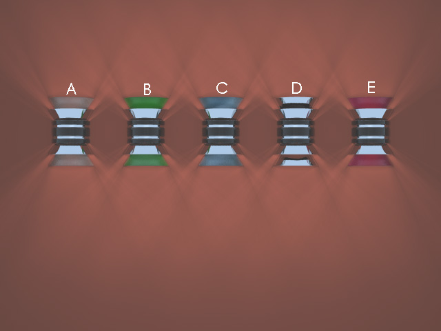
Thanks Zaryin, I like 'E' and 'A' most, but may end up using 'A', since I think 'E' will end up blending with the wall too much in the background, but who knows. I'll probably test both the next time I get the opportunity to render a multipass shot of the office set up.
-
Okey-dokey, here are some variations of the sconces that were suggested, as well as it rendered in multipass to show that the final renders will not have the harsh shadows. I actually like the glass look. The chrome doesn't look so good since I had no environment for it to reflect and I might go for a more pastel version of the colored glass used in these renders.
-
I do like the idea of the glowing band, kinda like a neon tube, but it would be more appropriate if the sconces were going on the outside of a building or maybe in a lobby of a theatre, resteraunt or nightclub, but not so in an office. I'll need to test some colors of glass and see what works with the color of the office. The color of the office is set, though I could work out more of a history of the office. The short is set present day, but the building the main character has her office in was built during the 20's. It's possible that the office used to be white initially and has been painted more recently the color that it is. My main character is predominately going to have a rust/mahogany color scheme with a kelly or emerald green color as her accent. I'll post my trials and see what everyone thinks works.
-
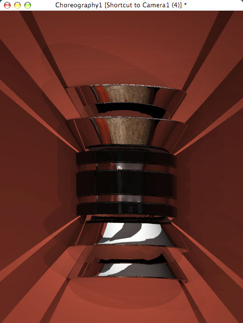
I was thinking of doing the uppermost and bottommost reflectors in frosted glass but decided to do chrome since they really seemed to love chrome in the 20's. Maybe I'll give the glass thing a test run, I'm not certain about a color, but I can give those a try as well.
-
Actually, it's for a multi-pass thing and, yes, the shadows won't be so harsh. If time allows this week, I'll try and get a render showing what it'll look like via multipass. Thanks for the comment and the concern.
-
Well, I've never liked the wall sconce I made for my office set. It looked more 50's and I wanted something more Deco. So here is the latest incarnation of my wall sconce Just wondering what you people think.
-
I can tell you are using z-buffered shadows. You'll get better results with ray-traced. They do take a bit longer to render, but I'm sure you'll be happier with the results. If you get a chance, I'd suggest reading through Yves' "Lighting Tutorial" in the Radiosity forum. It may help you better understand how to set up your lights.
-
Now, all he needs is a sidekick. Maybe a character named 'Pinky'.
-
Or you could try my 'pre-duplicator wizard' tutorial. Linkity-Link.
-
Great image! I really need to learn how to use grunge maps and such. Anyhow, I'm trying to figure out how large this janitor is supposed to be. Something about the image makes me think it's only a few inches tall.
-
Chosing the best side of a model
HeadlessBill replied to Williamb's topic in Work In Progress / Sweatbox
I'll need to remember that. "If I use mirror mode for two-long, all my models will look like the offspring of Two-Face." Got it. -
Yeah, you know what this car is..or you better
HeadlessBill replied to pixelmech's topic in Work In Progress / Sweatbox
It's looking really good, pixelmech. I'm assuming you are going to build some wheel wells? Also, what kind of material are you looking for? If you need a car paint finish, there is nice one here. The one called Bodywork would probably work fine if the color is changed. -
Yeah, you know what this car is..or you better
HeadlessBill replied to pixelmech's topic in Work In Progress / Sweatbox
I think I recognize that car, but I'm used to only seeing it's rear. Looking forward to seeing it done. Someone should do Racer X's car. -
Thanks Nancy. I'll give that a look-see and see what comes up. Any critiques on the composition of the image? I've been looking at it for so long, I've lost my focus on the image. I keep thinking it needs more, but everytime I add something else, it looks too cluttered.
-
Thanks for the suggestion, but I'm not applying the decal via the UV editor, I'm just slapping it on the old fashioned way. Anyhow, here is a clearer view of the decal and the problem.