


BrainLock
-
Posts
247 -
Joined
-
Last visited
Content Type
Profiles
Forums
Events
Posts posted by BrainLock
-
-
I've got a prototype done. It still needs some tweaking.
Mostly I used screen caps from the WIP animation videos. I'm assuming you'll want to sub in high-res renderings. I'll need those. I'll also need to get the banner in high-res.
All the images for now are in color. I can convert them later, although I kind of like the color. Maybe we can adjust the look, maybe desaturate or something, to make it clear that these are photos, not the "real action," instead of going black-and-white.
This is a large JPEG. I've also got options to output to PDF, TIFF and EPS. I'm seeking a solution for TARGA/TGA.
On the Easter Egg front, there's a number of references to the Wizard of Oz literature, plus for the TWO team and Animation:Master.

-
Looks great! It's on the mock-up. I'll need a higher-res version for the final product. What formats can you send it in? The best options for me may be tiff, eps or png. I can PM you an email address.
-
David, could you make the "Oz" in your banner green? Green because the capital of The Land of Oz is Emerald City.
-
I forget how many but I showed them all in the pitch.How many photos are you planning? And critical: What are the deadlines?In the pitch you showed four and said there are more. You never said a total. Shot 2-01-66 has five. Your your pitch references a sixth (the one that animates at the end) and implies there will be others.
With the panning and the time needed for the audience to read the headlines, what should be the maximum? Six? Eight?
I've started to mock up some ideas for the page layout using David's banner/flag. I hope to have them posted here later today.
-
Very nice job on the nameplate, David. One component done! (Pending approval, of course)
I just realized it's Variety I was thinking of, not Hollywood ReporterI took so long to write my reply that we crossed in the night...
There would be copyright or trademark issues to use "Daily Variety." Unfortunately, the name so far isn't lending itself to good "close enough to parody or tribute" ideas.
-
Ideas are percolating... but my enthusiasm often goes beyond my skills.
first, FWIW, the design of The Hollywood Reporter is rather different from what you are asking for. At least, according to several sample covers I viewed online tonight. I wonder if there is another paper you had in mind.
You are asking for an (extra long) broadsheet with large display photos. The Hollywood Reporter is printed in a tabloid shape and most of its photos are small - most were no more than half-column "thumbnail" mugshots. Even the display photos aren't particularly "displayed."
The headline writing is rather punchy and alliterative, as you pointed out.
Regardless, I wonder if it might be more exciting and interesting for the audience if you take a slightly different tack in the same vein.
Instead of scrolling or panning down one long newspaper page, the energy and visual interest could be increased by using the old-timey technique of flashing up a lot of different newspaper and magazine covers. The paper spins in a blur from a distance and zooms up to the viewer's face, where it freezes, filling most of the frame with the blaring headline and giant photo. Music could punctuate the freeze-frame.
It's a bit of a cliche, but it would have a lot of "umph" and "look at me!" energy. What do you think? Would the spinning effect be hard to do?
Some of the titles could be made up, others could be parodies of real publications and the headlines might reflect their different takes.
Some title ideas off the top of my head:
The Winkie Reporter, The New Winkie Times, Oz Today, The Emerald City Post, The Emerald City Times, The Winkie Bee, The Winkie Morning News, The Oz Observer, Winkie (in a font like People magazine), Munchkinlander, The Gillikin Gazette, The Quadling Country Star, The Oz Enquirer, OzWeek (like Newsweek), The Oz Daily News. Maybe one could be an in-joke - 3D Oz World...
Of course, making all those covers, especially in parody style, would be more work than just laying out and designing a single page front. To ease some of the work, the newspaper broadsheet covers could be limited to the part that's "above the fold."
How many photos are you planning? And critical: What are the deadlines?
-
Great job. Looking forward to seeing your live action scene with it.
-
Truly amazing work. Not only the model, but the environment you have put it into.
Stian is amazing. However, Tralfaz, I believe that the background environment behind the airplane in the image actually is a photograph.
It's a testament to his talent and skill that his model is so real looking that he can seamlessly mix it with real-life images.
-
looks great!
Are you doing the interior, too?
-
What resolution do you have your display set for? Higher res = smaller text and more virtual real estate.
Another tip - "Command-tab" will help you navigate to other programs, as will Exposé. I think Leopard has a few more navigation options, too.
-
The face rotates 180 degrees, you are looking at the back side of the model when it does this ... but still appears to be the front.
I think that's called the Hollow Face Illusion.
In college I saw something similar. A woman made a mold of her face. Then she then photographed the interior of the mold and achieved the same effect.
When looking at a 2D representation of a 3D object, the brain translates the clues to see what should be "normal." Sometimes it's wrong.
There is another illusion like yours that people make with paper dragon sculpture and video cameras. Someone duplicated it with AM. When the camera moves around, it looks like the dragon moves its head.
Read about it and download it here:
-
"The AM mac interface is 'weird' (ie not resizable"
You mean it won't go "full screen"?
It's always full screen on mine, although the choreography window(s) can be shrunk, allowing you to see through the A:M interface to whatever's behind it. If you switch to another running program, the interface disappears but the choreography window remains visible.
-
Possibly the path to the project file is too long. I think xp can only handle so many characters..
He seems to be on a Mac - OnyX is a Mac utility.
-
I can definitely say that we need at least one more render pass (even though I haven't seen all of this one yet). WebRender better come though because it's going to take 100s of people rendering at night if we want to do another pass before the movie gets delivered to the Buyers.
I have an older Windows machine that I don't use much anymore. It's a 2.4 gHz P4 with 512 megs. I can set it up to do rendering for you.
But I'll need instructions, etc.
-
The tech reference is handy, and nice to have.
But for a novice learning the ropes and trying to understand the basic concepts, David Rogers' "Animation:Master, A Complete Guide" is the best I've found.
I'm more than a little shocked that it's not available through the Hash online store.
Frankly, Hash ought to work out a deal with Rogers to make a package deal of some kind with his book and A:M original purchases and upgrades.
Or, perhaps, make a deal for Rogers to freshen the book for each new upgrade to the software and then package the book with A:M and upgrades instead of TAoAM. Even if it forced a $25 or $30 price bump on A:M and A:M upgrades, it would be well worth it. Rogers explains things far more clearly and in more depth as he takes you through the program.
-
have the ears poke through holes in the hat.
-
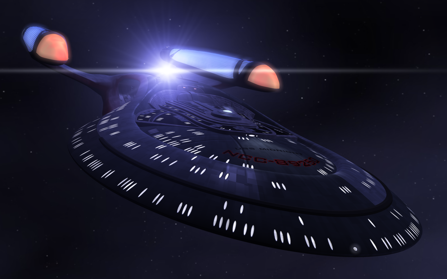
Someone made a model of the original Enterprise a while ago that solved the problem. I'm trying to find a link to it. Google seems to have lost it. I have the model somewhere, but can't find it right now. The model was very detailed and even included details inside the bridge.
-
the leader now is "do a short", which is misguided. a large group needs a large project.
a killer short is best made by one crazy, determined individual, or at the most three crazy determined individuals who will still end up hating each other by the end of the project.
a large group working on a small project would quickly implode, or produce a grey goo unworthy of drive space.
-jon
Depends on the size of the group.
A short would have a faster turn-around time. The smaller size of the project would give each member of the group more opportunity to refine, polish and add bits of panache ("plus" in Pixar/Disney slang) to his piece of it.
If the available manpower is large enough, several shorts could be made at the same time.
In this YouTube/Internet video age, shorter pieces are a lot more popular than longer videos.
If the goal is to try to make a movie to make money on DVD sales, maybe the longer project is better.
If the goal is to crank out high quality animation to promote Animation:Master, a plethora of well-made shorts in different genres and styles would appeal to more audience segments. And a DVD full of good shorts could be popular, too.
A key question (which I don't know the answer to): Which get more play at animation festivals? Short films or longer films? What about at independent film festivals?
-
every time i look at bill shatner, i see james tiberius kirk.
You need to start watching Boston Legal. Denny Crane is a lot of fun.
-
I don't think the guitars at the pawnshop are in a format that can easily be imported into A:M...
-
same here.
-
Does a handheld computer like a Palm Pilot count? The first one was on par or greater in power than my Commodore 64 was.
-
tsk tsk, single-shot voting...
TWO needs a better poster. It's a bit tame compared to the others and is more about the process of making the movie than the movie itself.
-

Newspaper layer-outer needed
in TWO Texturing
Posted
grrr. . you're right. When I did the screen grabs from the sequence Rob mentioned (2-01-66), I didn't notice that that the knock-down image was absent. Instead, it starts with a freeze-frame of Scarecrow holding his nose afterward.
I'll get back on it tomorrow. Time to celebrate the New Year.