

CreativeAustinYankee
-
Posts
362 -
Joined
-
Last visited
Content Type
Profiles
Forums
Events
Posts posted by CreativeAustinYankee
-
-
I LOVED the Neverhood. Doug TenNapel has teamed up with a few old friends and is creating another similar game. Terry Taylor is onboard for the soundtrack! They're looking for support, I thought I'd help spread the word.
http://www.kickstarter.com/projects/194953...=home_spotlight
-

Not trying to start a political flame war or anything, just thought this was funny enough to share.
From the Austin Chronicle's Headlines section:
The Confederacy has found the Internet! A petition on the White House website, asking for Texas to be given independence, has gained more than 30,000 signatures and therefore must get a response from the president (we're expecting it will be "no"). A rival petition, asking for Austin to be allowed to secede back into the U.S., is also up on the website, as is a petition seeking to deport all persons signing petitions to secede. See www.whitehouse.gov/petitions.
-
This may be nothing, bu have you cleared your Hash registry file? Sometimes that gets a little messed.
Also, try updating your video driver files.
Just a thought.
Steve P.
-
He's asking for waaaaay too much money. I appreciate stop-motion animation, and feel it's a worthy artform to tell a story. 3D has yet to really capture the tactile nuances and imperfections that make stop-motion so compelling. Still, $65,000 for a 20 min short based on someone else's property?
Steve P.
-
Just discovered a great resource for all types of forgotten places. Perfect reference pics for all your haunted house or post-apocalyptic projects.
http://www.urbanghostsmedia.com/
Enjoy,
Steve P.
-
I like 15 and 16. hehe Hey, Steve P. didn't know there was another Austinite here
 I'm in the SW part
I know there are a couple of users in and around Austin. And more in Houston and Dallas areas. There used to be a map "thingy" that showed locations. I haven't posted on here in quite some time. I'm in the middle of a bunch of film/videography projects, but I'm diving back into AM to finish some of my animation ideas.
Feel free to drop my a line at CreativeAustinYankee@yahoo.com. I'm generally downtown or up north, but I know my way around south a bit.
Steve P.
-
Futuristic Concept Homes Photo Gallery
I'm always looking around for "muse food" and came across this. Thought I'd share. I've already decided on modeling a version of the Reboot home (pg 19-20)
http://www.forbes.com/pictures/elfk45ifj/tornado-proof-home/
Steve P.
-
SXSW has become the event only the out-of-towners attend. It's gotten too big and too expensive. If you decide to come, DON'T use the light rail or you'll wind up extremely pissed off.
I regularly use CapMetro - the bus system down here.
www.capmetro.org
The buses are going to be overcrowded, fares are $2 for 24 hour "Day pass" - you need to let the driver know.
Austin's a great city, and there's alot to enjoy while you're here. But, to be honest, I can't recommend paying all that money for so little value.
Steve P.
-
Steve,
Great work!
I did notice a few small things that, if changed, would add to the project.
First, I noticed the front tires of the bus don't really turn into the curve. It kinda looks like the bus is gliding along. Rigging the front tires seperately and getting them to turn along the path would help add a little realism.
Also, the bags of chips on the hot dog cart, there's a point of realism that your striving for, but these decals might be too real to fit within that context. You might consider creating fake chip decals that are a bit less realsitic.
Just one guy's opinion.
Steve P.
-
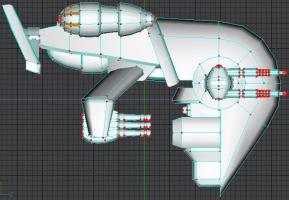
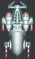
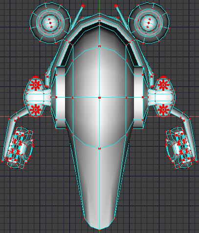
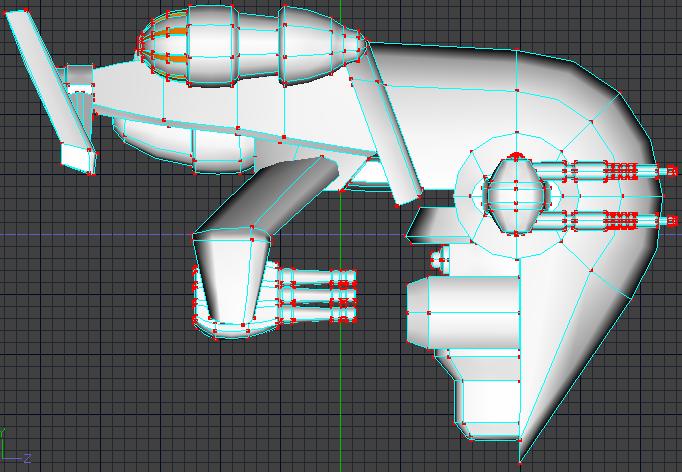
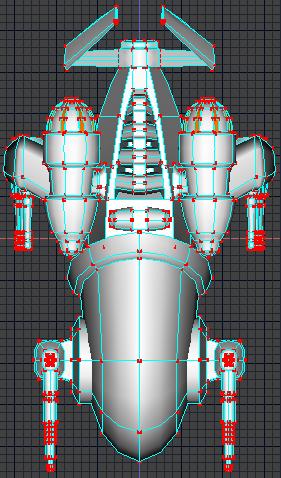
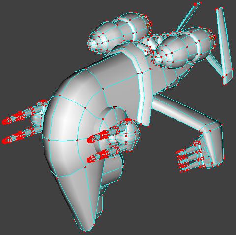
Hi,
I haven't posted anything in forever and thought I'd share what I'm working on. This is one of a few types of spacecraft I'm modeling for a live action greenscreen comp. Basically, I'm pushing the envelope with what I'm capable of doing. This is going to eventually end up on a showreel.
I've still got some nurnies to add and some textures and cockpit interiors and so on. I created a small avi turn around that I wasn't able to upload for some reason.
Anyway, crits welcome. I'll create some better wireframe pics.
Steve P.


-
You may find this site really helpful.
Steve P.
-
Actually, if you trimmed a little of the black, you could use it for your avatar. Just a thought.
Steve P.
-
This is very good.
There are a few areas that might be tweaked a bit, if you're still working with it. It has to do with motion arcs, follow-through, and secondary motion. Overall, he moves a little stiff. And.... he appears to be running with his knees bent.
My two cents.
Steve P.
-
Overall, the image still seems a little crowded, but that just may be my personal taste. Much better than the previous version.
My advice, let this rest for a bit. Come back to it when you have fresh eyes, and I'm sure you'll see things you can improve on.
In the meantime, take a look around some of the 3D galleries on the net for inspiration.
Check this out:
http://www.eve-online.com/screenshots/coll...5122007&n=8
http://www.eve-online.com/screenshots/archive/
Best of luck,
Steve P.
-
I did a side by side comparison of the older book with the 2006 version, I've pasted it below. It should answer your questions about the book.
Steve P.
***********
I've got both right here in front of me and I'll do a side-by-side comparison.
So what's different? Actually, it depends on the chapter, but even the ones that cover the same stuff have been expanded on. To give you an example: in the old book Chapter 1 starts on page 3 and ends on page 40... in the new book Chapter 1 starts on page 3 and ends on page 48.
One minus is that some of the new graphics are a bit too dark, you can still see the important information, but given how easy this would have been to correct, this appears to be something the publisher let slip through the cracks. HOWEVER, it's important to add that MOST of the graphics are included on the cd. The graphics on the cd are in color and were never adjusted for printing in black and white.
For some reason, they didn't include the Chapter 11 graphics on the cd, which is unfortunate given the ones printed in the book are so dark. Hopefully, the publisher will make these available online.
Chapter 1: Interface
Naturally, this is pretty much the same. David has included a few "Try It Now" sections that include helpful tips. The graphics for this section are pretty much the same.
Chapter 2: Modeling Basics
Again, the same areas are covered and expanded on.
The description on how to make a torus is still the same, which to me seems a bit confusing and kinda the long way, but to be fair, he also uses this opportunity to explain how lathe works.
Chapter 3: Bone Basics
Once again the same areas are covered and expanded on.
Chapter 4: Action Basics
The sequence of topics have been changed. The Timeline and Channels section and the Keyframe Interpolation section have a few nice new graphics that help make the topic easier to understand.
Chapter 5: Character Modeling For Animation
There's a few nice additions here. Starting a morgue library for all of your spare parts that you create over time is a real good idea, sure to be a timesaver.
Being that hair and cloth have undergone major improvements, these topics are covered in depth in Chapter 13.
Leg construction gets expanded on and includes some nice new graphics.
Modeling a character, we get a new guy, Captain Splines. He's kind of a Rocketeer-type character. He's a bit more advanced than Washer but the steps are mostly the same. There's also a section on modeling clothing that will animate well.
Chapter 6: the title has changed to Inorganic modeling.
The remote and urban landscape topics are covered, although like the old book, the new one seems to skip a few steps on modeling the remote.
The most noticeable difference is that instead of covering modeling natural settings, we are introduced to Captain Splines' evil arch-nemesis: Polygozmo, the perfectly evil robot. Constructing Polygozmo is mostly to show us how even inorganic forms can be combined to create interesting characters.
Chapter 7: Constraints
The same topics are covered.
This is the chapter where the dark graphics really detract from the enjoyment of following along in the book.
Also, although the section on mechanical rigging was short in the old book, it appears to be absent in the new version.
Chapter 8: Relationships
Pretty much the same as the old book.
Chapter 9: Expressions
(yipeee, wahooo, Caloo Calay... sorry, I've been waiting for a "Dummies" version that covers expressions for some time now.)
Though I have yet to dive into this section, (modeling Polygozmo is kinda fun), looking through it, David has taken the time to explain the inner workings of one of the most powerful features of Animation Master in easily understandable form.
The graphics in this section are thankfully easy to see.
There seems to be a typo with the ceiling entry. I believe the number would be rounded up to 3.
Chapter 10: Animation
Same basic information.
Some graphics, though mostly the same as the old book, have changed size, from small to big and visa versa.
The secondary motion section seems to be gone from the new book.
Chapter 11: Lighting
Again, the graphics really suffer here.
Being that the Captain Splines stuff takes place during the day, this section doesn't cover night-time situations.
Radiosity gets expanded on nicely.
Chapter 12: Surfacing
This chapter in both books covers alot of ground.
The graphics that cover decal maps are clearer in the old book. Although theres a section on applying and combining the effects of decal maps that more than makes up for it.
Chapter 13: F/X
Sprites, Blobbies, Streaks, Flocks, and Volumetrics are pretty much the same.
Because of the new features with hair and cloth, these sections have changed. You build on what you set up when you modeled the captain's clothing.
I don't know if spring systems have changed significantly in the latest version of the software, but the old book goes into more of the inner workings.
Ridgid bodies seems to be missing.
Layers are covered in the next chapter.
Chapter 14: Rendering and Compositing
Render options are expanded on but the graphics are too dark.
AM Composite is well covered in the new book.
Layers is about the same.
Chapter 15: Group Projects
Covers the basics
There's a chapter on Workarounds that doesn't appear in the new book.
Chapter 16: Miscellany
Mostly the same.
Appendix A: Keyboard shortcuts
The formatting for this section has been considerably condensed.
Appendix B: Glossary of terms
Same.
Appendix C: About the CD-Rom
Same.
Well, that's about it. For my money, getting info on hair, cloth, and expressions more than makes up for the negatives.
My two cents,
Steve P.
-
Okay, a few guidelines about creating interesting images. Your image is very static. The best images tell a story.
Perspective:
Right now, the ships are all of apparently the same size and approximate distance away from the viewer. Two of them are shown top/bottom. There's nothing there to really catch the eye and bring the viewer into the scene.
Show us the viewpoint from one of the ship pilots or perhaps what it would look like standing on one of the asteroids.
Play around with perspective, find an interesting viewpoint.
Composition:
The rule of thirds - this is a basic guideline used for all types of visual media. If you're not familiar with this rule, the short version is this: Divide your image with grid lines into thirds horizontally and diagonally. Where these lines intersect is where you want your object of interest in the image.
Contrast - vary the size of the asteroids a bit more. Perhaps, show us a planet, moon, or space station to help us establish a size reference.
Space is huge, everything in this image is kind of clustered together. Spread things
out a bit. Vary the distance.
You have a lightsource from the bottom right, yet everything is evenly lit and flat. The contrast of shadow and light would really add some depth to this scene.
Color composition: The space rocks are grey/white and the ships are grey. Uninteresting.
Storytelling: There's not really a story here. The ships don't really look like they're ore miners, they look more like single-pilot fighters. There's no implied action here. We can't tell what's going on. Give the ships a purpose for being here.
Take some time and really rethink this scene and you'll be suprised with the results you can achieve.
Good luck,
Steve P.
-
You might want to reconsider the brown of the dog, the horse, and the ground. Too simular.
Steve P.
-
Maybe I'm missing something about what you're asking but:
1. Set your chor up the way you want it.
2. Select Save and save your chor as "Scene1" or whatever
3. Select Save As and save your chor as "Scene2", "Scene3", "Scene4","Scene5", etc...
This would give you multiple copies of the same chor. You're going to want to plan out your animation ahead of time, but even if you changed something, you could do another Save As and copy over the old chor.
-
Hi,
Welcome to one of the most helpful forums on-line.
You'll want to read the following post, it will give you alot of info:
http://www.hash.com/forums/index.php?showtopic=31791&hl=
The biggest difference between some of the Machinema programs and Animation Master is CONTROL. From creating your own props, clothing, and characters to textures to actions, Animation Master gives you extensive control over everything.
There are quite a few things that AM can do that can't be done in other programs and all of that choice can be a little overwhelming and confusing to someone new to 3D.
When you have a question or problem, definitely ask the forum. Many problems have been dealt with by others and a forum search is usually a good start.
Again, welcome aboard.
Steve P.
-
Eyebrows, it all depends on how much detail you want, how close the camera is going to be, etc..
Depending on how the face is modeled, you could get by simply by changing the color on some of the patches.
If that's not going to work, for most work you should be pleased with the results of the image maps.
I recommend only using hair if you're going to be doing some up-close shots of the face.
Image maps (color map, bump map, transparency, etc..) are created with an image editor such as Adobe Photoshop, Corel Photopaint, etc...
There's a free one available.
OR
If you want some incredible flexibility with your maps, try 3DPainter for A:M. Check out the web site.
http://www.3dpainter.com/index.php?page=main
Well worth the price: $99
Steve P.
-
This video may help.
IGN Cloverfield Creating The Monster
http://www.youtube.com/watch?v=xBZIvaMcXmo
Steve P.
-
Not bad, I've got a robot character that looks alot like that. The one thing I noticed was the arms, for readability in animation, these need to be much thicker. And the hands need to be larger overall.
Just my two cents,
Steve P.
-
Not bad, but you still need a few more bounces at the end before it rolls away. The height of the bounce is directly related to the "springiness" of the ball material.
For most of this, the ball looks pretty springy. My suggestion is to work out a simple formula. If the ball bounces this high at Point A, the percentage of that needs to be ? at Point B, and ? at Point C and so on. Do this with distance (movement across the screen) as well.
Nice start,
Steve P.
-
I know that The Set-up Machine2 doesn't work with version 15, but am I able to bring in character's I've rigged with TSM2 and have them work correctly? Stretchy bones was a really nice feature.
Thanks,
Steve P.
Logitech G13 gamepad for AM!
in Open Forum
Posted
Hi,
Just wanted to recommend to any and all to consider using the G13 if you're still using the keyboard. I bought it from Amazon and have now set it up for modeling. Later on, I'll set up separate profiles for rigging and animating. Right now, I'm going to get used to the layout by building a bunch of nurnies.
Steve P.