

cosmonaut
-
Posts
369 -
Joined
-
Last visited
Content Type
Profiles
Forums
Events
Posts posted by cosmonaut
-
-
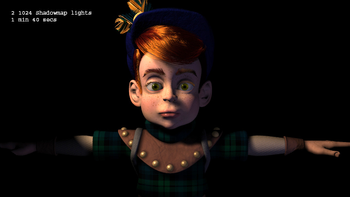
I just noticed this was up, nice to see all that work finally coming together. Still needs work to balance the lighting, some set decoration, and it looks like a few scenes weren't setup right. One question though ... what the heck happened to the shadows from Woot's hair? I've noticed the same issue on some personal projects recently as well ... hair doesn't seem to be casting shadows the way it used to. I can tightly focus a spotlight with a 4k by 4k shadow map on just a characters head and not get any shadows from the hair casting on the head. I spent a lot of time trying to get decent looking hair shadows with shadow maps in these scenes and it worked great back in january or so :
Looks like it's time for another report. Also, what's with all the walking and camera moves and cuts in the beginning? It takes Woot over a minute to finally get to the throne and it feels WAY too long. Either we could make it one continous tracking shot to show off the castle or (preferably) just cut it way down. And Woot's hands still freak me out. I swear his hands are bigger than mine! Oh, and do we ever plan to render these things with motion blur?
-
Actually, Kevin's changes have already been reverted- Martin and I had decided we liked the look of the old (Nancy) hair better... It seems like the change was much more dramatic than what should have resulted from Kevin's minor change-
muhHair does seem rather sensitive to small changes ... it's likely when I ported it I screwed up or misinterpreted something. That or it might just need a bit of rework to be more usable. I sometimes find that values that look good in one lighting setup look terrible in a different situation. I've been meaning to look into, just haven't had the motivation to code at home (I do more than enough at work).
-
Toning down Woots hair ? Nope. Boring.
Underhanded, sneaky, disappointing? Yup. Big Time.
I do not appreciate doing work for free to have it changed behind my back.
I resent being treated disrespectfully.
Nancy,
I certainly didn't mean to step on anyone's toes. I was asked to look at why Woo'ts hair was going totally orange in certain situations, all I did was desaturate the color of the primary highlight in the muhHair shader thinking that might help. I'm sure we can go back to the old hair, I wasn't trying to be sly or underhanded. Sorry.
Kevin
-
Beautiful ....
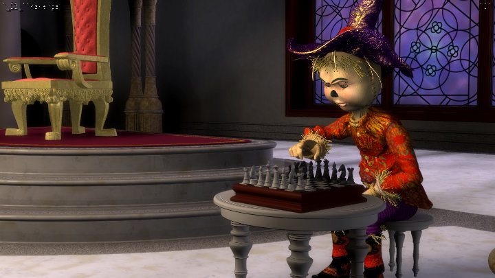
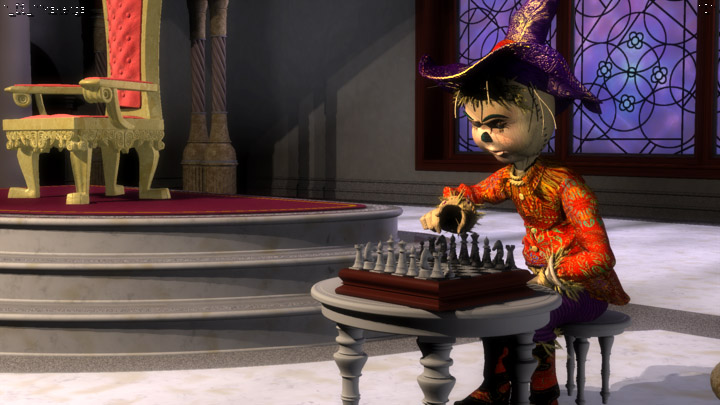
In this image the difference of the characters' style is notable. Woot using "real" hair and his mother with modeled hair.
That's a good point, why doesn't she have particle hair?
-
Beautiful!
What do you think of Woot's toned down hair color? (I noticed Kevin did that on the sly.)
Hey! Steve asked me to do that ...
 Very nice lighting Mark, but I agree you probably need some bounce lights especially on Woot.
 -
Our intern, "Stevie," was doing the "It's Getting Hairy" tutorial in TaoA:M. He was complaining how difficult it was to pick the correct driver for Property Driven Materials (bitmaps that control Hair length and color) from an undifferentiated list of 100s of Bone names. I told him, "You're a programmer - fix it." With Noel's help, Stevie found where someone else had started working on the problem (years ago) but hadn't quite finished (?) An hour later and it's a lot easier to pick from the list now.
YES!!!! Thank you!
-
Awesome work Jeff!
-
yes, while I was working out the timing...
-
Try this Julian, and make sure you have shaders enabled...
-
Been sitting on this scene forever, just haven't had much time lately. Anyways, this is my first animation for TWO so be gentle...
Kevin
-
That order makes a heck of a lot more sense Martin....I'm now in a lesser state of confusion.
-
3) Near the beginning of 1_03 is out of order! However, once it got beyond that, it seemed okay.
I think 1_03 is in order for the shots based on my intimate knowledge from all the lighting I've been doing lately. One thing that has been bothering me is that in 1_03_08 TW's axe magically moved from this chin to his foot...also the axe in 1_03_32 is spinning in a really weird way (it's not pivoting from a single point)...1_03_17a was never animated (since I was originally going to do it but you were going to find someone else)...1_03_41 and 1_03_42 don't flow into each other at all...I think that's it for now...
-
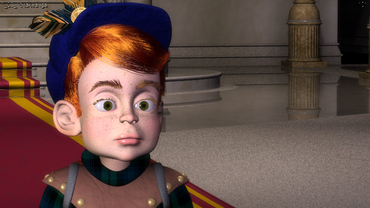
Can we do something about Woot's hands? Those things are kidna freaky looking and don't seem to match the rest of him. I can't take my eyes off of his hands! They're ... too ... distracting...
I find them freaky too. I'd like them to be changes as well. But I thinkl we need to discuss the possible consequences of such changes before we do that. What would be the consequences for already done animations?
I thought about that too, but I gotta say, after looking at it some more I think most of that hand animation probably needs to be redone anway. It could be because people didn't know what to do with such freakish hands but in a lot of the shots I saw Woot's hands (the fingers in particular) either didn't move in any sort of natural way or didn't really even move at all. If we changed them to more childlike hands (shorter, stubbier fingers, etc.) but kept the same bones, what would that do to the animation?
-
Can we do something about Woot's hands? Those things are kidna freaky looking and don't seem to match the rest of him. I can't take my eyes off of his hands! They're ... too ... distracting...
-
Interesting idea there Rodney, sounds little busy though (and hard!). No matter what, Woot definitely needs something to be awed by, and so far there's really nothing there for him (or the audience). Maybe we can just make some of Nancy's fancy renders of TM and SC into paintings to put up on the wall?
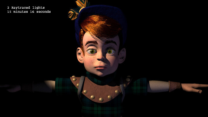
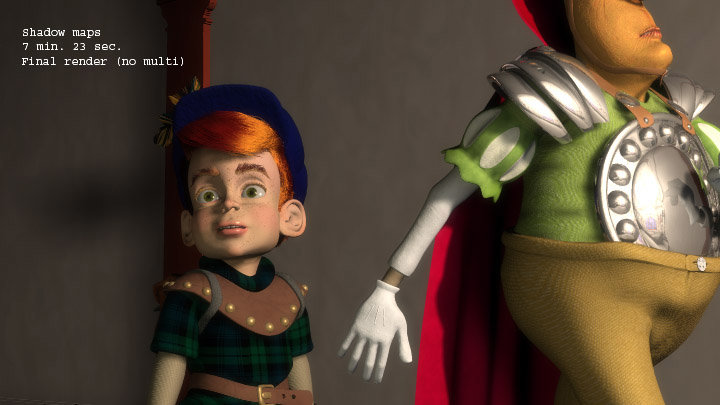
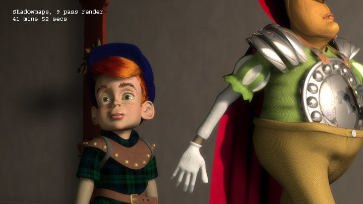
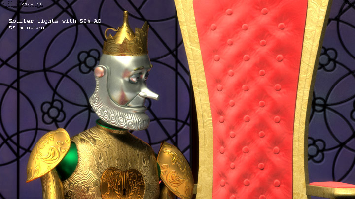
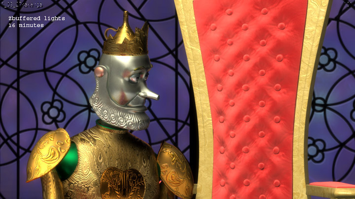
Just out curiosity Yves, what kind of speed up might we be able to expect? For instance, how long did that last render with hair take? I did a little experimenting this weekend with different shadow types comparing render times/results. I guess I still feel unless we are using soft raytraced shadows (are you planning to?) and you are able to get some significant speedup, that shadow maps still have the advantage. Oh, and by harsh I meant that standard raytraced shadows have no blurring, which in most cases doesn't look very appealing. Don't get me wrong, I love using soft raytraced shadows for stills/when I have time to wait. They certainly are a lot easier to use, no messing with shadow bias, adjusting map res, etc, and can look way better, but they still add so much time to the render that it doesn't seem to be worth it, especially with so many frames to render. I was missing a lot of shadows with my lighting, which I think I've been able to fix in a lot of cases now. Of course, all this is moot if you've got some good speedups going for raytracing. And if you guys decide we really should use raytraced shadows I'll go ahead and make the switch. Anyway, here are my results, the shots of tinwoodsman were 16 pass, the shots of Woot were final (no multipass):
btw, are we planning to use multipass rendering for everything, and if so how many passes? Also, does anyone know why the frameburn looks so bad on all the frames I render? It's unreadable...
Kevin
Edit, added a 9pass version of 1_03_01 with shadowmaps for comparison.


-
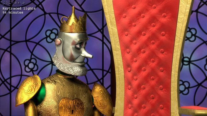
I see what you are saying Yves, that's really cool you are working on raytracing optimizations, that will really help. Do you have any previews of that shot we can see? I guess one thing I was concerned about without using soft raytraced shadows would be that the lighting might end up being too harsh. My other concern was the hair, how does that look? Did you add a bulb for every bulb in the chandelier? My first attempt with replacing zbuffer shadows with raytraced didn't go so well, I guess I like the soft lighting even if it isn't too realistic. Anyway, I'll keep experimenting. I still think Scarecrow needs more "hair".
I also didn't know the renderer multiplied the AO, that's pretty cool, I'll have to play around a bit.
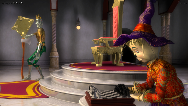
Oh, and one more call for a texturer/set-decorator for the throne room, Martin, can we get someone to do some additional work on this thing?

-
Thanks for the comments guys, lots of good stuff here.
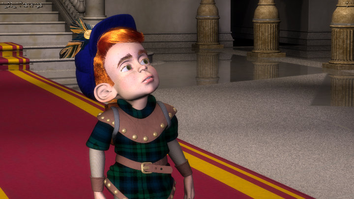
I have mixed feeling. On one hand, I find the lighting very attractive with the right balance of contrast with nice soft dark corners and bright lights and highlights. It really gives the textures and materials a nice soft look. Overall, it is very pleasing.On the other hand, I really miss the shadows. TM looks like he is floating over the ground and in the second shot, the throne looks like it is floating too. SC hat looks like an addon through composition and his sleeve look like it is not part of the shirt. The table feets also look like they are not part of the table. On the fourth render, woot suit looks flat. All of that because the shadows are so soft that they are practically non existant except for the larger objects. Adding shadow would take care of the apparant missing hair on SC for instance.
Also, not related to lighting but I mention it anyway, the throne room lacks a sense of vastness. This is mainly due to the long camera angle. A very short camera angle would increase the depth of the shot. Right now, the stairs look like they are 6 feet behind Woot.
BTW, what is a "sourcy" light?
Thanks, glad you like the overall feel. I assume you mean you miss raytraced shadows
 I know what you mean and I do agree with what you are saying, one thing I would love to do is be able to use AO in a similar way to the way I did my Christmas contest entry, it added everything that was missing to those shots just like it would to these shots (especially since the throne room lighting would likely be pretty diffuse anyway. What I'd like to be able to do (and I wrote a report somewhat along these lines) is be able to render a separate pass of all these shots with purely white objects and AO. Then composite that shot over these renders with a multiply to get some nice diffuse shadowing. You can see what a difference it made in my christmas entry (note it was a straight multiply, I had to adjust the brightness of the AO shot a lot to get it to work). The big problem with it though was the fact that I had delete all the materials/textures and delete the roof. It would be so awesome if we could have something like that plugin marcel made that could work for AO and also awesome if we could set a min and max ray distance for AO, but I digress. Anyway, I will try out raytraced shadows to see how they look/how much time they take (Marting already asked me to try). I will try to play around with depth of the shots, I'm a little worried about doing that though because there is likely a lot of missing characters/animation that I'm not about to do ... but I'll see what I can do...
Sourcy just means that the lights don't blend together very well, as in you can see the "source" of them. It is usually used to describe bounce/fill lights but since the chandelier would produce fairly diffuse lighting i thought it fit.
The lighting is amazing, Kevin, though in the images of Woot I wonder what could be casting that intense light on his face. Also I would prefer to see Tinman facing the other way in the first shot and his heel appears to be penetrating the step. The throne room could use a few tapestries and furniture which would help to create a feeling of comfortable spleandour. This is a place that Tinman and Scarecrow have spent a very long time in. Long enough to grow tired of listening to each other's tales of adventure. There should be signs of their obsessions about the place.The lighting looks beautifully crisp and well balanced.
Thanks Paul! I probably do need to turn the lighting down on Woot a bit, at the same time there's lots of white marble around reflecting all that light so his face should be somewhat well lit...oh and I totally agree about the throne room. I'm hoping someone else can step up to take on some set decoration and texturing of the throne room, it feels so empty and can use some work. The modeling of the room itself is fantastic, it's just the texturing and the rest of the room that need some lovin (except for that cool window Colin did). I've got more than enough stuff going on that lighting is pretty much all I've got time for now.
Maybe the shadows could be made abit bluer so they stand out from the scenery. I agree there could be more too. But you're certainly on the right track.And some stuff not concerning lighting.....I also agree the camera focal length should be small. I guess each of the cameras will have to be changed in each of the projects. And the reflective marble on the floor behind woot seems abit too reflective. Finally, there should be some "guest chairs" spotted around the sides of the hall too.
Thanks Ken, I prefer not to color my shadows, any color should come from other lights (which might be part of the problem, too many other lights drowning out what shadows there are). I also agree about the reflection, problem is the ole fresnel effect (I wish we could disable that, hint, hint Yves). I've got the reflection down to 1% but it doesn't matter because of the angle of some of these shots. I tried increasing the specular, which I know should lower the effect, but there's a DT material on there and it caps at 100%. Again, if someone has time to do some work on the throne room ... please, please do it.
The lighting looks beautifully crisp and well balanced.I agree with Yves second comments. I'll have to check on my machine at home as well, but the lighting looks to even. There are probably only two main sources of light in the room.. the chandalier and the window. The side lights could be main sources but if so the room looses all atmosphere. Give it some dark corners and try adding color in the ambient areas by adding a light you can move around to point from one side or the other. I did this with the window light but I moved it around allot in order to give a slight blue tone to the dark side of the characters.
the thing I do like about these shots is that we are finally getting closer to similar lighting between our scenes ;-)
Perhaps its the camera angles, but I don't remember seeing the detail you have in my shots, maybe its because I had about a 15' to 20' depth of field on all of my shots, except for the outdoor scenes.
cool stuff Kevin. I'll let you know if the washed out look was just my monitors at work or not.
Thanks Colin, did you go in and change a lot of the camera settings on your shots? And yes, we are getting there...
Kevin

-
I think Scarecrow needs more "hair" he's got some weird looking bald spots in these shots. Anyway, here's how things are coming, any comments? I've still got a bit of "sourcy" lighting and I need to balance things a bit more...
Kevin

-
That is awesome, all it's missing is that authentic transformer sound...
Kevin
-
I think that was my fault (the brow spec), thanks for catching that Paul, it's been in there a while now. Nice test BTW, but what's up with that black mark on the left side of his face?
-
OK, tried that (I didn't have drivers on which is why i didn't see the action objects before). It's still not working for me, it never saves the light lists on the action objects and never renders properly even with the lists. Was it working for you? Should I submit another report?
-
Ok, so I tried what you suggested Martin about the light lists on the throne room. Unfortunately it doesn't work since most of the throne room is in an action object. When I put a light list on the throne room it doesn't apply to anything but the floor, i.e. none of the action objects are lit with the lights from the list. I already submitted a report about a month ago about the limitations of light lists and action objects. Any suggestions?
-
Thanks for the suggestions Martin, I'll be looking at those tonight. I was wondering how to get those shadows from rendering, I even wrote up an AM report about it. I'll also give the raytraced shadows a try, but I'm not sure we want the super long render times we're getting now do we? Also, what does the active driver thing do?
-
Looking very, very nice Colin. Were you using raytraced shadows or zbuffered in those shots (I suppose I can look in SVN huh). Looks like a bit of both ... A few shots look like they could use a bit more fill lighting on the characters (I notice it mainly on scarecrow). Also, the tin castle in the outside shots looks really flat and too CG. Overall though I'm digging what you've done here.
BTW, is there any chance we can increase the transparency of the window? It's blocking all my outside fill lights now almost completely...
Kevin


Hackfest
in TWO: General Discussion
Posted
Wait, so we aren't using SSS at all now?