

Heath_Naylor
-
Posts
207 -
Joined
-
Last visited
Content Type
Profiles
Forums
Events
Posts posted by Heath_Naylor
-
-
Hate to beat a dead horse, but this Animation got featured as a Video of the Day today, three cheers anyone?
-
The only test your animation seems to fail is the 'Would my Mom understand it' test.
I don't think she would but thats not so much a scathing criticism as it is an example of potential barriers to communication through the generation gap.

What I mean by this is that the punchline is one reserved for a particular audience that is 'in the know'.
Where this hits its intended audience... Bam! You are there.
Not sure how you could make it more universal except to include it within some kind of bookend that clues everyone in to what is going on.
One example: Introduce an alchoholic beverage (even though not required in the process demonstrated) and the 'aha moment' would be transcribed.
I'd think the 'yellow liquid' alone achieves this for the majority of audiences.
Otherwise you've communicated effectively. Without words even.
Good use of sound effects to sell it too.
This is a very successful animation on so many levels.
I'm impressed.
Well done!
LOL Rodney, I used the same test! She did get it, got a chuckle out of her. I agree with all of you on the points you made, and looking at it now, it lacks character in a lot of ways. I am glad that people let me know this stuff, I will work hard on it for new animations. I have been watching a lot of animated films for inspiration, and I think it has worked. I seriously have watched about six animated films about 3 times each, evaluating scenes, facial expressions, basic body movements. It is amazing to watch what kind of actions go into resting animations alone. Well, back to animating! Keep the comments coming,
-
Lol, I know what you mean. I will go back and change that if possible, I sort of changed on of the models and didn't save it as something different, oops
Thanks for the comments guys. -
Oh yes. Bias handles are one of A:M's specialties. Everything in A:M is controlled by splines with bias handles,
that's what makes this program so powerful for animation.
Ball bouncing are looking pretty good. It took me quite a few trys to work out the timing on mine.
Thanks guys, yeah I have never used the handles in my life, they make things so much easier! I am sitting in my 3D animation class right now, so back to work for me
 .
. -
I found a good ball bounce tutorial, followed it, and learned a lot more then I expected. I am beginning to break some bad habits, blocking out the animation ahead of time, and manipulating timeline splines. One thing I have noticed, A:M doesn't have spline manipulator handles, how can I get these? Without them spline in the timeline is cumbersome. I know it must be something I have missed. Anyways, here is the ball bounce test.
-
Yeah, I need help, what is wrong with him. Below is a picture of skimpy 1.0 and 2.0, I am making 2.0 better with hips and such, but I must know what is wrong with him before I move on with rigging.
-
I would really appreciate some input on this, it is my first ball animation with a story and I would like to know if there are any major problems with it.
-
Hey guys, I have entered Revver's next film contest, this one has the April fools theme. I started out to do a basic ball movement test, but as soon as the contest was announced I changed my whole outlook on the animation. Let me know what you guys think, thanks! Maybe I can get first this time around?
-
hmm. I see where you are coming from Heath. would you mind whipping us up a layout that you think will work better? I use dreamweaver... so yeah. thanks. Always good to have constructive crit.

Alright, I am making a website for my animations, http://uberanimator.com/ . The layout it has right now is what I like to call a bare bones layout. It has all the declensions set, but basic images. I will be able to change the images as I see fit. I use black dividers to separate major features (banner, navigation, background) and then I use different colors to suggest a boarder for the side sections. Notice I NEVER use white (except for the images I will replace at a later time with non white ones). I can't afford Dreamweaver so I use Nvu, it is a lot like it, but you need to know some HTML to use it properly, and it doesn't have templates that I know of
 . I spent the last few hours on the site so I have to hit the sack.
 -
Right, I also have the story board on foam core to present to the class. I will see if I can change some things up, such as silhouette poses.
-
Hey guys, this storyboard is actually for a class I am taking, but I decided that what better presentation then a video? Let me know what you guys think.
Storyboard - 'Unexpected Headache'
Crits please, it's due Thursday.
-
As a student graphics designer I can tell you that http://www.crumblenet.com/ is a site in need of redesign. It is lacking a steady theme. Here are my suggestions.
1: Text Size: Keep it universal for example: ' why Subscribe To Nunsofamerica on youtube? ' is far to long for a graphical text title. It Should be more like ' On Youtube ' or something that draws the user in quickly and effectively. Then in that section have a clear link to the youtube page (ex. http://www.youtube.com/profile?user=nunsofamerica ) Also, it would be better if you had a Mario Film specific youtube, not that I don't like seeing snowdays
.2: Fonts: Your Sub Font is NEVER bigger then Intro font, example:
______________________________________________________________________
Bad Way:
Welcome To CrumbleNet
WOW!
The about us page is now up and working. check out the workers!
______________________________________________________________________
Good Way:
Welcome To CrumbleNet
WOW!
The about us page is now up and working. check out the workers!
______________________________________________________________________
Next, no one will take you seriously if you site is grammatically incorrect. After periods you MUST capitalize.
The about us page is now up and working. check out the workers!
SHOULD BE
The 'About Us' page is now up and working. Check out our members!
'About Us' should link to the 'About Us' page. Try never to use double words, such as working and workers. Members/Staff/Team is much better then workers.
3: Navigation: This is a big problem for the site. Navigation MUST be left side or top, no one wants to have to scroll down to find the navigation. Bottom navigation is optional, but the first thing you want people to notice is that they have a choice where to go.
4: Boarders: The page has major problems with this. At first glance it looks like you have a top boarder, a bottom boarder and just EVERYTHING in between
|__________| Current Site Layout
|__________|
|__________|
|__________|
|__________|
|__________|
|__BANNER_| Suggested Site Layout
|=navigation=|
|_|Updates|_|
|_|_______|_|
|_|_______|_|
|_|_______|_|
|=navigation=|
|___________|
If that doesn't make since I will whip up an example. Basically you need to define where a section ends and the next begins, otherwise the user will get lost.
5: Ease on self: This is important, never do things like 'Picture of the week' instead make it 'Picture of the moment'. This way people don't expect to see a new image every week, just to be let down if it doesn't change. If you don't update that weekly then people begin to think you are lazy or a dead film, they leave and never return.
_______________________________________________________________________________
I'll end it there, all I have done here is stated the problems, suggested fixes, given examples. Please take the criticisms in a constructive manor and decide if you want to look deeper into them. The site works as it is, just sloppy.
-
You guys are right, my approach is a ball that is alive, and jumping up. I will change the animation name
. -
Funny story behind this. So I am taking a 3D Animation course at the college I am going to, and the program we are using is Cinema 4D. We are doing a bouncing ball project, and I decided to do it in the program I am familiar with as well as C4D. I will compare the two when I am done and upload a comparison video if I see fit. You can also see the animation in Flash format
BallBounce.mov - Quicktime
BallBounce on Revver - Flash
-
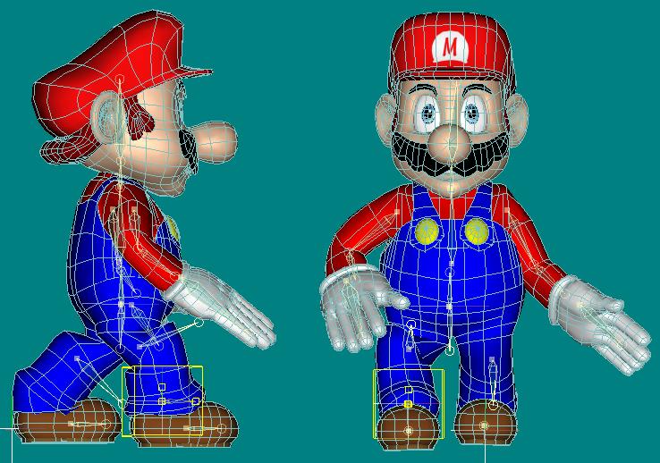
Problem with animating mario:
is it my rig that isn't good?
is it my model that wasn't design well for animations?
is it because I have to do a lot of smart skin?

Any combination of the three, I knew the rigging would come to this, making a model is easy. Making a model that will animate well is the challenge. You have a lot of CP tweaking to do, smartskins, changes in rigging. It is a long road, but at least your not walking down it alone.
-
2nd?! I'm in 2nd?! NOOOO!! Guys help me out, watch, comment, let me know, I don't want to walk away from this 2nd, it is first or bust!
Watch IT! Thanks guys, please please comment and critique.
-
Thanks Tot, 8 days tell the competition is over, can't wait!
-
Well, it has been a bit of an underwhelming response. I guess I will just throw out there that the animation is currently in 1st place with 275 views. Thanks for those that viewed, thanks to the few who commented, and sorry to the many that might not have gotten the blender joke.
-
# 1, Decals are important, the L is off, needs to be thicker all around. The top should be wide, the angle normal, and the right end of L a little wide as well.
# 2 the eyes, They are far too close to the eyebrows, no room for any expression.
# 3 The nose, too small, not spherical enough.
# 4 The Mustash, too thin, needs to be thicker.
# 5 The Lips, bottom lip is far to thin thicken it up a bit.
# 6 The ears, too sharp, make some smooth transitions.
Those are the six things I noticed, sorry if you don't agree
Keep it up, looking good. -
-
Animation done for the RevveR Film School topic "Green". After over 61 hours, 4 minutes, and 37 seconds of rendering, the render was corrupted... So I re rendered on my main PC, taking 11 hours, 40 minutes, and 19 seconds. So total render time was 62 hours, 44 minutes, 56 seconds. Animation time was from RFS announcement of topic "Green" until February 18th on and off. Thanks, rate high folks and remember to share this video with your friends. Crits welcome, I had to do it fast because the contest only gives you a month to do the film. Help me win guys
-
Thanks for all the comments guys. I have yet to figure out all the implications of weight, but I know I can get it... eventually
. Right now I am rendering out an animation that is 33 seconds long. It has been rendering for 24 hour and 27 minutes as of right now. I will post it here when it is done -
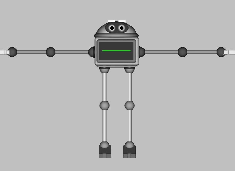
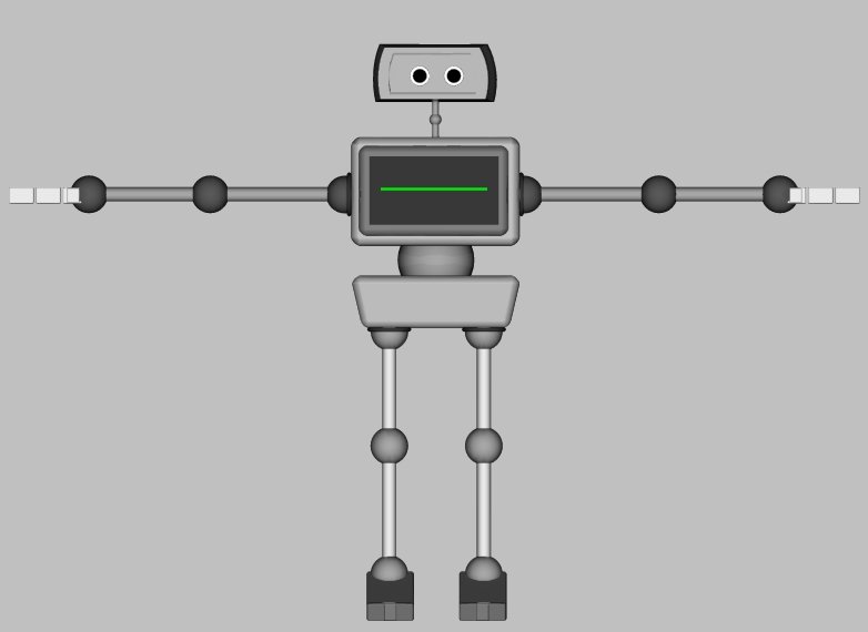
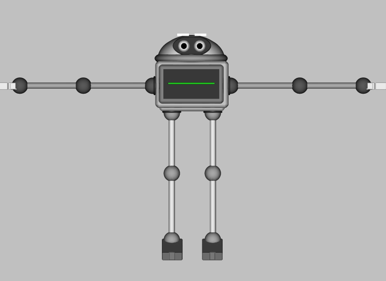
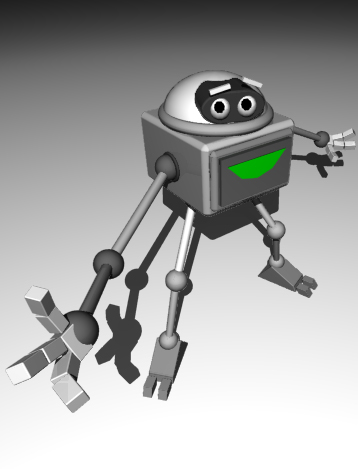
Hey guys, this is my Robotic Character running, what do you guys think? I had to get used to animating him again, his rig is a little different. Comment and critique please.
-
Yeah, I have 15 save files of him now from start to finish, the final is saved on my computer, over the network on my other computer, over the network on my brothers computer, and on my flash drive. I emailed it to myself as well. So I have him for good. I tweaked him a bit more and posed him, what do you think?


Contest Animation - April Fools
in Work In Progress / Sweatbox
Posted
Thanks Phastso. I am currently behind in the competition. The animation doesn't really relate to anyone as the characters are actually balls I guess . Thanks for the nice words, I still have a long way to go. I took a week off animation for spring break (naughty me, I know).