Ilidrake Posted October 2, 2011 Share Posted October 2, 2011 So this is the character I will be using in the up and coming forum project. Quote Link to comment Share on other sites More sharing options...
TheSpleen Posted October 3, 2011 Share Posted October 3, 2011 very interesting Quote Link to comment Share on other sites More sharing options...
Ilidrake Posted October 8, 2011 Author Share Posted October 8, 2011 Honesty I DON"T think he is that interesting. I've been listening to alot of Enya, ALOT!!!!!, and I've also been drinking more than usual for me. More than 2 is weird!!!! So anyway, the great thing about having bouts of depression are the sparks of inspiration you get with them. So I've just been modeling my brains out and this is by far one of my favorite characters I've done to date. And I've done about 6 in the last 3 months. Quote Link to comment Share on other sites More sharing options...
*A:M User* Shelton Posted October 8, 2011 *A:M User* Share Posted October 8, 2011 I like this one. Very cute and you could do a lot with this one Steve Quote Link to comment Share on other sites More sharing options...
Ilidrake Posted October 8, 2011 Author Share Posted October 8, 2011 Thanks Shelton. I hope the rigging goes as smoothly as the modeling has. Weather anyone believes it or not she came out of desperation for my Wonderland project that I have going on. The main character has never really meshed well with my thoughts or ideas and she came out while I was reworking the main character for the short I'm working on. I do hope I can find a place for her because she's to dang cute to not use Quote Link to comment Share on other sites More sharing options...
Admin Rodney Posted October 8, 2011 Admin Share Posted October 8, 2011 I really like this girl character! This character looks good but I think he could use some exaggeration in the right places to really finish him off. It might be good to see an image of their respective sizes to see how they play off of one another. My initial thought is that you could get away with bulking him up considerably more and enlarging the size of his head. For instance, the girl is approximately 3 heads tall whereas he is 4 and upwards to 5 heads. That gives the impression that they don't quite fit into the same world. Again, hard to say without a side to side comparison. I like them both. Quote Link to comment Share on other sites More sharing options...
Admin Rodney Posted October 8, 2011 Admin Share Posted October 8, 2011 Here's an attempt to reimagine the character with roughly the girls proportions.... not sure if it's any improvement but hopefully you see what I mean by enlarging the head. I got a little carried away with reforming the chest and legs and actually prefer your broader legs over this one. Quote Link to comment Share on other sites More sharing options...
Vertexspline Posted October 8, 2011 Share Posted October 8, 2011 Ilidrake-----nice job and both but for me I like the girl better as well.....and I think Rodney's thoughts are spot on for the other dude. To me he is close to being as good as the girl but she just looks ready to go.....(and i wish I could do either as well ) Quote Link to comment Share on other sites More sharing options...
Paul Forwood Posted October 8, 2011 Share Posted October 8, 2011 I love the girl. Very nice model! The SSS looks like it could be tweaked a little. Quote Link to comment Share on other sites More sharing options...
Ilidrake Posted October 8, 2011 Author Share Posted October 8, 2011 Thanks guys. Thanks for the input on the guy but i'm scrapping him completely. Ive already started another version of him that i think will be much more appealing, and will fit with the girl much better. Quote Link to comment Share on other sites More sharing options...
Zaryin Posted October 9, 2011 Share Posted October 9, 2011 I love the character style of that girl. The SSS looks a little heavy to me though. Quote Link to comment Share on other sites More sharing options...
Ilidrake Posted October 9, 2011 Author Share Posted October 9, 2011 She's not textured yet, thats just surface color with sss on. And yes it needs to be toned down but im gonna wait until I rig and texture her. Quote Link to comment Share on other sites More sharing options...
Ilidrake Posted October 10, 2011 Author Share Posted October 10, 2011 Okay let me see where to start.... Toned down the Subsurface alot!!! Textured her face a bit. Not sure if I'm happy with it but it will do for now. The skeleton is in place and this is just a test pass to see how her splinage works in the major joints. So far the only place that is giving me issues are the hips, as usual...It doesn't show in this pic but you can't over extend her hips or legs or they start clipping with other meshes. So I'll adjust those splines in the troubles area until I'm satisfied. She does have eyelids I just have them hidden for this shot. Redid the belt. Didn't care for the style so I opted for something I bit more simple. I'm thinking the texture on the pants SUCKS. The shirt is wool and I'm happy with it. Any suggestions for the pants??? And I'm thinking about maybe giving her a leather strap skirt. Kinda like strips of leather that will make a short skirt that just comes past the crotch area. What are your thoughts? Quote Link to comment Share on other sites More sharing options...
Admin Rodney Posted October 10, 2011 Admin Share Posted October 10, 2011 Looking very good. For some reason this character really appeals to me. I want to see her adventuring! Before you get too far down the line I would suggest giving the shirtsleeves and boot tops a slight extrusion and turning back in of the geometry. This will give them a sense of depth. Currently, the ends are razor thin. (I like how Robert Holmen describes it... 'infinitely thin') See attached image for an example of what I mean by adding thickness at the termination points. As far as the texture goes I think you are doing fine there. You might experiment with adding the same/similar image a second time and change the Decal image type to bump/displacement/diffuse or whatever produces the effect you need. Quote Link to comment Share on other sites More sharing options...
Ilidrake Posted October 10, 2011 Author Share Posted October 10, 2011 I realize they are thin but i wasnt sure about adding thickness as im thinking about using simcloth on them. Would the thickness affect them? Quote Link to comment Share on other sites More sharing options...
Fuchur Posted October 10, 2011 Share Posted October 10, 2011 I realize they are thin but i wasnt sure about adding thickness as im thinking about using simcloth on them. Would the thickness affect them? Yes it would... because of that I would not really add thickness but only do it for the edge... you can extrude there and dont go further with the extrusion and it should be easier to handle for both simcloth and any rigging you might want to do without loosing the illusion of sickness. See you *Fuchur* PS: By the way: very cute character! Quote Link to comment Share on other sites More sharing options...
Admin Rodney Posted October 10, 2011 Admin Share Posted October 10, 2011 I realize they are thin but i wasnt sure about adding thickness as im thinking about using simcloth on them. Would the thickness affect them? My take on this is that you want the appearance of thickness even if using SimCloth... so yes... you want to add that. As Fuchur mentions you don'thave to overdo the extrusion, you just want enough to create the illusion of thickness. As a benefit to SimCloth the additional splines at the termination point should help prevent any penetrations into the leg. Too thin a mesh and you risk having penetrations. As an aside: One of the secrets of effective SimCloth is to leave dangling splines in place (but they are invisible/will not be rendered). These dangling splines can then be manipulated to effect the tolerance of the Cloth's interaction with the leg. Quote Link to comment Share on other sites More sharing options...
Ilidrake Posted October 10, 2011 Author Share Posted October 10, 2011 As an aside: One of the secrets of effective SimCloth is to leave dangling splines in place (but they are invisible/will not be rendered). These dangling splines can then be manipulated to effect the tolerance of the Cloth's interaction with the leg I did not know that!!! Thanks for the tip Rodney. Once I get her rigged I'll do a few render tests and see how she looks in motion. On a side note I picked up a Cyber Tablet 12000!!! Not too bad for the price. Makes those pesky textures so much easier to paint. Quote Link to comment Share on other sites More sharing options...
Ilidrake Posted October 12, 2011 Author Share Posted October 12, 2011 Okay here's what I have of the guy so far. Not exactly where I want him but he's still a work in progress. Quote Link to comment Share on other sites More sharing options...
Admin Rodney Posted October 12, 2011 Admin Share Posted October 12, 2011 Hey! You should throw out your models more often. That guy is really looking great! Outstanding even. I like him. On a side note I picked up a Cyber Tablet 12000!!! Not too bad for the price. Makes those pesky textures so much easier to paint. Color me jealous. Everyone is surpassing me in tech these days. Quote Link to comment Share on other sites More sharing options...
Vertexspline Posted October 12, 2011 Share Posted October 12, 2011 Ilidrake --I like him ..nice job so far and even at this stage he has some personality oozing out of him ........keep churning along!! Quote Link to comment Share on other sites More sharing options...
mouseman Posted October 12, 2011 Share Posted October 12, 2011 Great model! You'll be able to do a lot with him! Quote Link to comment Share on other sites More sharing options...
NancyGormezano Posted October 12, 2011 Share Posted October 12, 2011 Good looking models! Quote Link to comment Share on other sites More sharing options...
Ilidrake Posted October 12, 2011 Author Share Posted October 12, 2011 Okay today has been a day of hair experimentation!!! Mainly on the fella as his head isn't as complex as the girl's. I have a side by side comparison of the "helmet hair" and the particle hair. Which is the "better looking of the two? I'm thinking of sticking with the Helmet Hair and just redoing the shape and look of it. Thoughts??? Quote Link to comment Share on other sites More sharing options...
NancyGormezano Posted October 12, 2011 Share Posted October 12, 2011 I'm thinking of sticking with the Helmet Hair and just redoing the shape and look of it. Thoughts??? I like them both. However if the girl has helmet hair, then he should probably be helmeted as well. Helmet hair is faster render, easier control. If you go with helmet, you might want to consider rigging some strands with dynamic constraints for some movement. Particle hair looks nice as well, can be render intensive the denser you make it, and of course is trickier to control with respect to penetration (but can be done). Quote Link to comment Share on other sites More sharing options...
dblhelix Posted October 12, 2011 Share Posted October 12, 2011 if you're experienced in decaling&such, you might find inspiration in the decals for Gala in a:m models. she has really nice helmet hair. Quote Link to comment Share on other sites More sharing options...
Ilidrake Posted October 13, 2011 Author Share Posted October 13, 2011 Here's a side by side of the two. The hands on the guy need the SSS taken down a lot. There seems to be an issue with normals on the guys belt, behind the buckle. Not sure about any of the textures, though I do like the scalemail shirt. I think the pants should go all the way to his feet but am unsure if I will. If I don't do I need to perhaps add a collar there with metal studs? The hair will remain as it is. Particle hair looks good but doesn't give me the "look" I want. As I say I'm very happy thus far with the characters and there overall looks. Now it's just a matter of getting the textures right, getting them rigged, and animating Quote Link to comment Share on other sites More sharing options...
Admin Rodney Posted October 13, 2011 Admin Share Posted October 13, 2011 Looking good! I can already tell that these are going to be great characters and (if you accept the concept of 'Character First!' great characters tend to lead to great storytelling. You are well on your way! The texturing is really starting to look great as well. Feedback Mode: I'm not smart enough to accurately convey what I want to say about proportions here so I will type toward it and hope others can narrow my focus. Ultimately this is your story to tell and I am not trying to sway you from pursuing your vision in any way. I do want to offer feedback for consideration. I hope you will do the same for me someday. Here's a site I found while trying to find the right words to say: http://www.zebtoonz.com/proportions.htm There's nothing there you don't already know already right? The area that comes closest to what I'm rambling on is somewhat hidden in the webpage: You also need to establish relative sizes between each character, i.e., Adults are one head taller than a ten-year-old, almost two heads taller than a six-year-old, etc. It's helpful to do a character sheet with all your characters on the same page to show comparative sizes. Obviously this is that artist's attempt to formulate his own understanding on the relative proportion of characters. Your mileage may vary. I've certainly seen adults that towered a lot farther than one head above ten year olds. While much rarer, I've seen shorter ones as well. What I'm after here is a sense that the characters belong in the same set... in the same universe... in the same story. Can they can safely and effectively interact (this will make them easier to animate!). When they are in a close up shot, establishing shot or looking eye to eye does everything work... in frame? Are their silhouettes immediately recognizable and compatible. If they were seen only in black against white how might their interaction 'read'. So, this is the underlying area of focus I think... I think... I am narrowing this down to: Why are the head proportions so dissimilar between the two characters? Should they be more similar? If not, why not? Will it have impact on your storytelling one way or the other? (i.e. There may be very good reason for this or even a greater dissimilarity) You don't have to answer these questions here. The important thing is just to ask yourself these design and composition related questions. I'm certain you are already. If you are happy with the relative proportions between the characters as they are then that is an answer in and of itself. It's your thing... "Please yourself." My long winded way of saying... I'm enjoying your updates! Added: Here is an old classic from Preston Blair: Quote Link to comment Share on other sites More sharing options...
Ilidrake Posted October 13, 2011 Author Share Posted October 13, 2011 Well put Rodney. I hadn't really thought about it until now and perhaps this is one of the underlying things that troubles me about the guy. I thought it was the textures and what not but it is the proportions. Note that he's human and she's a young elf, but still..... I do believe I will rework him again and see if i can't get a better look and see if it works better. If it doesnt no big deal i'll keep him around just in case. Thanks for taking the time. Quote Link to comment Share on other sites More sharing options...
Admin Rodney Posted October 13, 2011 Admin Share Posted October 13, 2011 One useful construct for proportioning is to sketch out (or modify meshes in A:M) several versions of the character that show a progression of the character's ages. I'd say optimally there are three stages: child (baby), young adult (teenage) and aged (adult). Inbetween those ages as necessary to target the age of your character and their storyline. These don't have to be detailed models/drawing but might also be useful later if the story ever dictates a look into the past or future of the character. Even if never used it gives the creator a better idea of who they are, were or will be in the character's story arc. The progression I have yet to do is to take a character from three heads high (a child) to 5, 6 or 7 (an adult). I did a set of drawings once that I thought I might pursue some day where a youthfully enthusiastic teenager is transformed into a overly cynical and frightened old guy. As stories are suppose to being already in progress and don't usually contain the death of a character in old age, the infant and the octogenarian usually won't fit into most onscreen storylines. The use of highly advanced age often conveys wisdom, experience but also degenerative frailty. That'd be quite a challenge but I know it'll be educational so it's on my list of things to do. Usually in 3D each stage of the character is a separate model but I can see some characters being one model morphed and remodeled. Also, some adaptation can be made almost exclusively with textures or animated personality traits (youthful exuberance or a slow methodical painfully unstable gait). Change... animation is all about change. The more change/contrast between otherwise similar thing we can direct at the viewer the better. But there does generally have to a rationale for that change... a grounding in reality. That's were relationships (and proportions) come into play. Quote Link to comment Share on other sites More sharing options...
Ilidrake Posted November 10, 2011 Author Share Posted November 10, 2011 In case anyone thought this was dead it is not. I'm still working on my models. Here's a pic of the girl's wings. Yes wings!!! I thought she had a good fairey look so I'm redoing her clothes and adding these wings. Quote Link to comment Share on other sites More sharing options...
Vertexspline Posted November 13, 2011 Share Posted November 13, 2011 Ilidrake.....I think most folks understand that these wip projects take time to develop since most folks are doing things in their spare time etc. --- and hey I like the wings .....so post as you can ---we all will wait patiently for the next piece to show up. (Smiles.....when I get up to making a wip forum project I may stetch folks patience way worse.) Quote Link to comment Share on other sites More sharing options...
TheSpleen Posted November 14, 2011 Share Posted November 14, 2011 love your style lildrake Quote Link to comment Share on other sites More sharing options...
Wildsided Posted November 14, 2011 Share Posted November 14, 2011 You've captured the frailty of those wings beautifully Quote Link to comment Share on other sites More sharing options...
Ilidrake Posted December 7, 2011 Author Share Posted December 7, 2011 Two months of work on this girl and she's finallt getting where I want her. I added the wings and changed her outfit. Comments, Crits??? Quote Link to comment Share on other sites More sharing options...
NancyGormezano Posted December 7, 2011 Share Posted December 7, 2011 Excellent. Love the wings Quote Link to comment Share on other sites More sharing options...
mouseman Posted December 7, 2011 Share Posted December 7, 2011 Looking really good! Rig her (if you haven't already) and call her done! Quote Link to comment Share on other sites More sharing options...
Ilidrake Posted December 7, 2011 Author Share Posted December 7, 2011 Yep, rigging is next and she'll be ready to animate!!! Quote Link to comment Share on other sites More sharing options...
TheSpleen Posted December 7, 2011 Share Posted December 7, 2011 I love your style! Quote Link to comment Share on other sites More sharing options...
kwhitaker Posted December 7, 2011 Share Posted December 7, 2011 She's cute, with a lot of personality. can't wait to see her in action. Quote Link to comment Share on other sites More sharing options...
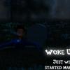
Ilidrake Posted December 8, 2011 Author Share Posted December 8, 2011 I really like this character!!! I also discovered AO today and decided to see how she would look. Comments?!?! Makes a great desktop wallpaper LOL This of course begs the question, can AO be used to do night scenes? Quote Link to comment Share on other sites More sharing options...
*A:M User* Shelton Posted December 8, 2011 *A:M User* Share Posted December 8, 2011 She really looks good. Pull the background ambience down a little and she will pop in the foreground. Great work!. I love the wings as well, and she looks like she will have a great deal of personality! Steve Quote Link to comment Share on other sites More sharing options...
NancyGormezano Posted December 8, 2011 Share Posted December 8, 2011 I really like this character!!! I also discovered AO today and decided to see how she would look. Comments?!?! Looks nice, but obviously if you're intending on doing any SSS or shimmer-glitter-glitz, you'll need some lights as well. Quote Link to comment Share on other sites More sharing options...
Ilidrake Posted December 9, 2011 Author Share Posted December 9, 2011 Thanks guys. Yep, I was just taking a break from modeling and what-not and decided to play with AO a bit. Quote Link to comment Share on other sites More sharing options...
NancyGormezano Posted December 9, 2011 Share Posted December 9, 2011 Thanks guys. Yep, I was just taking a break from modeling and what-not and decided to play with AO a bit. Try playing with FakeAO. It's a very very good alternative to AO with very very fast rendering (adds almost no time). But not sure how well it plays with SSS. It has a different look than AO, but is quite remarkable. Quote Link to comment Share on other sites More sharing options...
Recommended Posts
Join the conversation
You can post now and register later. If you have an account, sign in now to post with your account.
Note: Your post will require moderator approval before it will be visible.