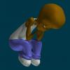
jirard Posted December 26, 2007 Share Posted December 26, 2007 Crits welcome and Merry Christmas! Quote Link to comment Share on other sites More sharing options...
NancyGormezano Posted December 26, 2007 Share Posted December 26, 2007 all very cute characters - nice, consistent style Quote Link to comment Share on other sites More sharing options...
higginsdj Posted December 26, 2007 Share Posted December 26, 2007 Nice, The only inconsistency I see is the relative feet/shoe size. Any reason they vary so much? Quote Link to comment Share on other sites More sharing options...
largento Posted December 26, 2007 Share Posted December 26, 2007 Wow, Jirard! You've been busy. Nice work on finishing 'em! Quote Link to comment Share on other sites More sharing options...
phatso Posted December 26, 2007 Share Posted December 26, 2007 Nice, The only inconsistency I see is the relative feet/shoe size. Any reason they vary so much? Style, man, style. If we always wanted realism we'd be photographers instead of animators. Quote Link to comment Share on other sites More sharing options...
higginsdj Posted December 26, 2007 Share Posted December 26, 2007 Style? What does this have to do with consitancy or 'photorealism'? For consistancy if they have large feet then they should all have large feet. If they are to have small feet then they all should have small feet - or does foot size have some hidden meaning? Cheers Quote Link to comment Share on other sites More sharing options...
John Bigboote Posted December 26, 2007 Share Posted December 26, 2007 Very cool! The differing foot sizes don't bother me one bit! Quote Link to comment Share on other sites More sharing options...
Jeetman Posted December 26, 2007 Share Posted December 26, 2007 WOW! Those are excellent!!! I too think the style is awesome!!! David, I disagree with your assessment about style. All appendages (as in feet) do not need to be the same size. Different characters absolutely can have variations. All the characters to me are all is the same style and I can see a complete movie created from these characters and it IMHO depending on the rigging and animation, would look fantastic!!! Fantastic work Jirard!!!! George Quote Link to comment Share on other sites More sharing options...
Dale_The_Bold Posted December 27, 2007 Share Posted December 27, 2007 Well done! Lots of personality even when standing still. Quote Link to comment Share on other sites More sharing options...
phatso Posted December 27, 2007 Share Posted December 27, 2007 I, at any rate, shall refrain from setting myself up as the Art Police. History is full of examples of critics who made fools of themselves. Even intelligent, educated ones. Scribes, Pharisees and Zealots all, who can't see the forest for the trees. Or in my line of work, can't hear the music for the notes. I'm reminded of the very learned music critic Hanslick, who referred to a particular composition as "a stink in the ear." He was speaking of Tchaikowsy's violin concerto, which is now hands down the most popular of all violin concertos among musicians and public alike. Quote Link to comment Share on other sites More sharing options...
higginsdj Posted December 27, 2007 Share Posted December 27, 2007 Veilled attacks on people opinions are not warranted. You can agree or disagree with an opinion but do not attack it simply because you don't agree with it! We can't all be as 'hip' or as stylish as you obviously think you are! Quote Link to comment Share on other sites More sharing options...
ypoissant Posted December 27, 2007 Share Posted December 27, 2007 Nice style of characters. Clothes need more texturing. I am also in a character design stage myself, for a short animation, so while I'm in a character design mindset, I'd like to offer a few observations and suggestions. I feel all the characters share too much of the same proportions. There are some differences in the facial structures in the first posted characters, the skin colors are the more prominent differences and the shoes are quite different. But I feel there could be much more variety. All the characters share the same body proportions. That is same head to body proportions, same upper body to legs length proportions, same arm length, same body size, etc. Same general morphologies. There are no endomorphic, ectomorphic or mesomorphic body shapes distinctions or any inbetween variations. There are no variations in heights or weights too. If you are planing to place all those characters together as a gang, for instance, they will be barely distinguishable from one another. There is much more efforts put in distinguishing the shoes for instance. I guess that this sameness in body shapes is what caught David's attentions to differences in shoes. And there are some efforts in differentiating the faces too but this is not pushed far enough IMO. For the head and face only, there can be wide variations in proportions and positions of the facial features as well as head shapes. I'd suggest you do test different body shapes and proportions. I'd suggest you do some sketches but if you are not a good draftsman, you could test ideas with the help of distortion boxes in A:M. Try long and skinny, short and fat, large and bulky, short and thin, short and bulky, high and fat, etc. for body shapes. Try round, square, oval, triangular and inverted triangular for head shapes. And try small, large, thin, wide, close together, spaced apart eyes. small, short, long, wide, fat, thin noses. etc. Try placing the eyes, the nose, the mouth higher or lower in the face or at different height relationships in the face. Concerning this mini-controversy about design vs style, here, all those variations could be designed while still keeping with the current style. Within a given style, design can go in so many different directions that style is barely limiting. To me, design and style are two different vectors. While they are somewhat related, they can barely restrict, impose or justify one another. Quote Link to comment Share on other sites More sharing options...
largento Posted December 27, 2007 Share Posted December 27, 2007 In my way of thinking, there's a purpose behind design and an aesthetic behind style. That's not saying that the two don't have some bleed between them, but there are practical reasons for design. Style is more about choice and isn't about rules. Quote Link to comment Share on other sites More sharing options...
Admin Rodney Posted December 27, 2007 Admin Share Posted December 27, 2007 I agree with everyone up to a point here concerning modifying the design of your characters. There is one major precedence set that tells me you should trust your instinct, stay on track and keep on going as you are. Think 'Charlie Brown'. Its possible that in not seeing your characters interacting together we are seeing them largely out of context. As you apparently have been creating an entire world of differently sized characters the design suggestions may not be as valid over all. Some similarity can work to your advantage. The similarities suggest to us these kids are all part of a team. I do agree that little changes can make a big difference. Changes in height alone would suggest interesting possibilities. For instance, it would automatically suggest age difference between the kids. That is something the current renderings don't seem to have. I've attached a wordless piddly e-critique exploring a few possibilities. Apologies if I've taken too many liberties with your work. Keep it up. This is great stuff! TheKids.pdf Quote Link to comment Share on other sites More sharing options...
jirard Posted December 27, 2007 Author Share Posted December 27, 2007 Wow! Thanks for all the crits guys. First off I think I'll explain the differernt proportions and the reasons for them. I wanted to make a project based on The Peanuts, Fat Albert, and Our Gang/Little Rascals series. I chose Peanuts as an influence on proportions, all of the characters in that series pretty much had the same or at least almost the same proportions. The first characters I made had the same look and proportions for that reason. The last character I made was the one with the green shirt. By that time I realized by changing things up a little looked alot better and was more appealing. The coolest thing is that last character only took a few hours, so redoing the rest wont be that hard. If any wants to play around with any of the characters p.m me and I'll e-mail them to you. Again thanks for the responses. Quote Link to comment Share on other sites More sharing options...
animas3D Posted December 28, 2007 Share Posted December 28, 2007 Interesting discussion. Yves, I am excited to hear about your short animation project, can you give more details? Can't wait! Joe. Quote Link to comment Share on other sites More sharing options...
ypoissant Posted December 28, 2007 Share Posted December 28, 2007 Yves, I am excited to hear about your short animation project, can you give more details? Can't wait! Not here. I don't want to hijack this thread. But details will come in due time. Quote Link to comment Share on other sites More sharing options...
phatso Posted December 28, 2007 Share Posted December 28, 2007 (sigh) Text messaging is such a crappy means of communication. If I had known how my comments would be recieved, I would instead have just said that Jirard has a masterful way of stylizing physical forms to reveal character - I wish I could do it the way he does. Creativity, by definition, involves a divergence from reality. Picasso and Dali were capable of creating realistic images, but so is a $5 disposable camera. They achieved much more by being deliberately unrealistic. Thus with Jirard: he is not incapable of modelling realistically proportioned feet, so the fact that he didn't do so suggests a conscious decision. My purpose was not to attack a critic's statement of opinion, but to point out that an artist's deliberate distortions are also a statement of opinion - namely, that stylized forms often tell a story better than realistic ones. They are correct in context if storytelling rather than portraiture is what the artist is after. I was just now looking at his mean little s.o.b. character, and every detail, from his fat face to his big feet, makes a contribution to telling us who this brat is. To do that without word or movement, just with form, is an achievement. I myself critiqued an earilier Jirard image. In that case an irridescent tricycle captured the viewer's eye, and made it almost impossible to pay any attention to the person riding it. I felt that the criticism was objectively justified, that the flashy trike was really an oversight, because the trike isn't supposed to be the focus of attention. But in the same image, the kid's cap was coming down over the eyes in a most unrealistic way. I didn't critique that because it was obviously deliberate, and helped tell the story. With every detail in art, the question is, does it look the way it does because the artist wasn't paying attention, or because he was? Jirard, I have been watching the development of these characters with more than passing interest. If you've got stories to tell about these kids (or partner with a good storyteller) you could take them to where they're as much a part of our culture as the Simpsons. Quote Link to comment Share on other sites More sharing options...
higginsdj Posted December 28, 2007 Share Posted December 28, 2007 Yeah - looking over the last couple of days I think I should have had a thicker skin and realised I was taking things the wrong way - my appologies - it must be the season and those once a year family gatherings of the in laws, travelling and overeating I do like the charatcers - its just my military background has enforced a lifelong desire for uniformity I'll have to break that habit sooner or later. Cheers Quote Link to comment Share on other sites More sharing options...
mtpeak2 Posted December 28, 2007 Share Posted December 28, 2007 Love these characters Jirard. My favorite one is the one with the headphones. The one with the baseball hat, looks like it could use a little more detail, maybe just turning the hat to the side or backwards, but I sure you have the hat rigged to position where you want it anyway. Looking forward to seeing them in action. Quote Link to comment Share on other sites More sharing options...
ypoissant Posted December 28, 2007 Share Posted December 28, 2007 I wanted to make a project based on The Peanuts, Fat Albert, and Our Gang/Little Rascals series. I chose Peanuts as an influence on proportions, all of the characters in that series pretty much had the same or at least almost the same proportions. The reference to "The Peanuts" made me think. Why do this design choice of making all the characters almost the same heights and proportions work? When I woke up this morning, I had this thought: This design is constrained by the medium and works because of the medium. First, the character design have evolved through the years to stabilize about 4 years after the comic strip beginnings. Then, it started evolving some more when new artists took over drawing the strip. The design did not really required large variations in character shapes because the strip rarely featured more than two characters simultaneously and they were generally staged in a theatrical frame where the bottom of the frame is more or less the ground for the characters and each character occupied their specific portion of the frame for the whole strip. Also, during the years, there have been long periods where the strip featured the same one character or the same two characters in long series of themed interactions. The reader was never in a situation where confusion about which character is who would keep from following what is going on in those strips. The Peanuts cast of character is, today, so well known by everybody that they can be used in animation films without getting the viewer confused about which character is who. Fat Albert and Little Rascals cast of characters is quite diversified in body shape as well as in body attitude and dressings. In fact, it is surprising to observe the diversity in the cast of characters in Little Rascals even though they are true kids. Bottom line: It all depends on how are those characters going to be used. If they are designed to be used in comic strips, like the peanuts, where interaction between characters is generally reduced to one-on-one, then similar designs would work. But if the characters are to be featured in an animation where the interaction is complex, with exchanges, plots and tradings between the characters that influence the whole development of the story, if the viewer needs to remember who said what to who and figure the network of interactions, if the film will be made of interleaved short sequences featuring different characters doing things in parallel, then the character design should be thought out so that each character is unmistakably recognizable. Jirard, You are obviously knowing what you are doing. Your character designs are very cool, especially the adult characters you did so far, and I love them. I also like your influences and I think you are definitely on a good track. Consider my discussion about character design as just discussion on a subject. Quote Link to comment Share on other sites More sharing options...
Jeetman Posted December 28, 2007 Share Posted December 28, 2007 I feel all the characters share too much of the same proportions. There are some differences in the facial structures in the first posted characters, the skin colors are the more prominent differences and the shoes are quite different. But I feel there could be much more variety. All the characters share the same body proportions. That is same head to body proportions, same upper body to legs length proportions, same arm length, same body size, etc. Same general morphologies. There are no endomorphic, ectomorphic or mesomorphic body shapes distinctions or any inbetween variations. There are no variations in heights or weights too. If you are planing to place all those characters together as a gang, for instance, they will be barely distinguishable from one another. With all due respect, I have to disagree here. I see plenty of variation of these characters that I'd definitely be able to distinguish the differences. Also if we are talking animation, Jirard could easily distinguish the characters through personality, mannerisms, voice, etc. enough to easily tell them apart. The reference to the peanuts characters is a perfect example. Although the peanut characters are very much the same, we all can distinguish say Linus from Charlie Brown. I also like the peanuts style idea. My only suggestion Jirard, is if you do decide to modify your characters based on others opinions just remember art is very subjective and a lot is based on opinion only. Trust your judgment. They look great now. If you do modify them, (IMHO) try not to stray too far from what you've created. Oh and Rodney, your pdf was very cool! I love the poses with them in the various actions. George Quote Link to comment Share on other sites More sharing options...
Admin Rodney Posted December 28, 2007 Admin Share Posted December 28, 2007 Very astute Yves. I do have a few questions though about the underlying premise. I would like to hear your opinion further. Your thought was: This design is constrained by the medium and works because of the medium. In the case of 'Peanuts' this seems to fit perfectly but I wonder if its all that simple. 'Peanuts' has been welcomed in a variety of media including limited animation (TV and Video) with the same popular appeal very much intact. Perhaps their appeal is in the repetition of similar patterns itself? Perhaps it was the exception to the rule and escaped the medium? At first I thought Jirard's characters were going to suffer from having too many similarities. I set out to show that. The third page of my piddly e-critique is an attempt to identify how little change exists from one character to another. The closer I looked though the more I found I had to abandon that way of thinking. The similarities seemed to have some intrisic drawing power. Are there other precedences for 'same height and porportion' outside of newspaper comic strips out there? They certainly do seem more prevalent there. Think 'Family Circle' there. The closest I can think of at the moment in animation might be 'Rugrats'. I can think entire worlds of examples in limited animation. Think Hanna Barbera! This case though is a little different if you examine each show. Accross the board however on the larger scale the similarities are apparent. There seems to be some design principle at work here; 'keep things as similar as possible in a design so differences become all the more appealing' or something along these lines of thinking. Think Snoopy and Woodstock compared to the rest of the Peanuts gang! I'm confident they are classified as the most endearing of the characters. The design seems to work toward (or at least complement) this purpose. Trying to think of an example in 3D I asked myself, "Has Pixar ever used this design tactic?" I immediately thought of 'For the Boids'. I think its a pretty good example of the principle in 3D. In there short they play up the 'Odd one Out' theme. I think you are on to something here Yves but I'm not sure if it is wholely constrained to a medium. I do find it facinating. Your thoughts? Quote Link to comment Share on other sites More sharing options...
ypoissant Posted December 28, 2007 Share Posted December 28, 2007 "Constrained" may be a little too strong a word here but I don't have any other word that explains what I mean. When The Peanuts were created, there were no other expected output but the comic strips. In that sense, it was a constraint. Not a concious constraint but the intrinsic nature of the medium imposed some design decisions that were refined through the years of using this medium. The Peanuts characters are very simple in design but they all have a very distinctive graphic feature that distinguish them from another. What distinguishes Charlie is his distinctive pattern on his shirt. What distinguishes Linus is his blanket. The mass of black that is Lucy's hair is a stong enough graphic element to unmistakenly distinguish her from the rest. Pigpen is distinguished by his dust cloud. Etc. Their design were made to capitalize on the high contrast black and white medium so their distinguishing features uses this contrast efficiently. The Peanut characters are usually drawn in some iconic POV. There are well know face, side and 3/4 views of each of them. The "limited animation" movies that were made with The Peanuts relied on those views to make the characters recognizable. The limited animations were made to look like animated comic strips and thus respect the character design intents. Paractically speaking, the characters could be used in other stagings, even in 3D. Everything is possible. But I think their optimal usage is within it's designed comic strip staging. Again, character design should take into account how they are going to be used. That is what "design" is for. Pixar "For the boids" is indeed a good example. The idea was to make one bird different from the others so all the other needed to look similar and they were well designed for expressing exactly that. For a cast of character that would be designed to act together as a gang, I would suggest making them all similar. But for a cast of character having all their different contribution to a complex story development, I would suggest making them obviously different. If each character personality is to be only sketchy and basically of simple follower of a leader, then making them look similar would be a design decision perfectly in line with the desire to make them look like simple followers. If each character is to have a clearly defined personality, then their design should enforce their uniqueness. Character design includes also body posture, attitude and gestures that transmit the character's personality. Clothes and accessories will also go along that as well as voice and mannerism, etc. Body and head shapes and proportions are just another tool in the designer's arsenal to help communicate a character's uniqueness if they are to be unique. Having differently shaped characters of different heights opens up new composition and staging possibilities in a 3D medium too. If all the characters are of the same height, showing them all together pactically means that they will all be next to the others in a single line otherwise, they will hide one another. Having different height, they can be placed at different depth and some triangular composition become imaginable. Quote Link to comment Share on other sites More sharing options...
Admin Rodney Posted December 28, 2007 Admin Share Posted December 28, 2007 Thanks Yves. You've given us a lot to think about. Quote Link to comment Share on other sites More sharing options...
nino banano Posted December 29, 2007 Share Posted December 29, 2007 I think that every character have their own personality...we can talk different opinions about ..so the most important thing here...is that the designer give to any character the personality he wants...it could be good or bad for someone else...so I think this do the difference of style that every one has...so the models are great for me Quote Link to comment Share on other sites More sharing options...
Admin Rodney Posted December 29, 2007 Admin Share Posted December 29, 2007 Oh and Rodney, your pdf was very cool! I love the poses with them in the various actions. Hey... those aren't my poses. They are 100% Jirard! I just appropriated them from his earlier posts. If you haven't seen those discussions and his WIPs you should check them out: Link to: Every single topic Jirard has ever started! Quote Link to comment Share on other sites More sharing options...
phatso Posted December 29, 2007 Share Posted December 29, 2007 I look at those characters and I see an ethnically diverse neighborhood with infinite possibilities for plotlines, all - as in Peanuts - from the point of view of the kids, perhaps with never an adult visible. Schultz certainly did build a world exclusively with kids (and one dog) better than anybody else has been able to. I suppose you'd call that Peanuts Envy. Quote Link to comment Share on other sites More sharing options...
Paul Forwood Posted December 29, 2007 Share Posted December 29, 2007 Good work, Jirard! I also thought, "Peanuts", when I saw these characters. Though the size and shape of a character is always a consideration that must not be overlooked I don't see any real problems with your gang of kids, but then again it all depends on what you have in mind, the type of stories that you intend to tell and how you use the camera. I am sure that if you develop distinctly unique personalities for each of these characters that they will work together very well. How about a group shot so that we can see the differences in height? Have you rigged any of these guys yet? Quote Link to comment Share on other sites More sharing options...
jirard Posted January 10, 2008 Author Share Posted January 10, 2008 I know this is kinda of an old topic but I just wanted to show the size comparisons Quote Link to comment Share on other sites More sharing options...
ypoissant Posted January 10, 2008 Share Posted January 10, 2008 Looking good. The character to the extreme right have a significantly smaller head than the rest. It looks like that character was scaled down rather than being younger or really smaller. Quote Link to comment Share on other sites More sharing options...
jirard Posted January 10, 2008 Author Share Posted January 10, 2008 Looking good. The character to the extreme right have a significantly smaller head than the rest. It looks like that character was scaled down rather than being younger or really smaller. Hahaha You caught me Yves. Thats exactly what I did. I thought he had such a cute baby face the shorter look would fit. I will have to go back and reproportion him. I would also like to say thanks for the sss. I know in a previous post in this thread you noted that the some of the models needed texturing. I havent really tried to do because number I dont know how and two I was influnced by the character work being done on kidrobot most of which are made with vinyl. Sub Surface Scattering with a little A.O. kinda gives the characters that same look. Quote Link to comment Share on other sites More sharing options...
Paul Forwood Posted January 10, 2008 Share Posted January 10, 2008 Looking good, Jirard! I am slightly concerned that the characters with legs that taper out at the bottom will be very restricted when it comes to animating but, like I said before, it depends on what you intend to do with them. Quote Link to comment Share on other sites More sharing options...
jirard Posted January 24, 2008 Author Share Posted January 24, 2008 Heres a bulldog character that I'm working on to add to this project. Crits welcome. Quote Link to comment Share on other sites More sharing options...
jirard Posted January 26, 2008 Author Share Posted January 26, 2008 Almost finished the dog I still have to work on his legs and feet. Here are a couple of renders Quote Link to comment Share on other sites More sharing options...
Nuba X Posted January 27, 2008 Share Posted January 27, 2008 Almost finished the dog I still have to work on his legs and feet. Here are a couple of renders OOOH SNAP!!! Im Feeling that! Great Work! The Bulldog is a very nice touch. You should start your own series, comic book, Movie or something with these characters. Quote Link to comment Share on other sites More sharing options...
jakerupert Posted January 27, 2008 Share Posted January 27, 2008 the bulldog I like best. Great design! Can you post the mesh please. ;>) Jake Quote Link to comment Share on other sites More sharing options...
jirard Posted January 27, 2008 Author Share Posted January 27, 2008 Thanks guys Heres the wireframe Quote Link to comment Share on other sites More sharing options...
DarkLimit Posted January 28, 2008 Share Posted January 28, 2008 Nice job on the dog, I like the simple efficient use of splines.. Quote Link to comment Share on other sites More sharing options...
jirard Posted February 4, 2008 Author Share Posted February 4, 2008 Thanks Darklimit. Heres another one I created. I have to make a cat and then for the rest of the year I will be learning to rig and animate. Oh and I know I need to make an ear for her hehe Quote Link to comment Share on other sites More sharing options...
jirard Posted February 7, 2008 Author Share Posted February 7, 2008 Hey guys I am trying to post some of these characters on another board but a few members say they arent showing up. They show up fine on mine computer. Let me know if u can see them Other post Thanks Quote Link to comment Share on other sites More sharing options...
Caroline Posted February 7, 2008 Share Posted February 7, 2008 The pics show up for me - (great simple models, by the way). The quality of the pictures is not good, though, especially the last one, the girl in pink - she is very pixellated. They do not do your characters justice. What about a render with them all in scene - like: http://www.hash.com/stills/displayimage.ph...um=54&pos=0 Quote Link to comment Share on other sites More sharing options...
John Bigboote Posted February 7, 2008 Share Posted February 7, 2008 They have a sort of 'Fat Albert' feel to them...which rig are you planning to use? Too bad you can't get TheSetupMachine anymore...can you? Quote Link to comment Share on other sites More sharing options...
jirard Posted February 7, 2008 Author Share Posted February 7, 2008 The pics show up for me - (great simple models, by the way). The quality of the pictures is not good, though, especially the last one, the girl in pink - she is very pixellated. They do not do your characters justice. What about a render with them all in scene - like: http://www.hash.com/stills/displayimage.ph...um=54&pos=0 Thanks Caroline The last picture is low quality because I only used 1 pass and plus I never really finished her. I would use a group shot but I am without a computer right now and have to use a friend(s) whenever they let me. Again thanks Quote Link to comment Share on other sites More sharing options...
jirard Posted February 7, 2008 Author Share Posted February 7, 2008 They have a sort of 'Fat Albert' feel to them...which rig are you planning to use? Too bad you can't get TheSetupMachine anymore...can you? I honestly dont know about the setup machine. I think it still works with v14. I am planning on getting Bizzles training software so I can understand the whole rigging and animating progress in a:m Thanks Quote Link to comment Share on other sites More sharing options...
largento Posted February 7, 2008 Share Posted February 7, 2008 I've not ever used The Setup Machine, but I've used Barry's DVDs and they're real helpful. Barry doesn't really cover assigning CPs and weighting, so seek out as much info as you can on that subject when you get around to doing it. I'm still kind of intimidated by rigging myself, but thankfully I'm passed being completely terrified of it, so that's a step. :-) Looking forward to seeing your neighborhood come alive, Jirard! Quote Link to comment Share on other sites More sharing options...
jirard Posted February 7, 2008 Author Share Posted February 7, 2008 I've not ever used The Setup Machine, but I've used Barry's DVDs and they're real helpful. Barry doesn't really cover assigning CPs and weighting, so seek out as much info as you can on that subject when you get around to doing it. I'm still kind of intimidated by rigging myself, but thankfully I'm passed being completely terrified of it, so that's a step. :-) Looking forward to seeing your neighborhood come alive, Jirard! Thanks Largento I'm looking forward to seeing your stuff done also. Do you have any links that talk about assigning cps and weighting? Quote Link to comment Share on other sites More sharing options...
jpappas Posted February 7, 2008 Share Posted February 7, 2008 Largento, I didn't realize Barry's tutorials didn't cover weighting - but do they cover fan bones? That's another area that I don't seem to find many tutorials on. Colin talks about them a little in the Cooper tutorial and there's some basic tutorials that show a fan bone applied to a simple cylinder, but I haven't seen a tutorial that sets up a fan bone on something like a shoulder or hip, and goes one step at a time. thanks! -Jim Quote Link to comment Share on other sites More sharing options...
Tai Shan Posted February 8, 2008 Share Posted February 8, 2008 Awesome work as usual! I agree -- the use of splines is economical yet you invest the models with so much character. Quote Link to comment Share on other sites More sharing options...
jirard Posted March 27, 2008 Author Share Posted March 27, 2008 Finished one more. Quote Link to comment Share on other sites More sharing options...
Recommended Posts
Join the conversation
You can post now and register later. If you have an account, sign in now to post with your account.
Note: Your post will require moderator approval before it will be visible.