Joe Gamblin
-
Posts
107 -
Joined
-
Last visited
Content Type
Profiles
Forums
Events
Everything posted by Joe Gamblin
-
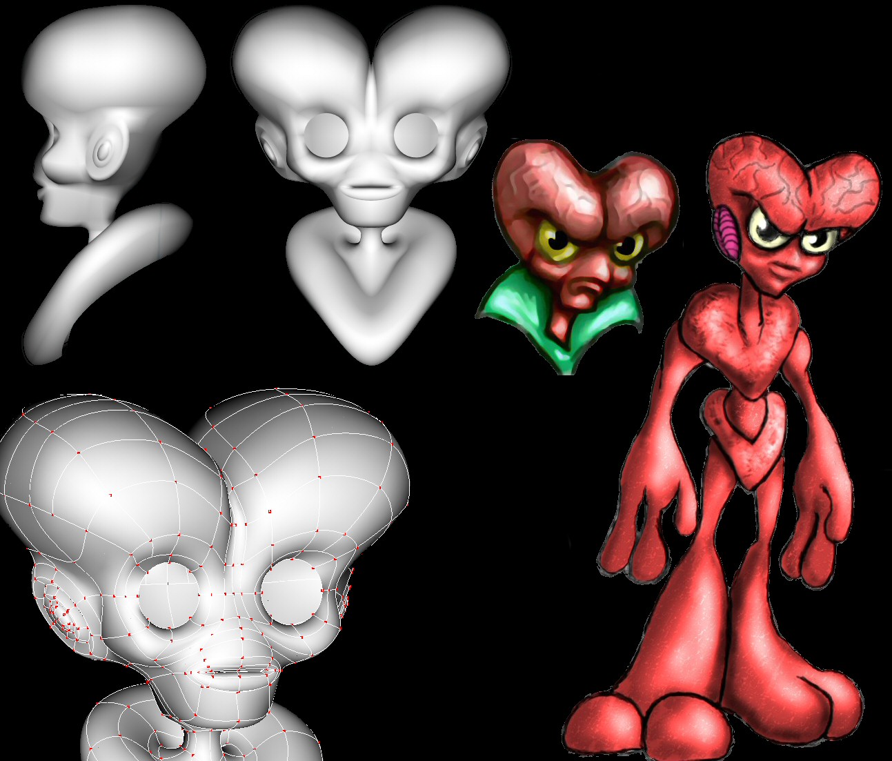
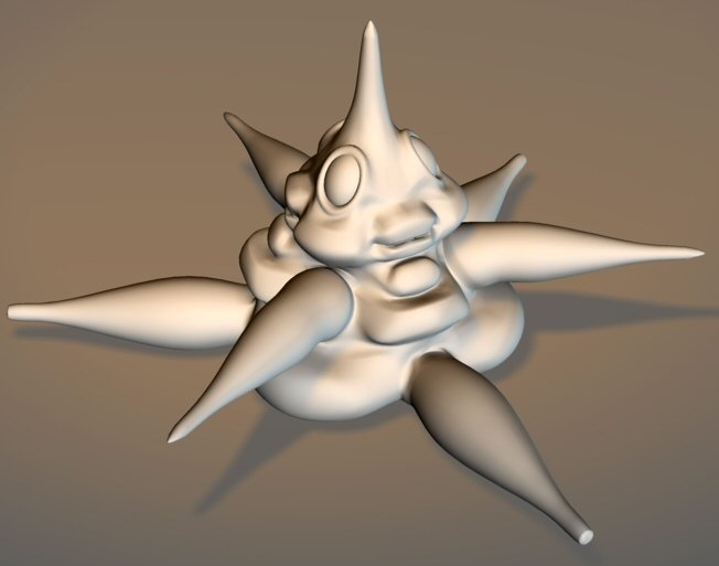
This really looks cool from what I can see, but could I request a close-up of the head region? It's hard to see at this size.
-

Better ressources for images to rotoscope
Joe Gamblin replied to animation man hi's topic in New Users
Which Ironman are you looking for? I've got a bunch of ref setting around, but most of my stuff is older model sheets from the TSR Marvel Superheroes RPG updates and the Marvel Universe sourcebooks from the late 1980s, so if you're looking for movie ref, I'm no help there. -
First, whenever you have a problem, post a wireframe. Second. Yes, you can fix that easy. Shift-click the 5 points and the five-point patch tool will light up at the bottom of your toolbar. If it doesn't, hit the "period" key twice. Should work no problem.
-
Very true. I was expecting Godwin's Law about three pages ago.
-
In his farewell address he actually warned us against political parties. All obstructions to the execution of the Laws, all combinations and associations, under whatever plausible character, with the real design to direct, control, counteract, or awe the regular deliberation and action of the constituted authorities, are destructive of this fundamental principle, and of fatal tendency. They [political parties] serve to organize faction, to give it an artificial and extraordinary force; to put, in the place of the delegated will of the nation, the will of a party, often a small but artful and enterprising minority of the community; and, according to the alternate triumphs of different parties, to make the public administration the mirror of the ill-concerted and incongruous projects of faction, rather than the organ of consistent and wholesome plans digested by common counsels, and modified by mutual interests.
-
That's two "amens" in two minutes. You're on a roll today.
-
Sorry, I'm not sure what you're asking. Do you mean cookie cutter decals? If you do, then yes A:M can do that. Try a search on the forum for examples.
-
Because I am not smart enough to stay out of this, and love the ridiculous, I will critique your critique of Bruce critiquing your critique. I think the first half of your critique of Bruce critiquing Mike's critique was helpful but in the second half, you too allowed yourself to get pulled into the larger topic.
-
First of all, I'm staying out of the political argument, but I think this raises another issue. Can one ask for an honest review with the idea of separating content from technique? Suppose I upload the latest animation from a very gory zombie story in which we see a small child ripped apart and eaten. Yes, you should be able to ask on the quality of animation alone, but isn't it asking too much passively watch something that has "hot button issues"? You've got politics, racial humor, and a sex joke all in this one animation. You may have not meant it to be, but can't you see how this was a hornet's nest? Also, don't take this the wrong way, but with what important issues were you trying to spark discussion? Almost forgot, excellent model with Obama.
-
Do .OBJ models from TurboSquid work with A:M???
Joe Gamblin replied to Handy Andy's topic in New Users
You know that's there's hundreds of free A:M models floating around. What are you looking for? You might be able to get it free, and this is a very active and helpful community. In my experience, any question that you can think of on using the model including lighting, animating, decals, normal maps, etc, will be answered in just a few hours. -
Best way to rig a tentacled monster with TSM?
Joe Gamblin replied to Joe Gamblin's topic in A:M Rigging
And here's a wireframe.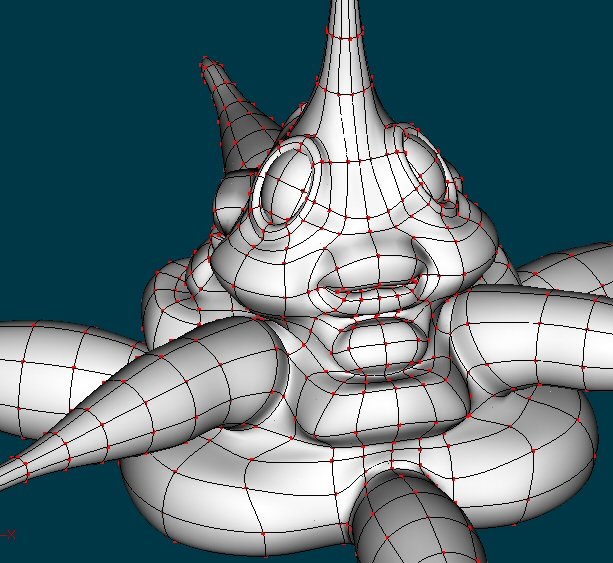
-
Best way to rig a tentacled monster with TSM?
Joe Gamblin replied to Joe Gamblin's topic in A:M Rigging
I've got "bendy legs" on the hard drive, and was going to give it a shot if I couldn't get the TSM rig to come out well. -
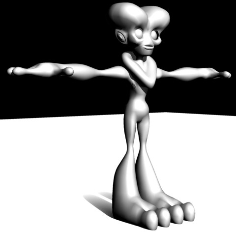
So I'm working on another alien design and I could use some advice from folks that have more experience with TSM. Here's the character. He's a trilateral design so ,kinda like a starfish, you could divide him into three equal sections. So there's three arms, three legs and all of them are tentacles. What would be the best way to rig all those limbs? All of them as tails? Arms? And, for example, would it be best to have a left arm and back arm and after flipping have three or just make three and skip the flipping? Before I start testing I thought I should ask the experts. Thanks in advance for any and all help.
-
You can also constrain along the spline with 4 and across the spline with 5.
-
Looks awesome! Great job!
-
That is a very well done toon render. Bravo.
-
Short answer = unisex.
-
Update. Still have the waist ring and some tweaking.

-
Oh, I do have a question about decals. I wanted to have a bump map for the veins on the forehead, and was wondering what the quickest and/or easiest way to make sure that it lines up with the color map. I don't have much experience with multiple decals on one area.
-
Done, I was a little worried about the dead end spline but it maintains a good curve. I modeled a neutral expression, but drew it with the angry look because I like the swooping s-curve of the heavy brow. However, I did a quick test and I think that it will curve well for facial expressions. Here's a render. Sorry about the weird render. Right now there's just a simple material until I get it painted in 3Dpainter, and I ran it thru some filters in photoshop to get closer to the look of an old pulp magazine. Still tweaking everything.

-
Here's a couple headshots, wireframe, and concept art. Crits welcome.

-
Your real name is Bigboote? Is that boot as in shoe or bootie as in buttocks? About that real name thing, can you change your name in the forums because I actually was getting tired of the Achilles thing?
-
Overall, I really like them, but I assume that you don't want people to just pat you on the back so here's a few questions/comments. First, where are the engines on the shuttles? They don't have to have rocket exhaust and all that, but even Star Trek adds nacelles with a nice glow (bloom?) that suggests some sort of inner workings. Plus, any kind of running lights, engine glows, etc could easily add a sense of movement thru motion blur, or just smear on a glow in post. As the piece stands now, it feels more like the ships are falling rather than flying. Second, this is just a personal taste thing, but both pieces are pretty unsaturated and with the earth-tone heavy palette it leaves them a little too flat for me. Both could also use an increase in contrasts. I'd like to see stronger lighting in the space scene (unless the sun's a dwarf) For example, you could add a greenish nebula in the space scene could add a little color without overpowering the whole piece, and the contrast would add some punch. Third, the atmosphere line is way too harsh in the planetfall piece. Yves has a really great tutorial on three different techniques you might want to search for. However, your clouds are excellent. Fourth, on the landscape, I don't think the profile fits the texture. The form is like sand dunes, but the texture is rocky. Displacement maps could fix that without too much trouble. Fifth, I like the shuttles overall design. Nice and simple with some nurnies/greebles without overdoing it. How did you do them? Modeling, bump, or displacement? Love the gun, so-so on the sensor array. The ship's texture is a little strange. I don't know if it has a faint camo paintjob or if that's supposed to be dirt. If it's dirt, the placement seems random, and too uniform. Quick question, how does the crew get out? I don't see any ladders, and the cargo door in the back doesn't look like it would get near the ground without some sort of telescoping. Also, the windows would look really cool if they were mirrored, letting us see a glimpse more of the landscape Sixth, some notes on the robot-bug thing. The pose is really stiff and I have no idea if it's friendly or going to tear the ship in half. It looks like a tourist posing for vacation photos right now. Also, unless I'm misreading the scale, it's freaking huge! If the door on the ship was built for humans, that would make the bug at least twenty feet tall. There ya go. All and all, they really are pretty hip and my suggestions are just nitpicking.
-
Hey guys, you've been quiet on this project for awhile. Just a voice in the dark saying not to give up now after ,what, a hundred pages of posts.
-
What kind of blur? Motion blur or just out of focus, or just generally fuzzy. Motion = Motion blur under rendering options (make sure multi-pass is on) Focus = Depth of field rendering option Fuzzy = Translucent material with a high density. Hope that helps. If not, try to describe the effect exactly that you're looking for.